
Brewery Branding
& Craft Beer
Label Design
From tap handle to shelf to Instagram, we build brewery identities that hold up everywhere they’re seen. Award-winning packaging design from a Portsmouth, NH studio working with breweries across New England.
Shelf presence is a design problem,
not a decoration problem.
A cooler door is a wall of noise. Forty labels, all shouting, most of them using the same three moves — a mountain, a hop cone, a distressed serif. The ones that sell are the ones a person can find again.
That means designing for three distances at once.
Across the room
Silhouette and color block. Before anyone reads a word, they should recognize the can. If a label only works held in the hand, it doesn't work.
At arm's length
Hierarchy. Brand, beer name, style, ABV — in that order, without a fight between them. Most craft labels fail here: everything is the same weight, so nothing leads.
In the hand
Craft and detail. This is where illustration earns its place, and where a drinker decides whether the beer feels worth the price.
Then the constraints that aren’t aesthetic at all: TTB requirements for the government warning, alcohol content and net contents. Ink limits and substrate behavior — a color that sings on screen can die on a matte shrink sleeve. Distributor and retailer expectations for how a series reads together on a shelf.
We design against all of it at once, because the label doesn’t get a second version.
Craft Beverage Projects
More than a logo.
A system your staff can run.
Every brewery has a story. We translate it into a system that holds — from the first concept sketch to final print-ready files. Launching from nothing or sharpening what you already have, the work has to survive contact with a bartender, a printer and a cooler door.
Core identity
Primary mark, secondary marks, and the variations you actually need — a tap handle lockup, a can top, a single-color version for embroidery, something that survives being an inch wide on a coaster.
Can & bottle label systems
Not one label. A structure that lets a core lineup, a seasonal and a one-off release all read as the same brewery while staying distinct on the shelf.
Custom illustration
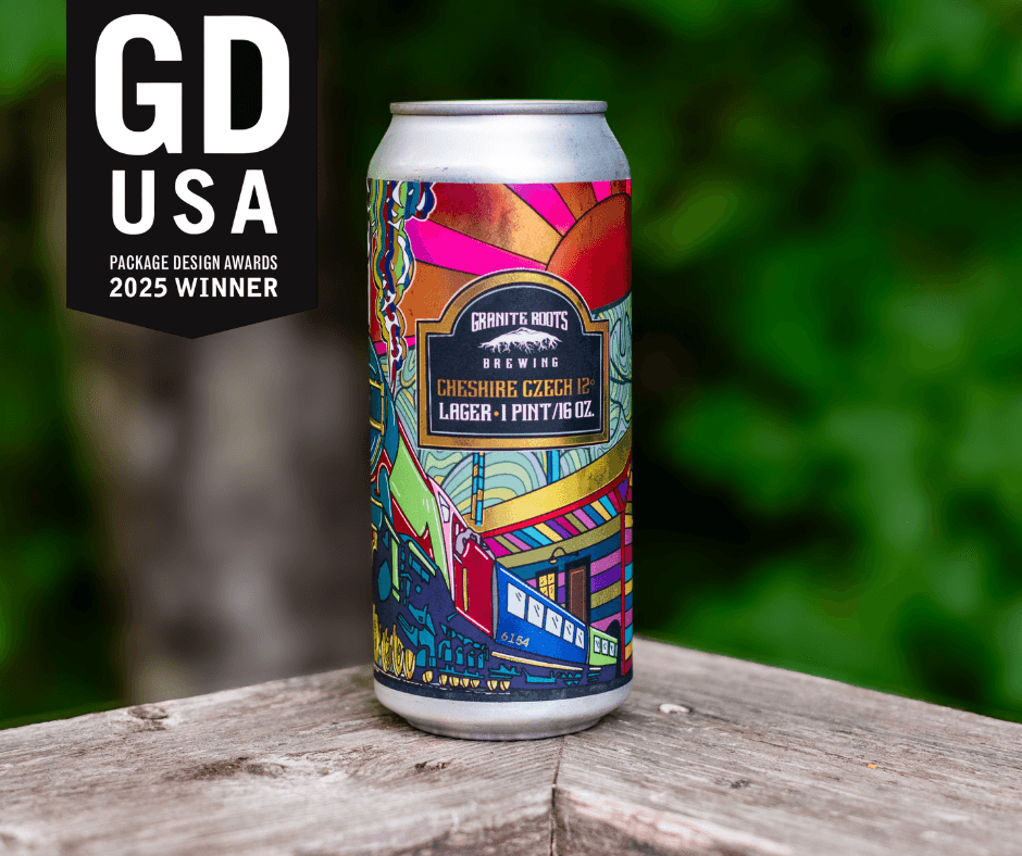
Where a brand needs something nobody else can use. The Granite Roots Cheshire Czech label was illustrated from reference photography of the Troy train station, with Mount Monadnock anchoring the composition.
Taproom & environmental design
Signage, menu boards, wayfinding and wall graphics — the brand in the room where people actually decide they like you.
Merchandise
Shirts, glassware, coasters, hats. Designed as part of the system rather than bolted on, so a hoodie doesn't need a logo of its own.
Brand guidelines
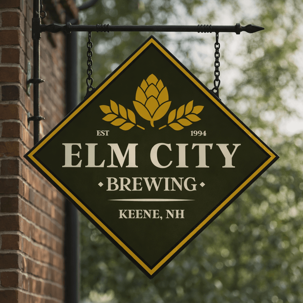
Written for a brewery team, not a design department. Elm City's runs 31 pages and covers what a bartender or a printer needs to get right without calling us.
Seasonal & limited-release design
A framework for the releases you haven't brewed yet, so the tenth label is as fast to produce as the first.
Built for Breweries
Deep Industry Knowledge
We know craft beverage culture and what makes a label sell on-shelf and on-tap. We design to the mandatory information requirements from the start, so nothing gets squeezed in at the end.
You Work With The Designer
No account layer, no handoff to a junior. You talk to the person drawing the label. For a brewery owner already doing four jobs, that means fewer meetings and faster decisions.
Nationally Recognized Work
Our Granite Roots label earned a 2025 GDUSA Package Design Award and was featured in the Keene Sentinel. Bold work gets noticed.
Full Brand Ecosystems
We don't just design labels. We create complete brand identity systems — from taproom to tap handle to merch.
Brewery branding
questions.
Beer labels have to carry certain mandatory information — the government warning, alcohol content, net contents, brand and class designation — and federal approval runs through the TTB, which issues a Certificate of Label Approval. That filing sits with the brewery, because it is tied to your permit and your existing relationship with the agency. What we do is design around those requirements from the start: the information gets real space in the layout rather than being squeezed in at the end, and you get print-ready files with it already placed. Send us your requirements or your last approved label and we will design to them.
Yes, and we would rather. We will talk to them before the design is final about substrate, ink limits, and any white-ink or varnish steps, so the file we hand over is built for that press instead of adjusted after the fact.
Yes. Granite Roots Brewing came to us for a single can — the Cheshire Czech lager that went on to win a 2025 GDUSA Package Design Award. If the brewery identity already works, a one-off label is a clean, contained project, and often the start of a longer conversation.
One to three weeks, depending on how much custom illustration it needs. A straightforward layout using an existing brand system lands at the short end; something drawn from scratch, like the Cheshire Czech label, takes the full three. Full brewery identities are a different scope — those run 4 to 8 weeks and are covered under branding packages.
See branding packagesYes. We are based in Portsmouth, NH and work with breweries across New England, and remotely beyond it. Most of the work happens in files and video calls either way.
Then we keep it. The Elm City Brewing project was explicitly a refine-and-strengthen rather than a start-over: the identity had grown inconsistent and hard for staff to use, so the work was restraint rather than replacement. Throwing out brand equity a brewery has already built is usually the wrong move.
Ready to brew a bold brand?
Let's create a brewery brand and packaging system that turns heads on the shelf and builds loyalty at the bar.