Elm City Brewing
Client
Elm City Brewing Company
Location
Keene, NH
Scope
Comprehensive Branding Package
Year
2026

Thirty years of goodwill, and a mark that had drifted
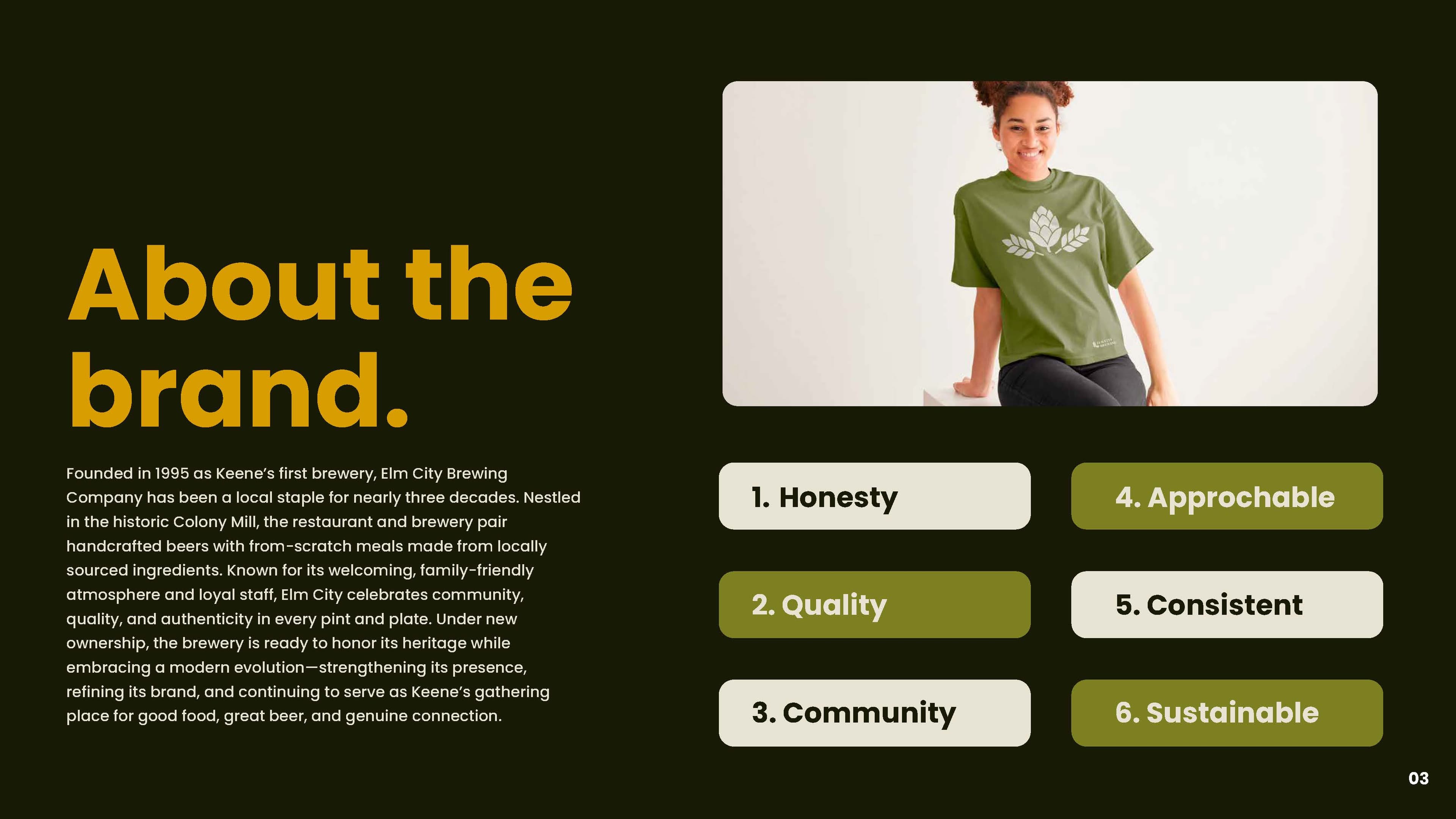
Elm City Brewing opened in 1994 as Keene’s first brewery, in the historic Colony Mill. It is a restaurant as much as a brewery — handcrafted beer alongside from-scratch food, locally sourced, in a room people bring their families to. Nearly three decades in, it had become the thing a town keeps: familiar staff, regulars who do not need a menu, a place that shows up in people’s memories of Keene.
Then it changed hands. New ownership wanted to honor the heritage and modernize at the same time — strengthen the brewery’s presence without making regulars feel like their local had been replaced by something else.
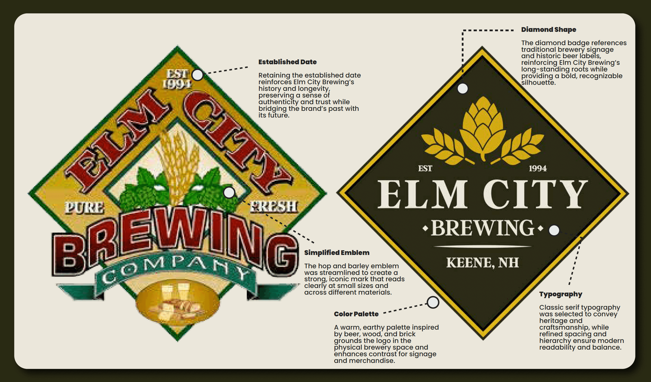
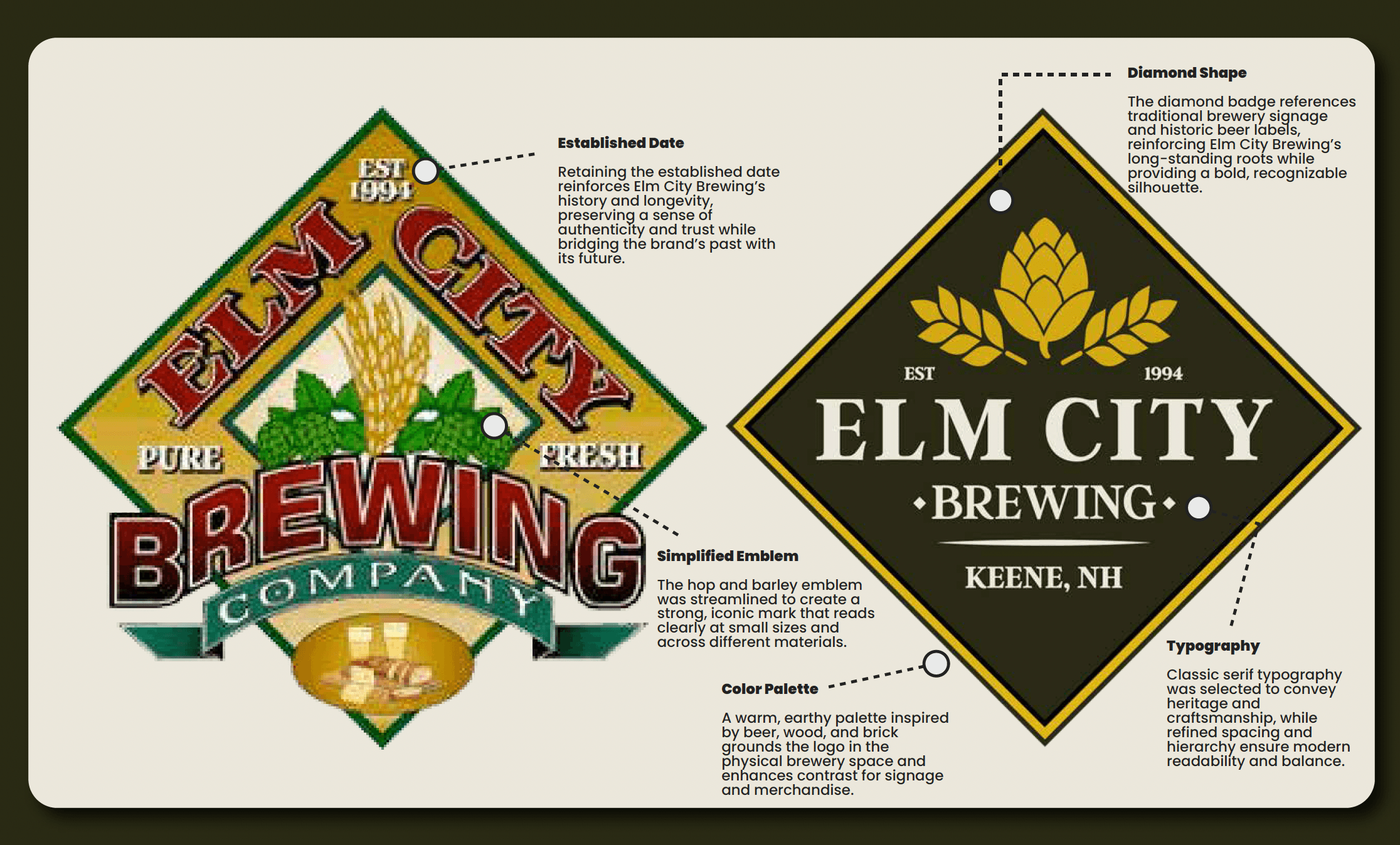
The existing identity was not a bad idea badly executed. It was a good idea that had accumulated. Three decades of additions had left a mark carrying a beveled banner, a scene of glassware, two display faces, a ribbon, a full illustration and eight colours — all fighting for the same space.
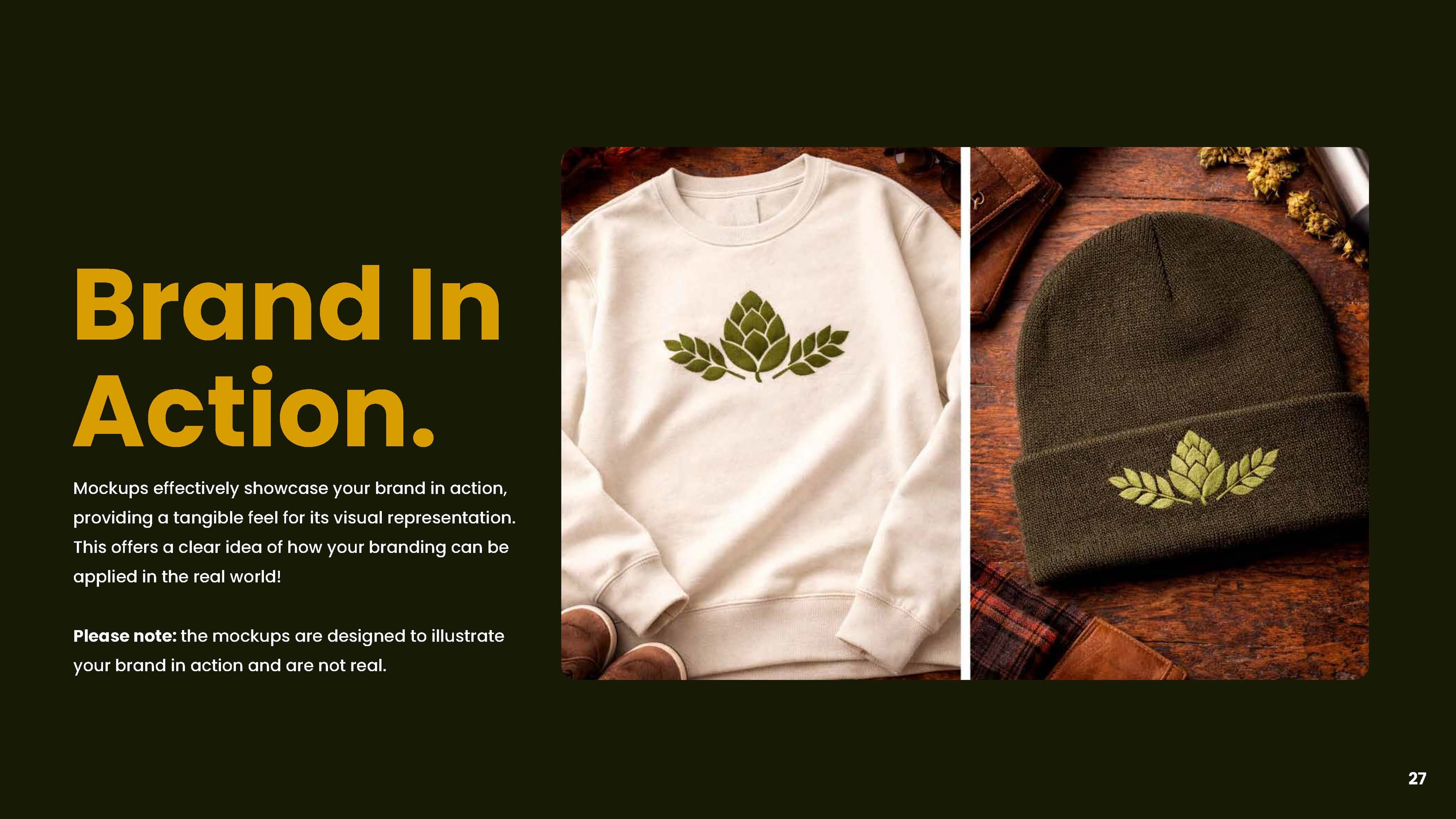
That reads on a building. It does not read on a coaster, a tap handle, an embroidered hat or an Instagram avatar, which is where a brewery brand actually lives. Staff were improvising, because the files could not do what the job asked of them.
Keep thirty years of recognition intact
Survive at an inch wide, in one color, on fabric
Work as a restaurant brand and a beer brand at once
Give staff files they can use without asking a designer
Read as established, not as new money in an old room
This wasn't a rebrand from scratch. It was about finding what already worked, stripping away what didn't, and building a system that could actually hold up in the real world.
01 — 02
Understand the foundation
Before designing anything, I audited what Elm City already had. The identity felt inconsistent, overly detailed, and hard to use. But this wasn't a "start over" situation — it was a refine and strengthen one.
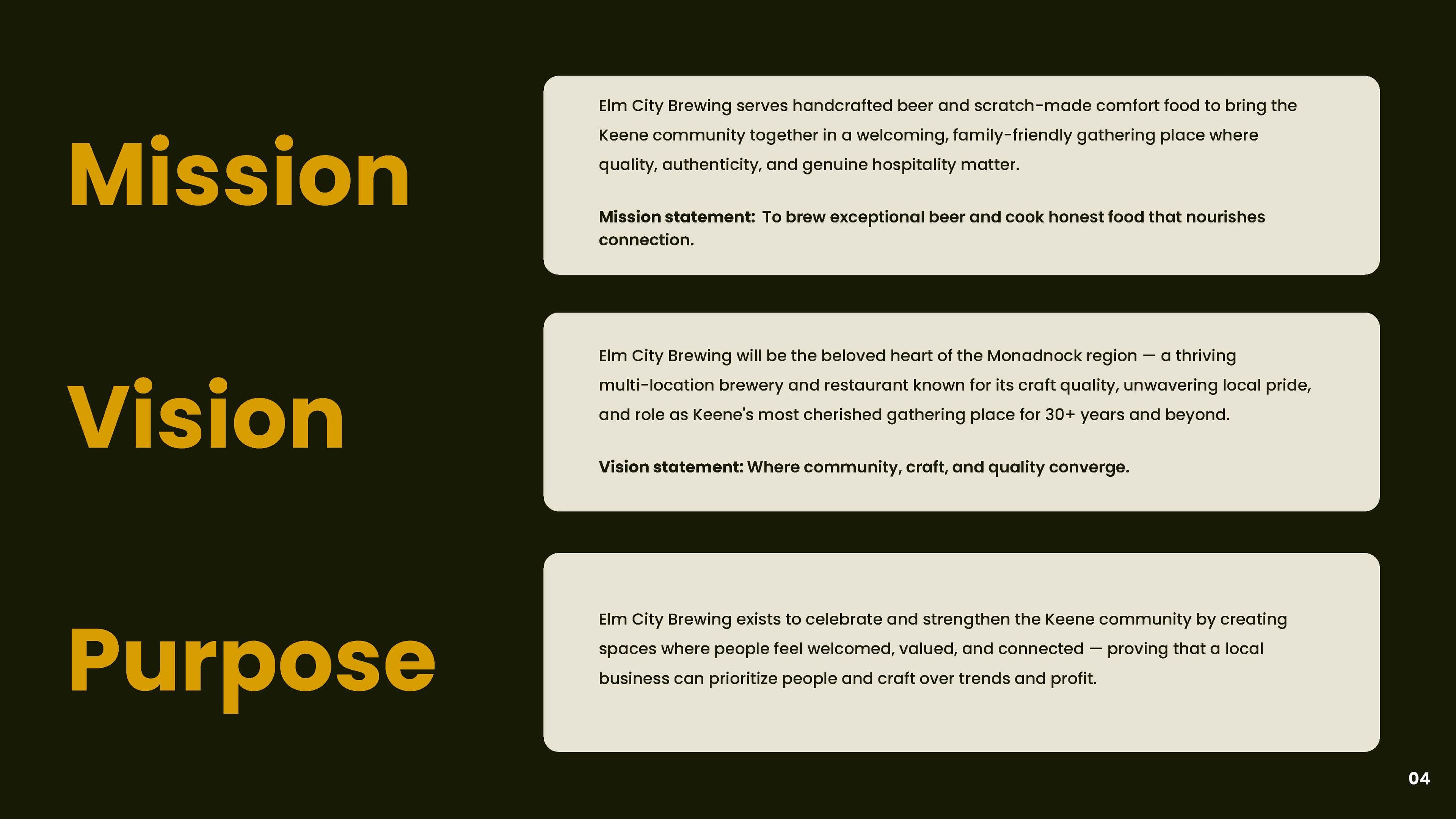
Elm City is a local staple — built on community and approachability. The brand needed to feel welcoming, established, and simple without being generic.
03 — 04
Strip it down. Build it up.
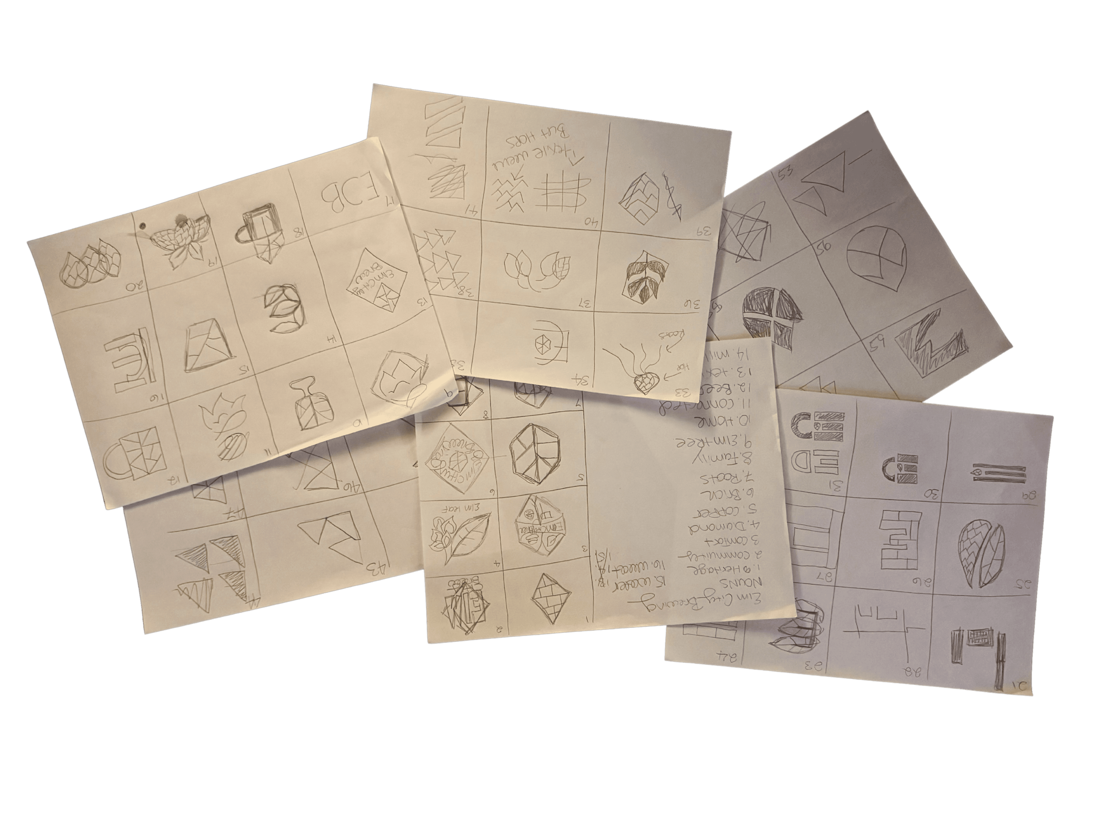
The biggest shift was restraint — removing unnecessary detail, visual noise, and inconsistencies. Then rebuilding around clean, recognizable forms that scale across menus, merch, signage, and digital.
The goal wasn't a single logo. It was a flexible identity system — multiple logo variations, a clear typographic hierarchy, an intentional color palette, and supporting assets that all work together.
05 — 06
Test it. Keep what matters.
Every decision was tested against real use cases. Can this work on a beer can? Does it read from across the room? Will staff actually use this correctly? If it didn't work in the real world, it didn't make the cut.
The goal was never to erase Elm City's history — it was to distill it. The final identity keeps the spirit of the original, just clearer, stronger, and built to last.
Most brands don't need more.
They need less — done right.
Four decisions, and what each one is for
Restraint is easy to claim and hard to defend, so every element that stayed had to earn the space it took. Three of the four came from the old mark. That is the point — the work was subtraction and hierarchy, not invention.
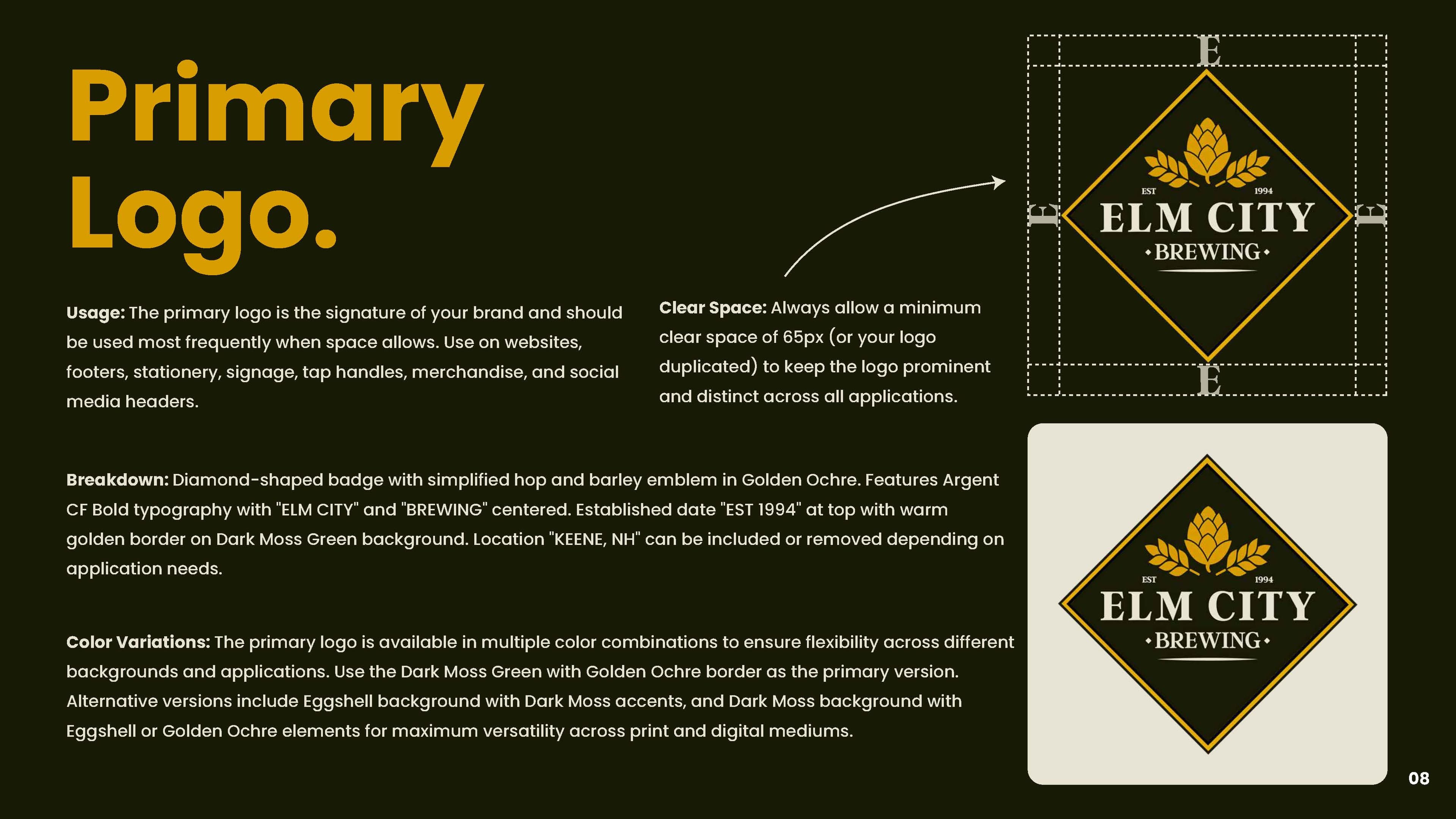
Established Date
Kept, not dropped. The date is the one piece of the old mark that cannot be redesigned back into existence, and it does the work of saying this place has been here longer than you have.
Diamond Format
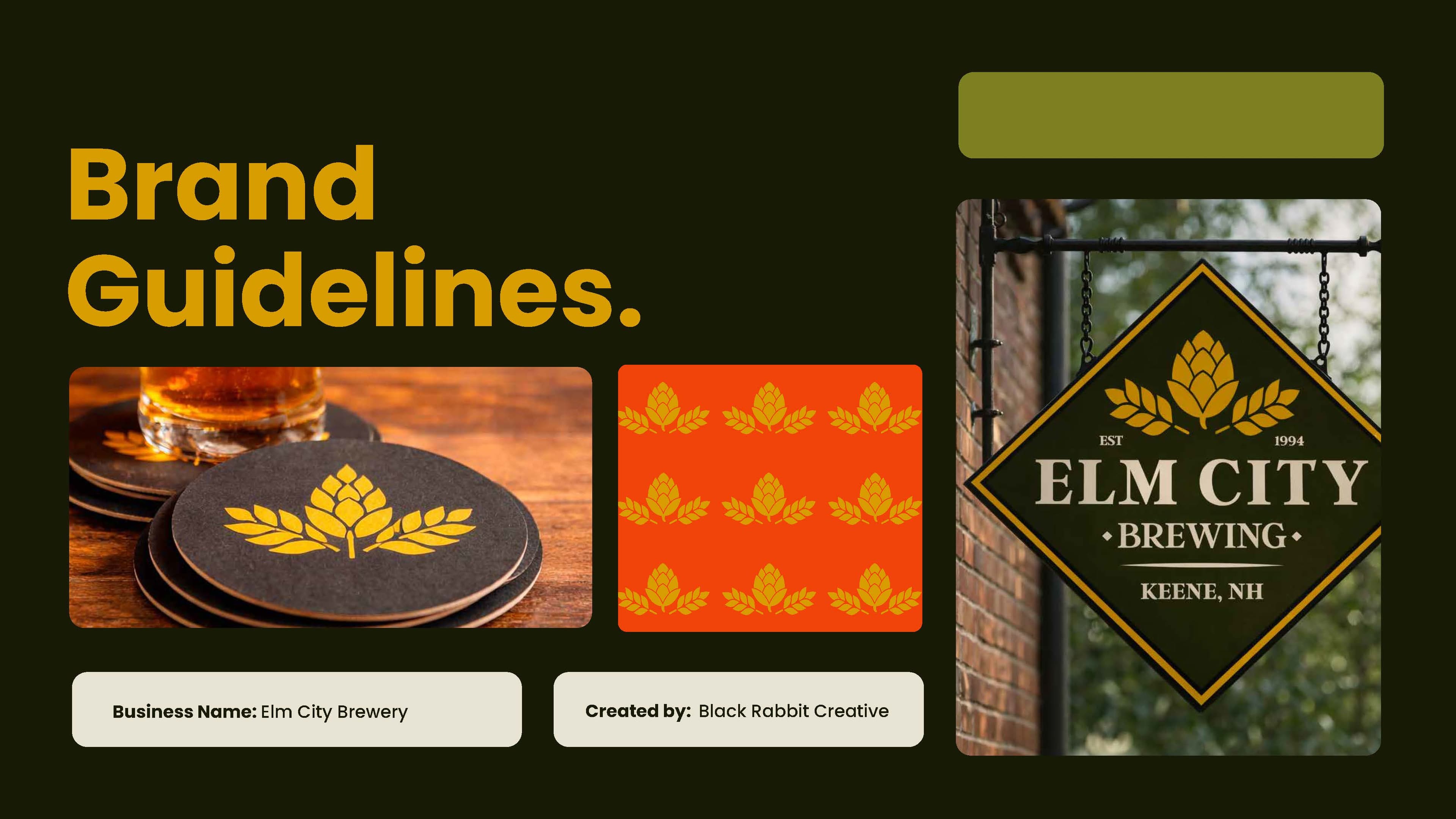
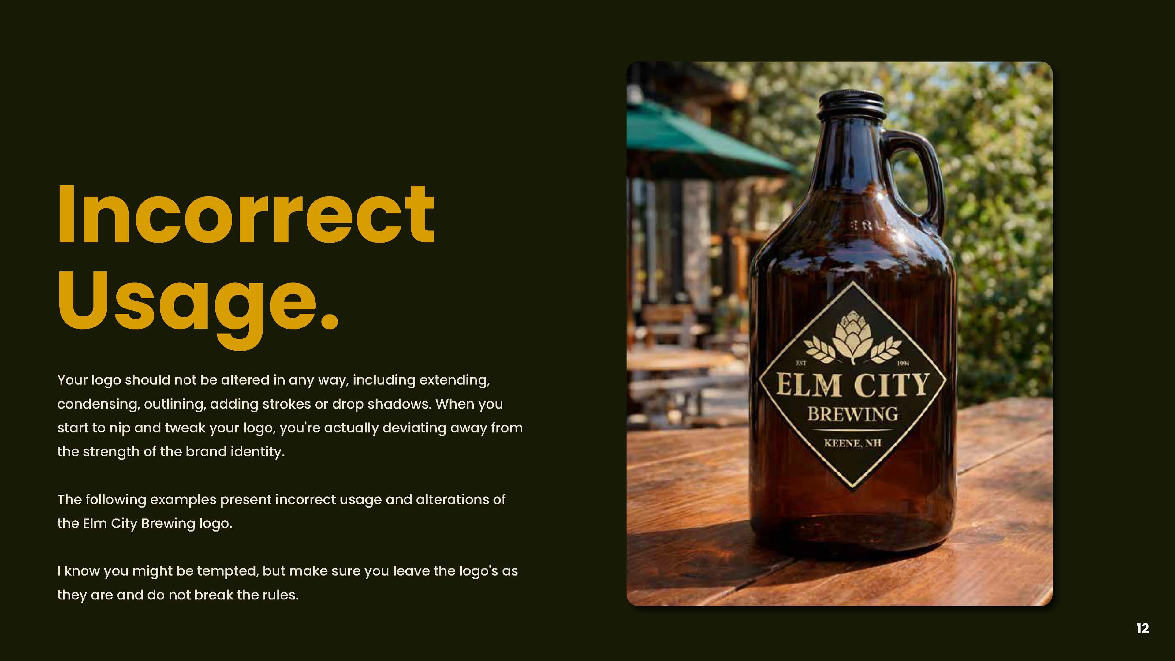
The badge shape references traditional brewery signage and historic beer labels. It also gives the brand one silhouette recognizable before any word is read — the thing a detailed mark can never have.
Simplified Emblem
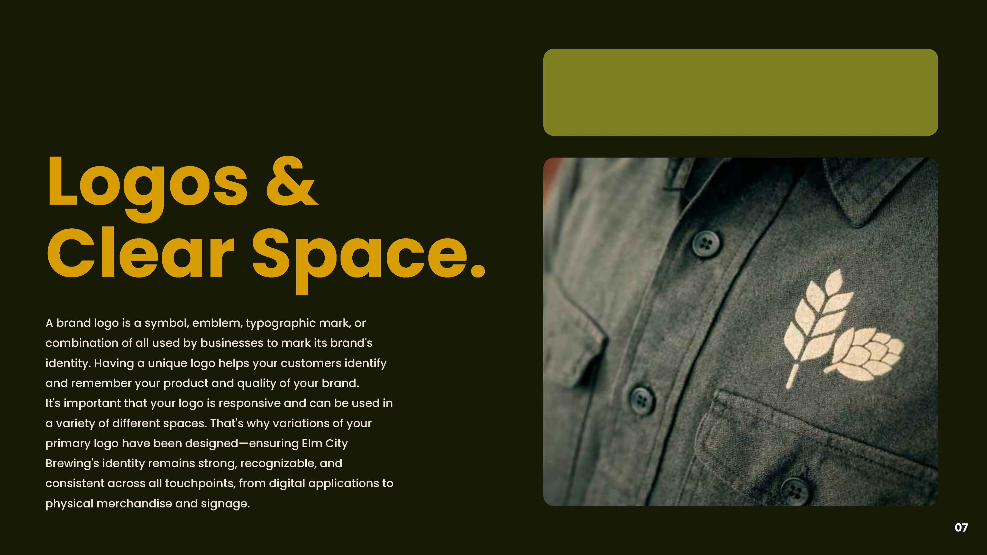
Hop and barley, streamlined to a single iconic form. Everything that could not survive being an inch wide came out: the glassware scene, the ribbon, the bevel, the second display face.
Classic Serif
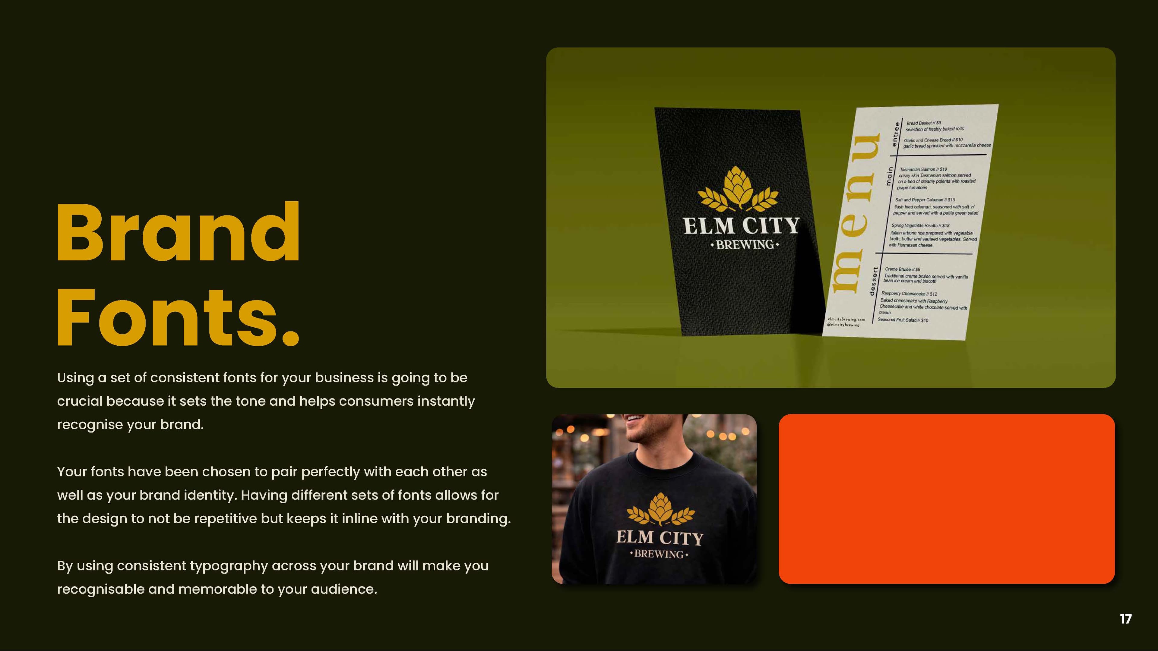
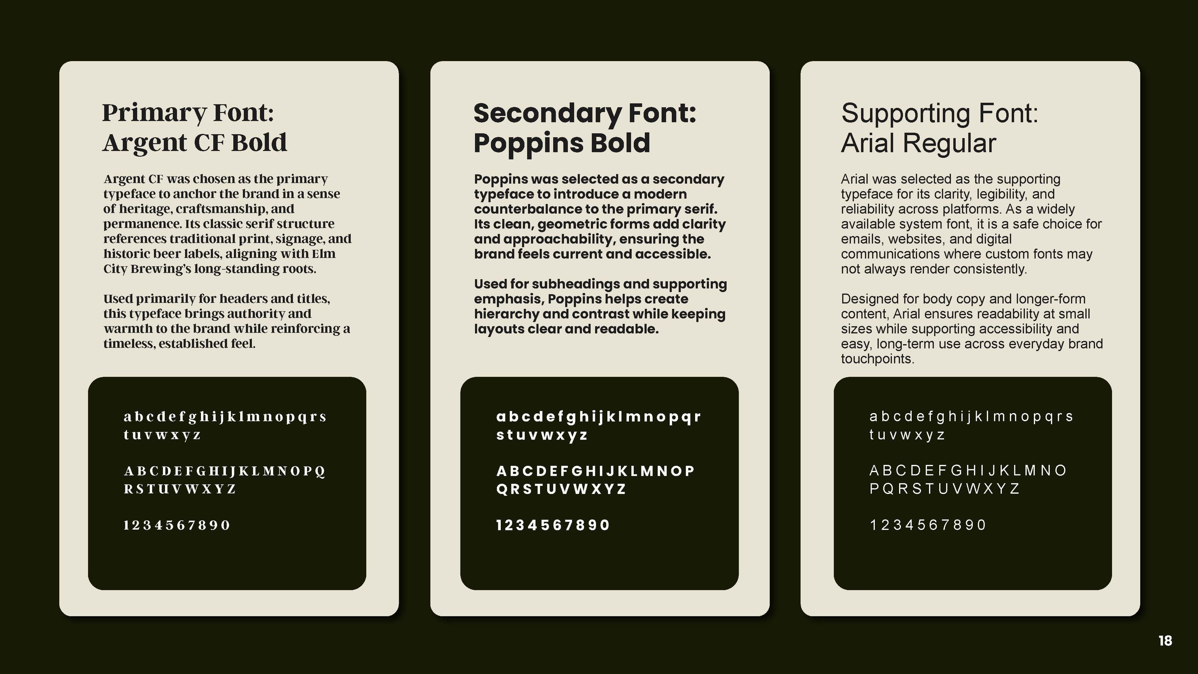
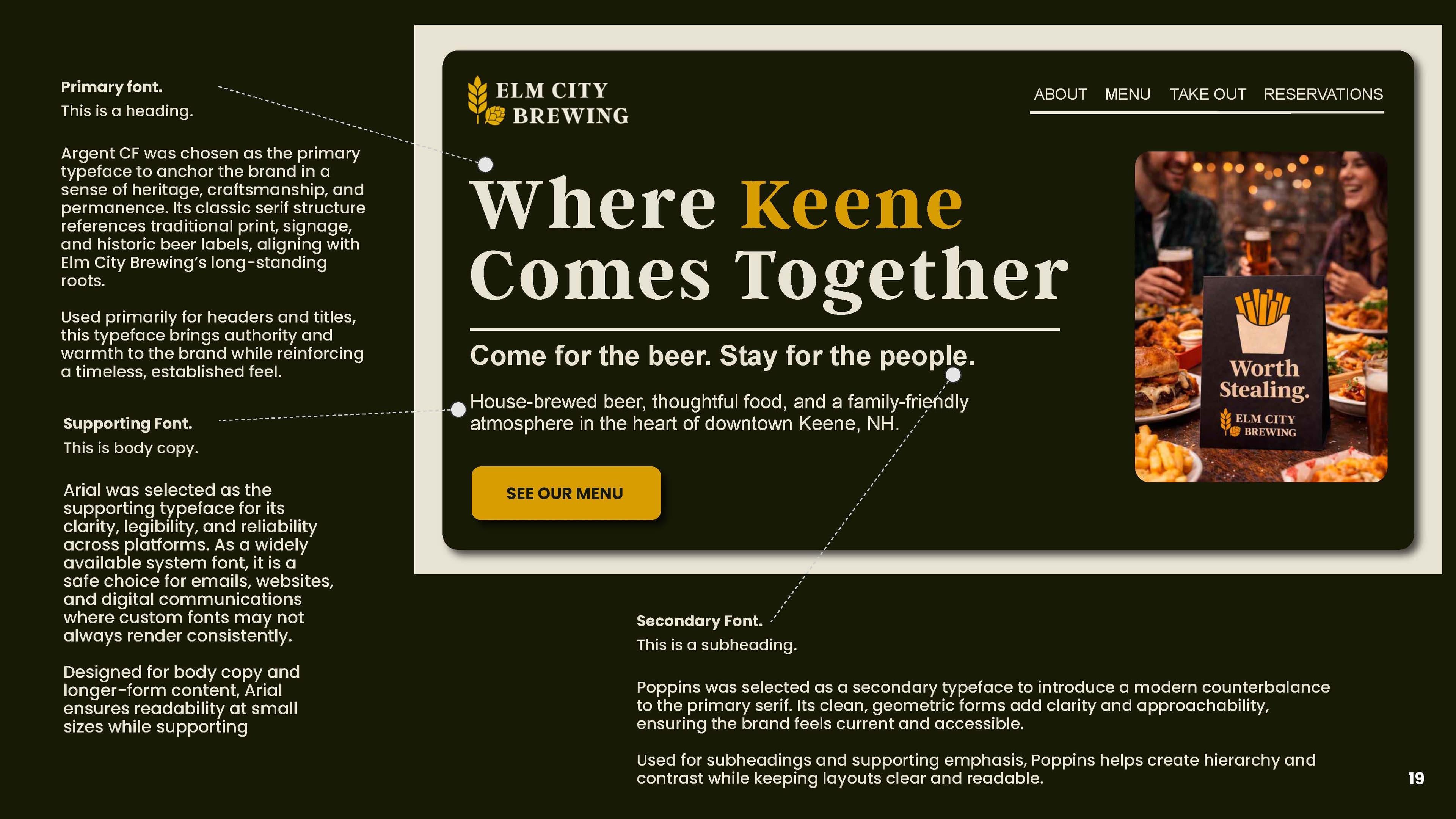
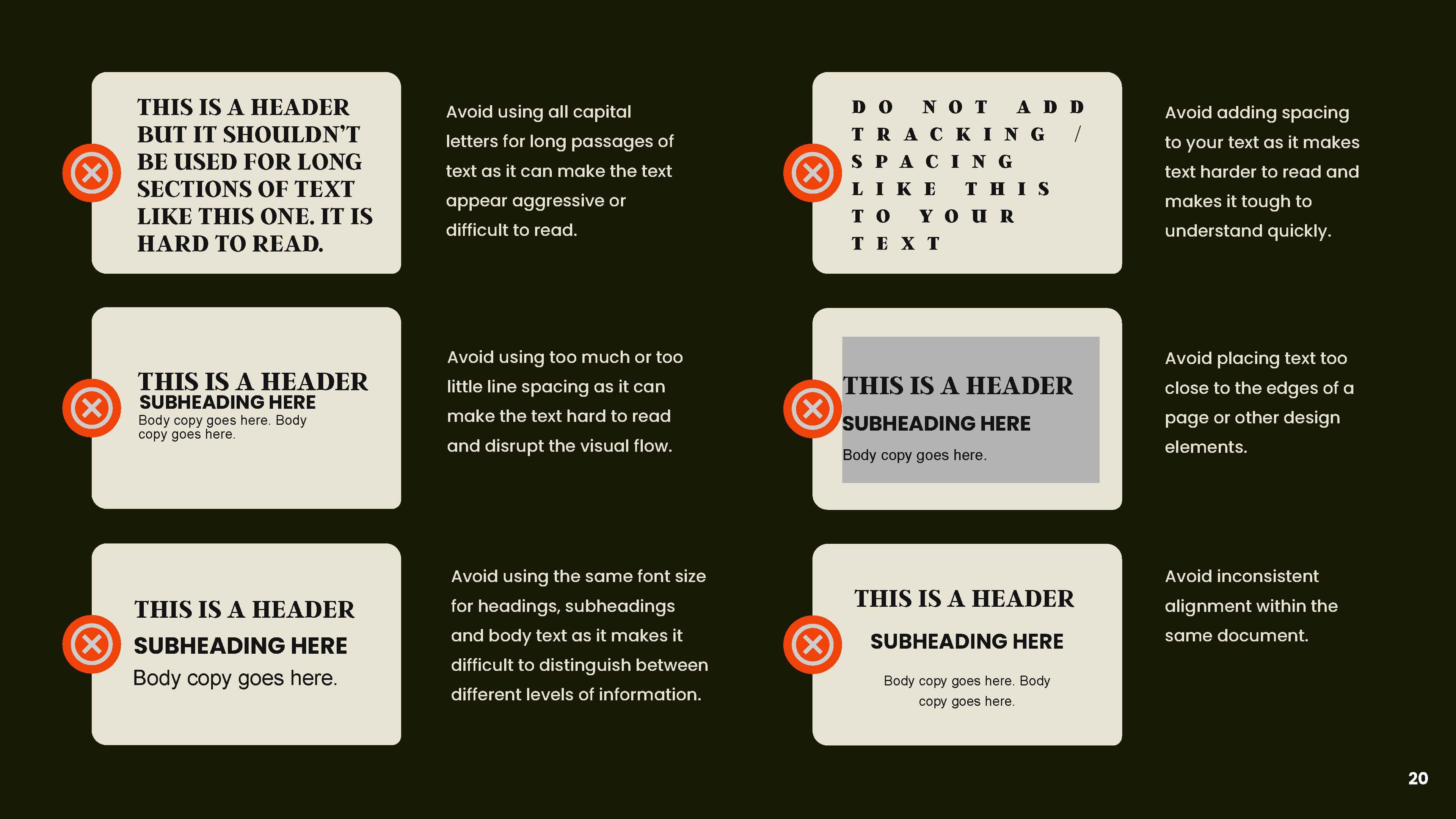
Typography carries the heritage so the illustration does not have to. Refined spacing and a real hierarchy — brand, then descriptor, then place — keep it readable at sizes the old lockup could not hold.
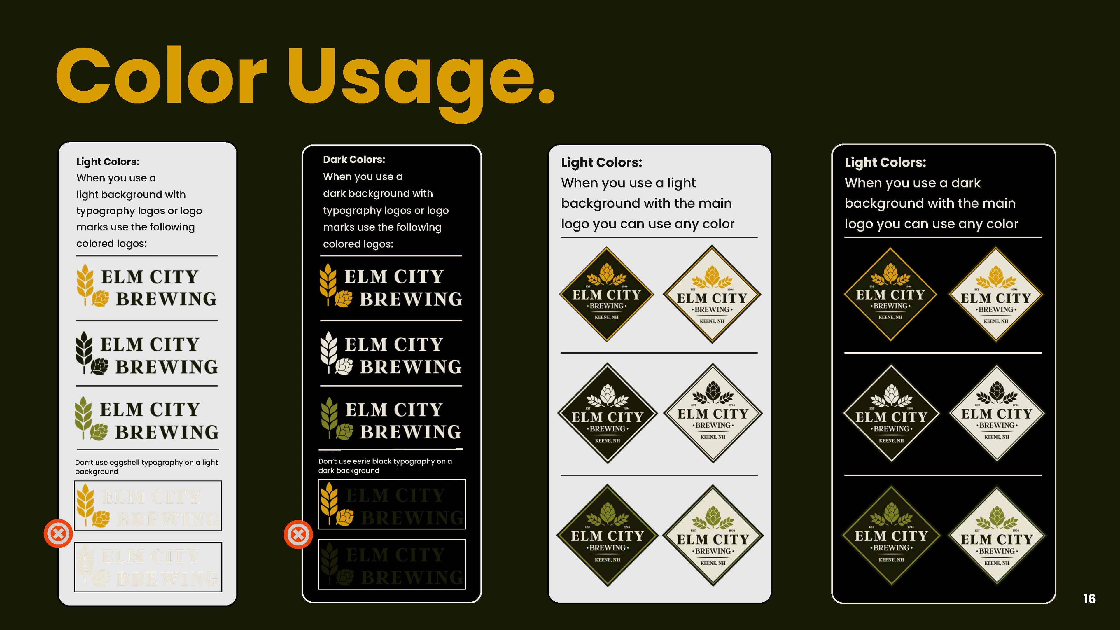
Color
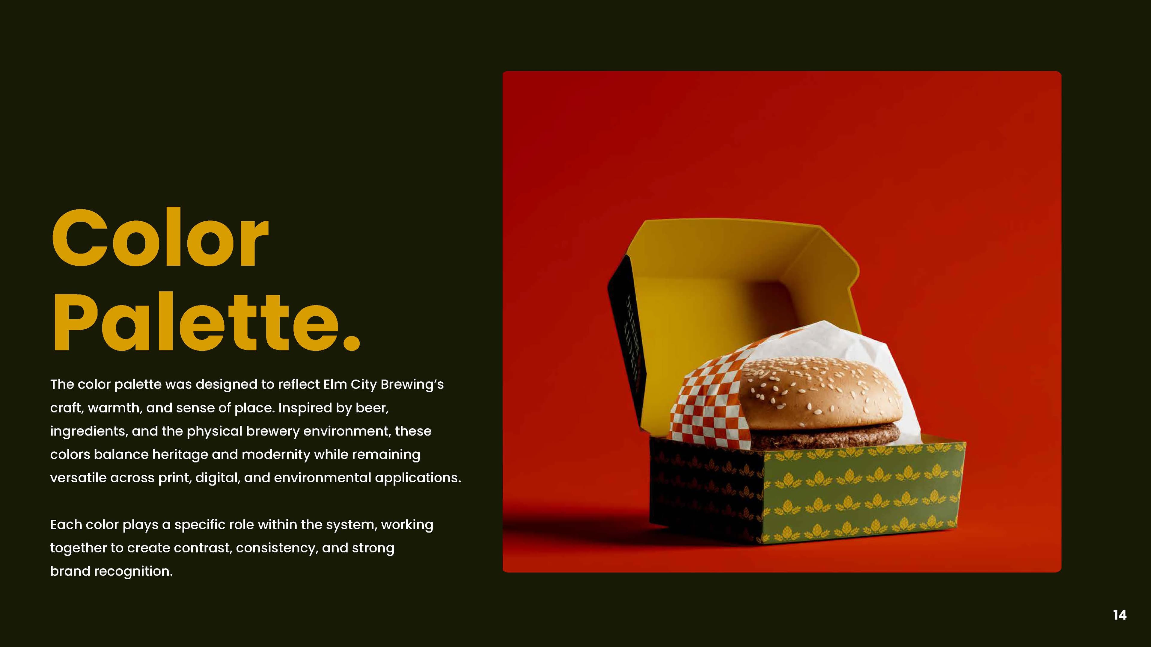
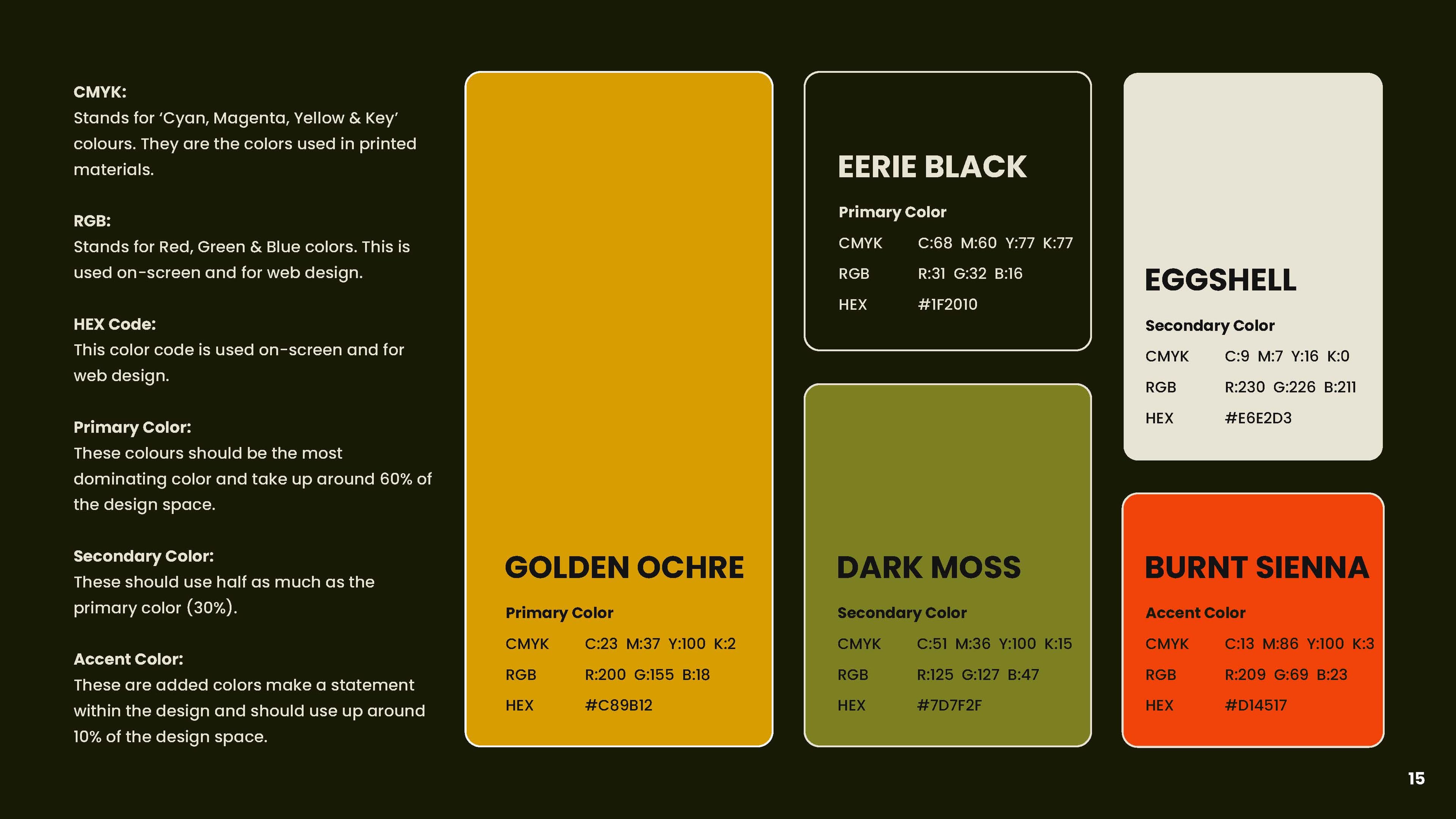
Beer, wood and brick — the palette is drawn from the room the brand lives in. Eight colours became five, and the guide states the ratio rather than leaving it to taste: ochre and black at sixty per cent, moss and eggshell at thirty, burnt sienna at ten. That number is what keeps a menu designed next year looking like the same brewery.
Primary · 60%
Golden Ochre
#C89B12
Primary
Eerie Black
#1F2010
Secondary · 30%
Dark Moss
#7D7F2F
Secondary
Eggshell
#E6E2D3
Accent · 10%
Burnt Sienna
#D14517
A trusted neighbor, not a craft-beer brand
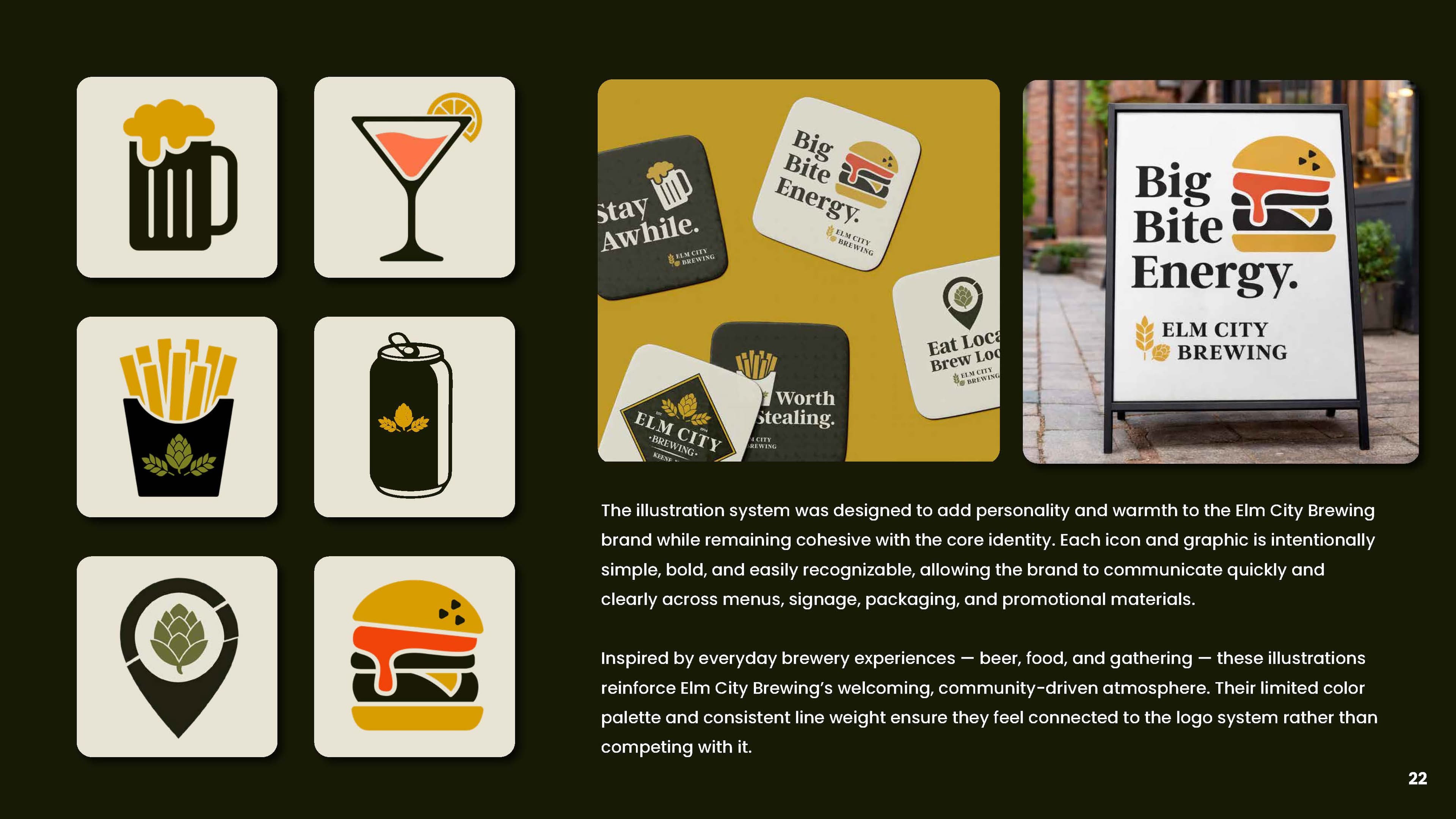
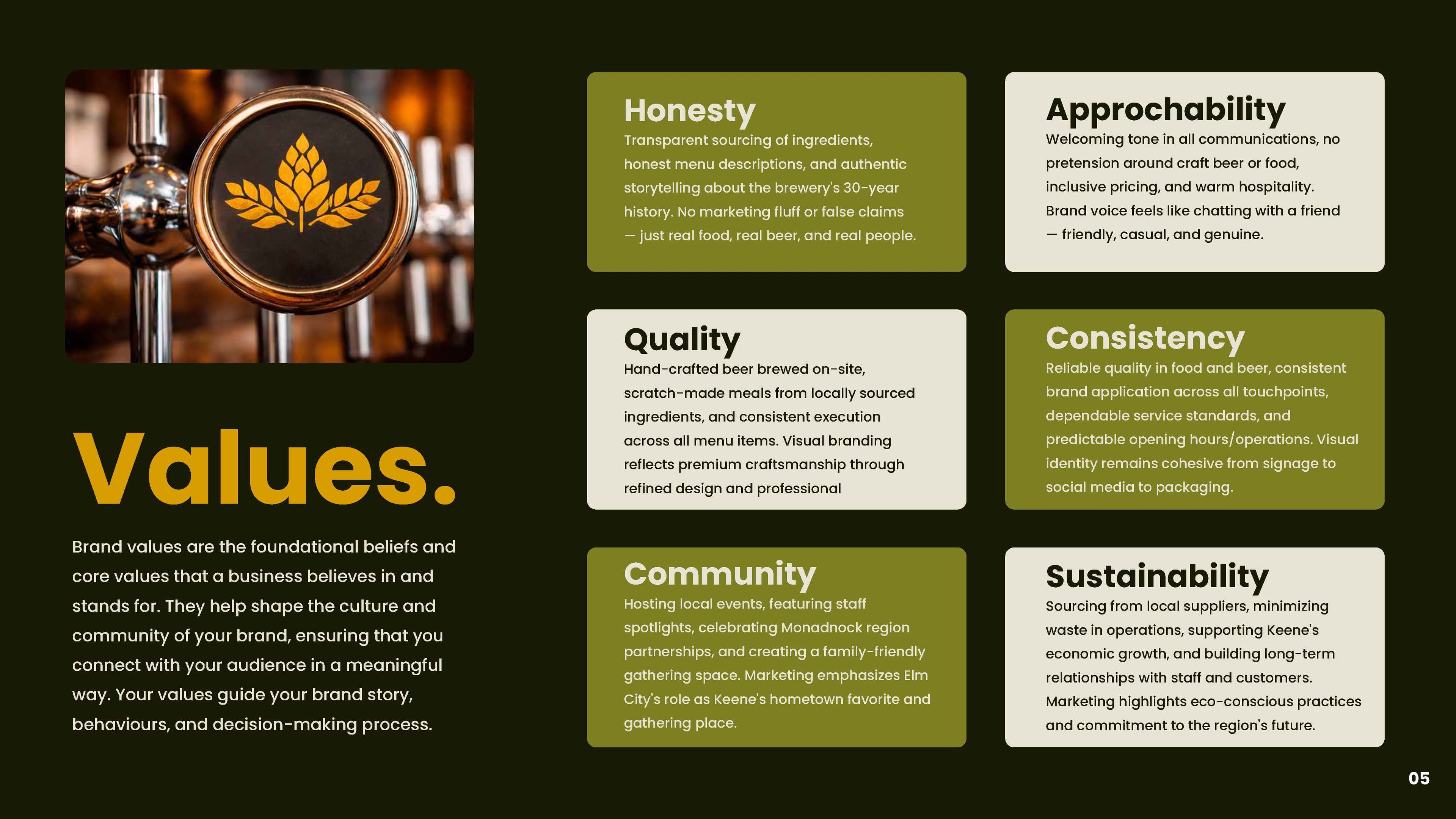
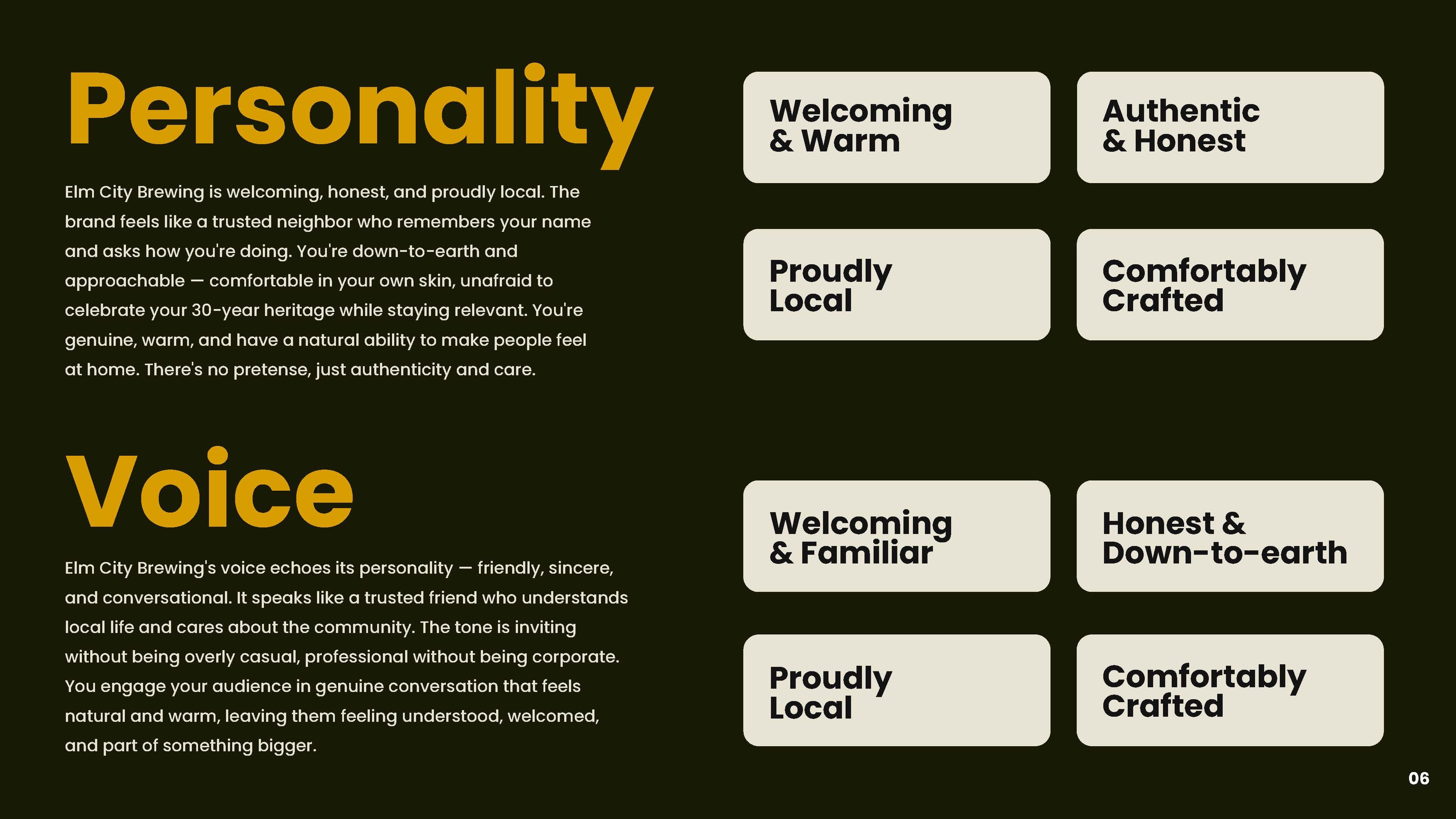
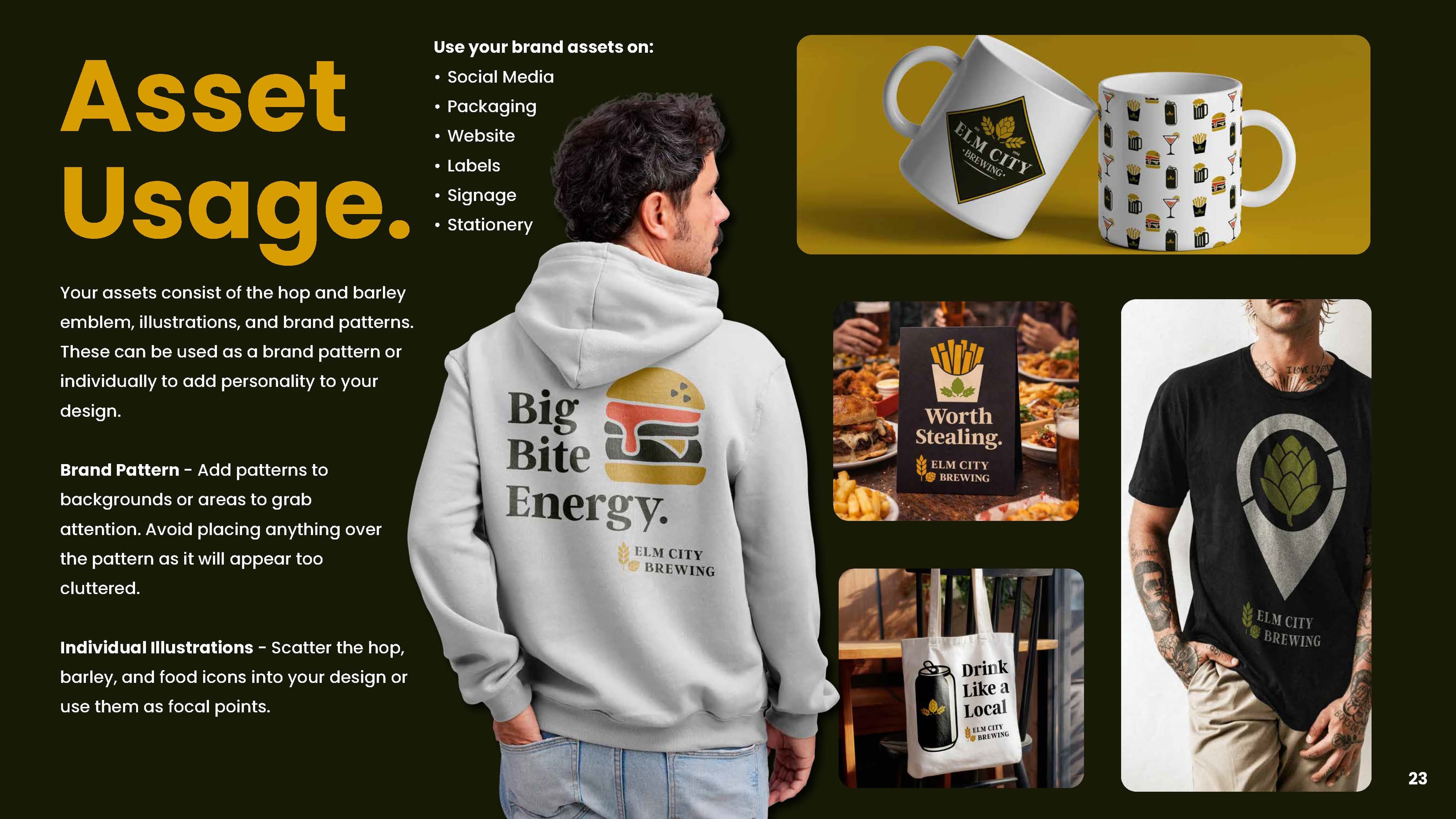
Welcoming, honest, proudly local — inviting without being casual, professional without being corporate. The guide gives the team lines they can actually use rather than adjectives they have to interpret, which is why the coasters read Stay Awhile, Big Bite Energy, Worth Stealing and Eat Local, Brew Local.
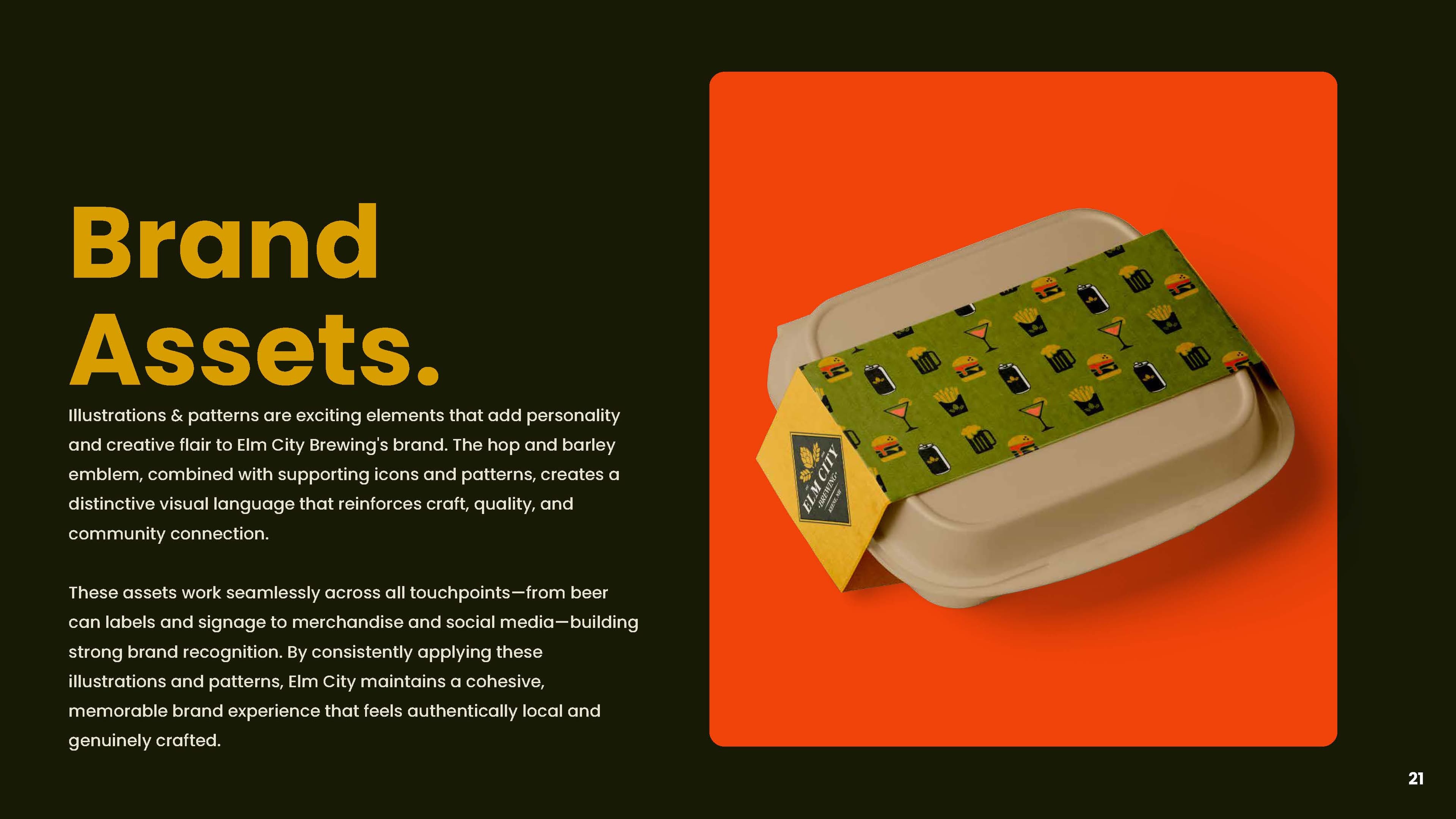
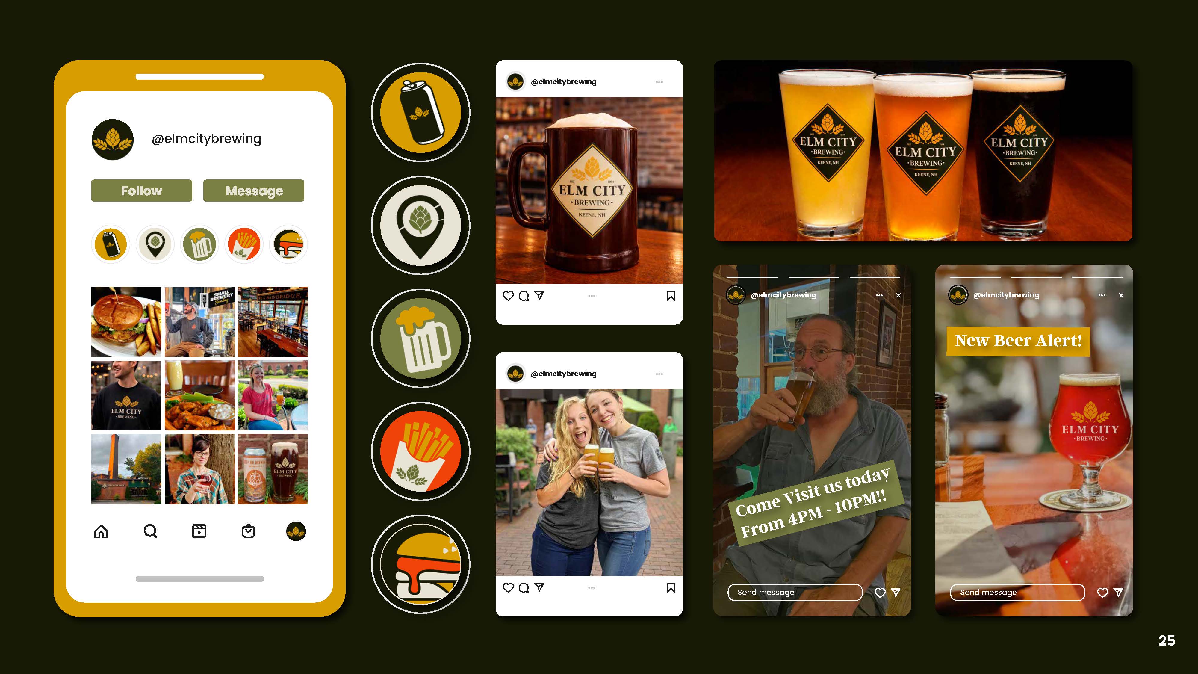
A set built from what is actually on the table — a mug, a can, fries, a burger, a cocktail, a hop in a map pin. Limited palette, consistent weight, drawn to sit beside the logo rather than compete with it, so a menu or a sandwich board can carry personality without a second brand appearing on it.
Brand
Guidelines.
01 / 31
Use the arrows to look through the guide.
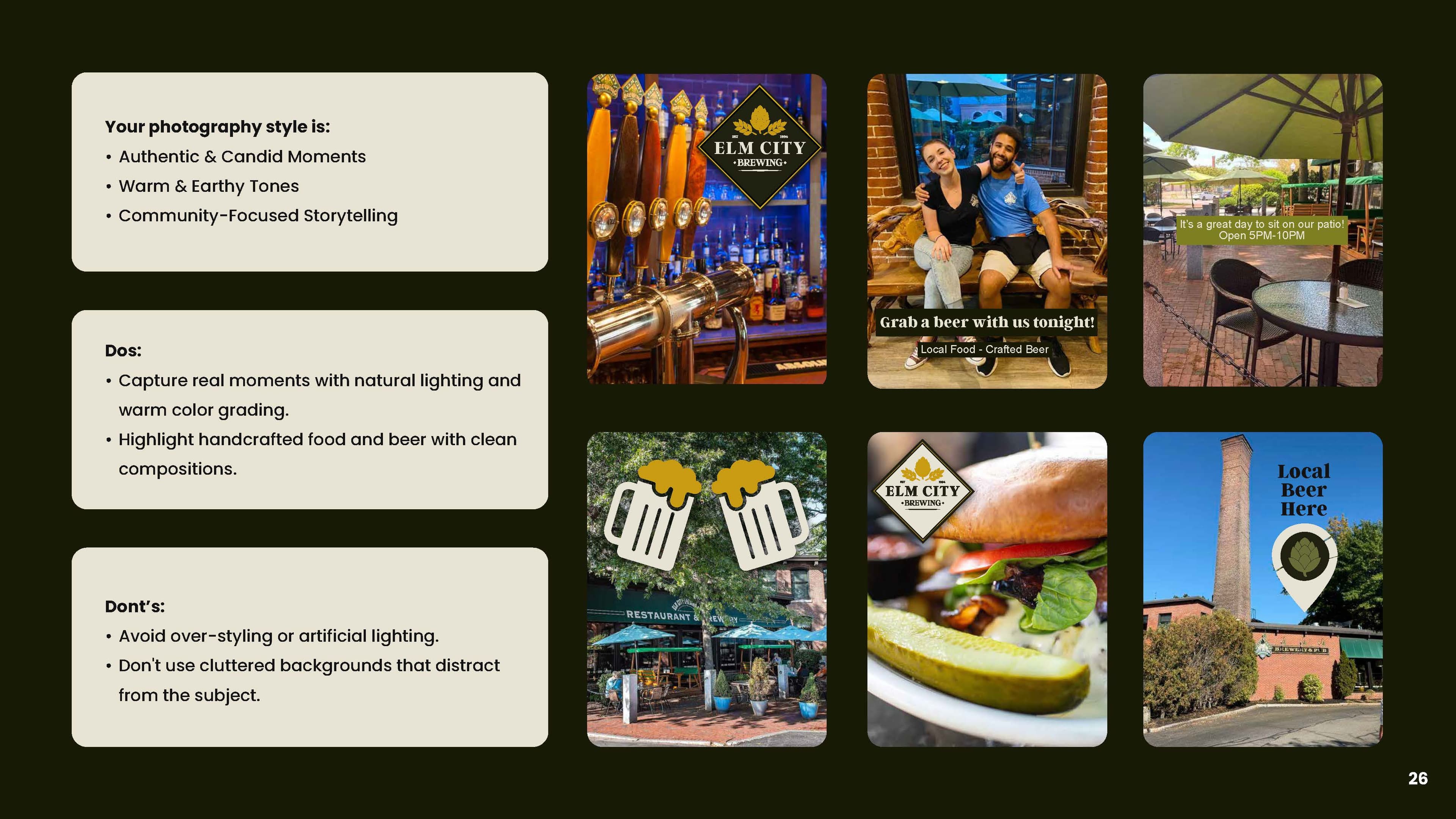
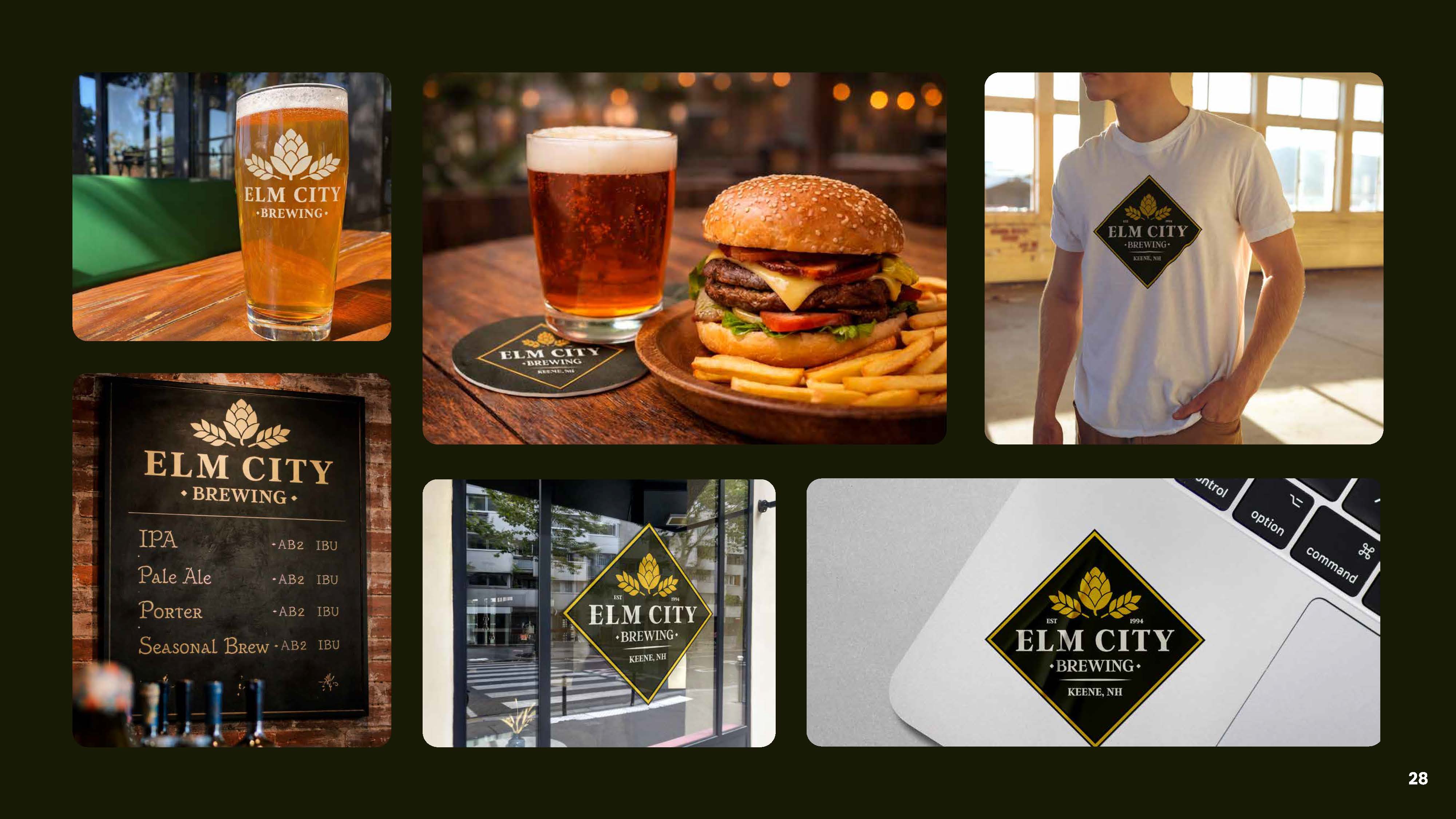
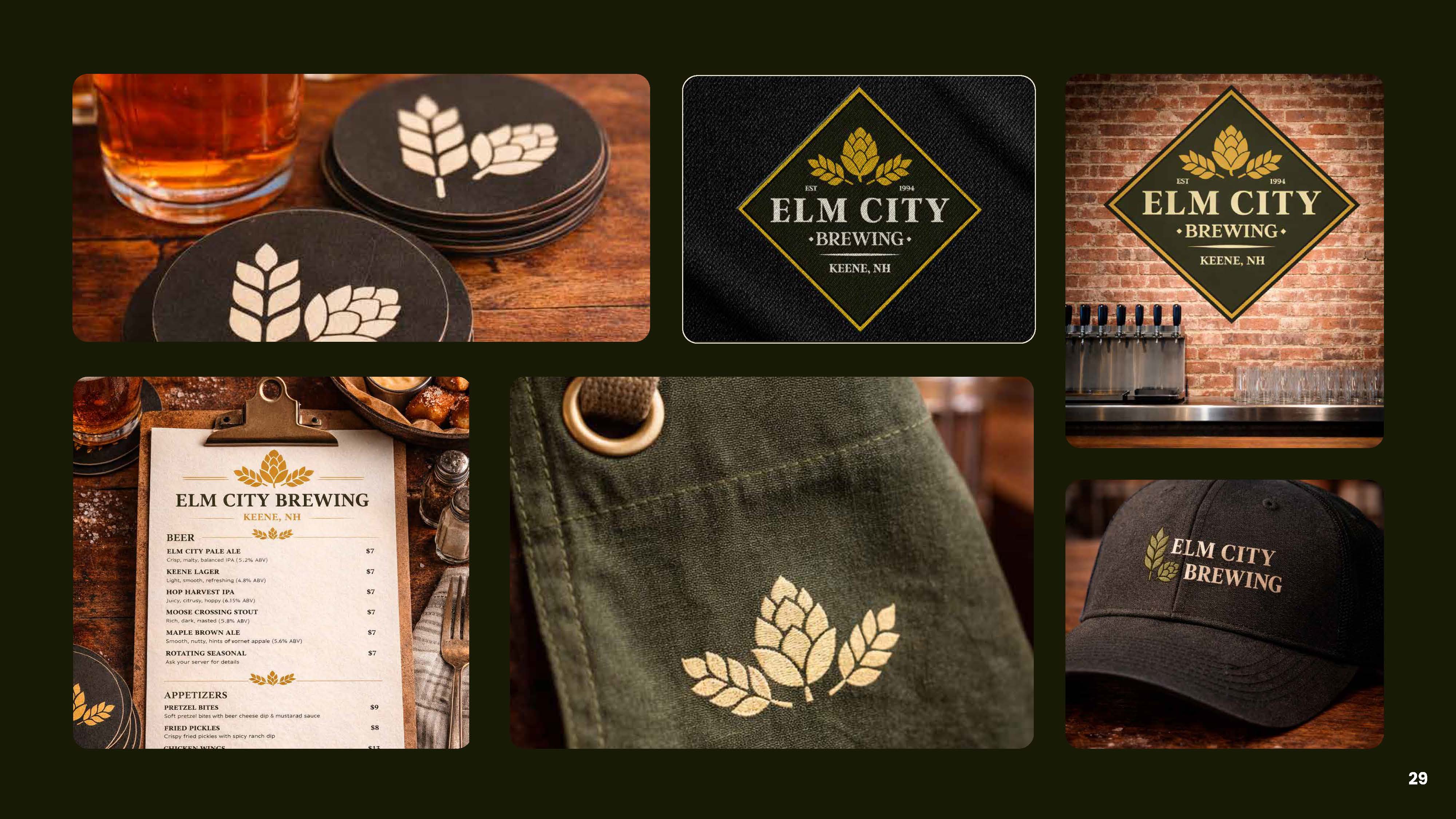
A brand only matters if it works where people actually see it. Here's how Elm City shows up — from behind the bar to out in the world.
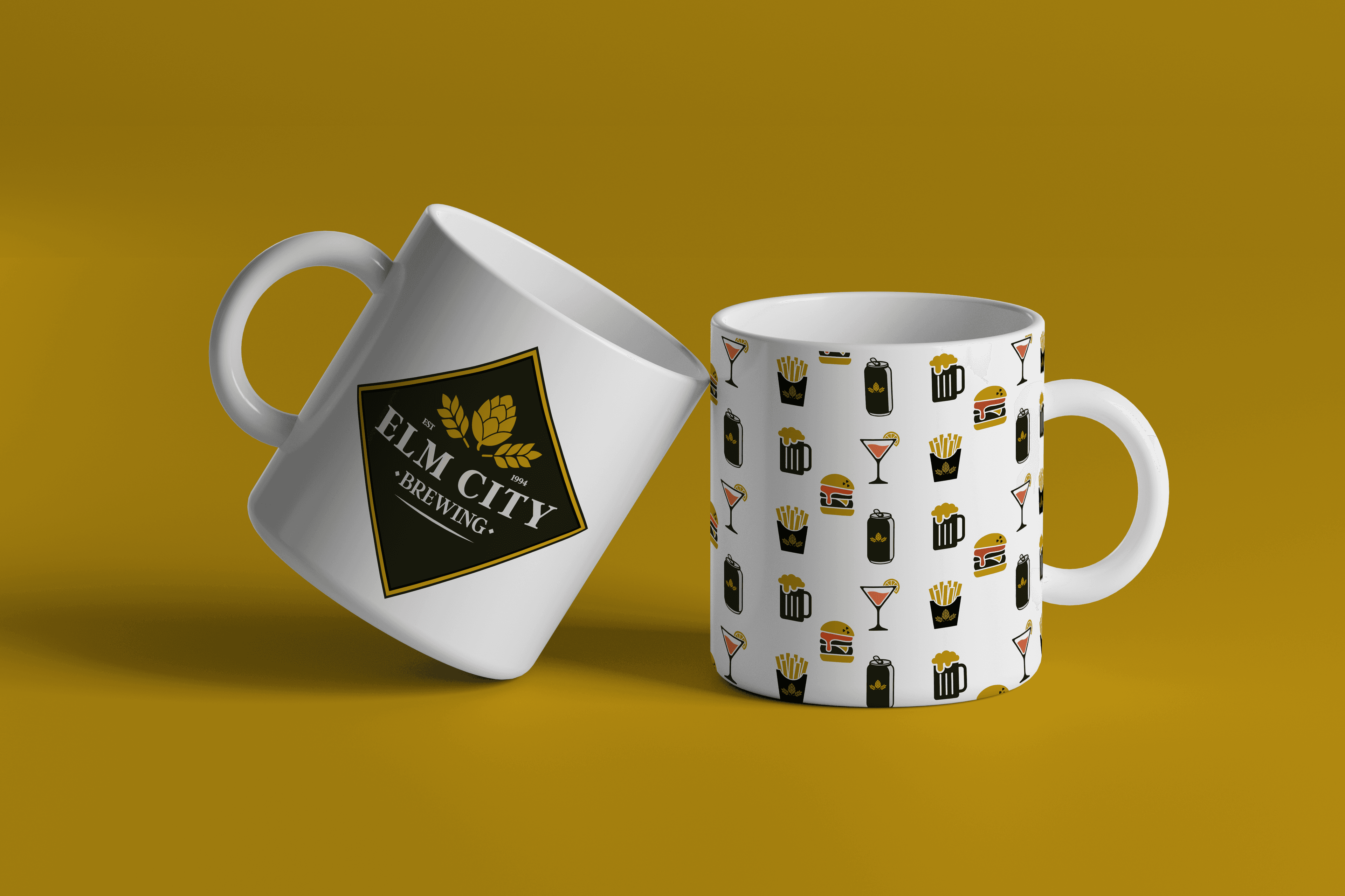
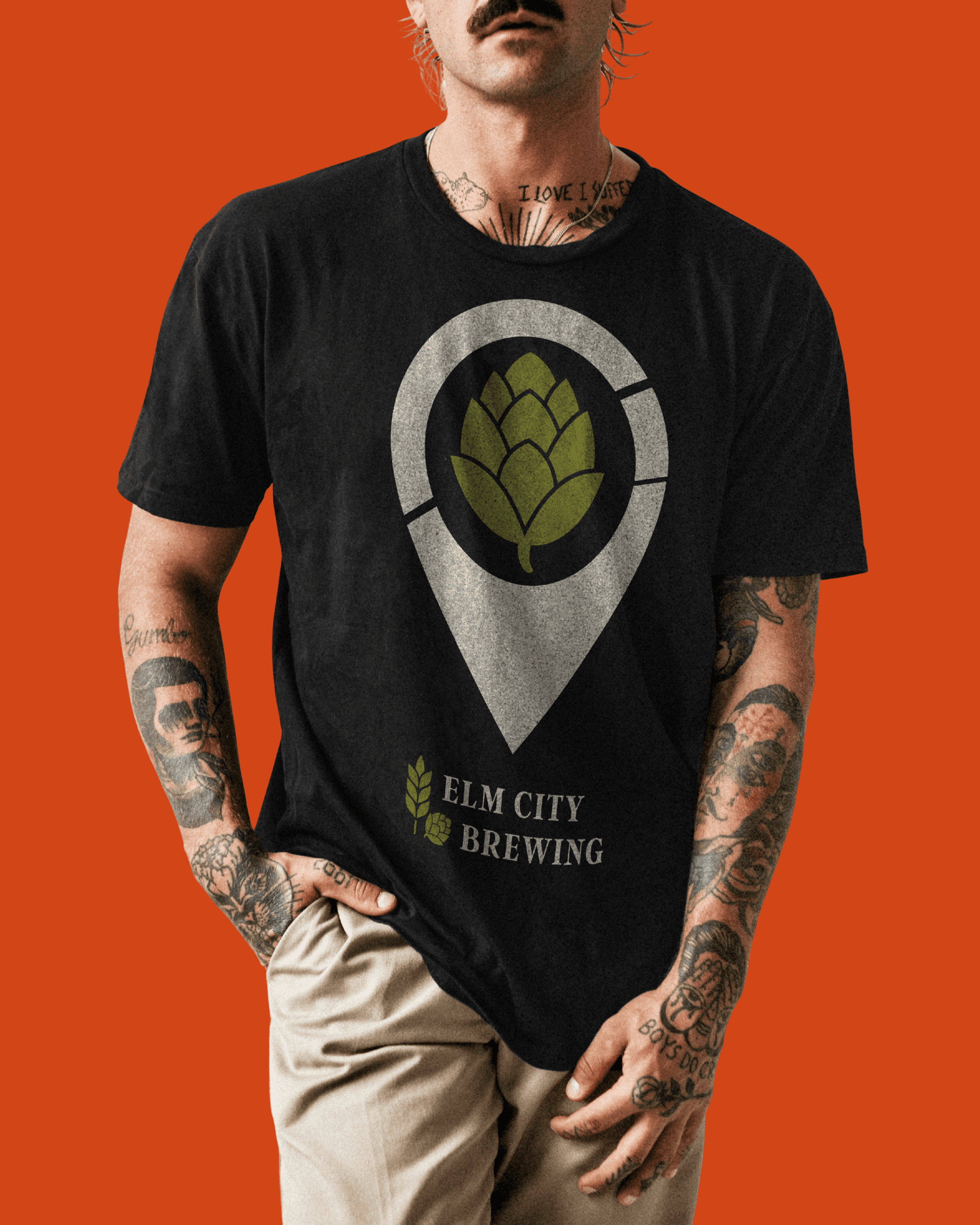

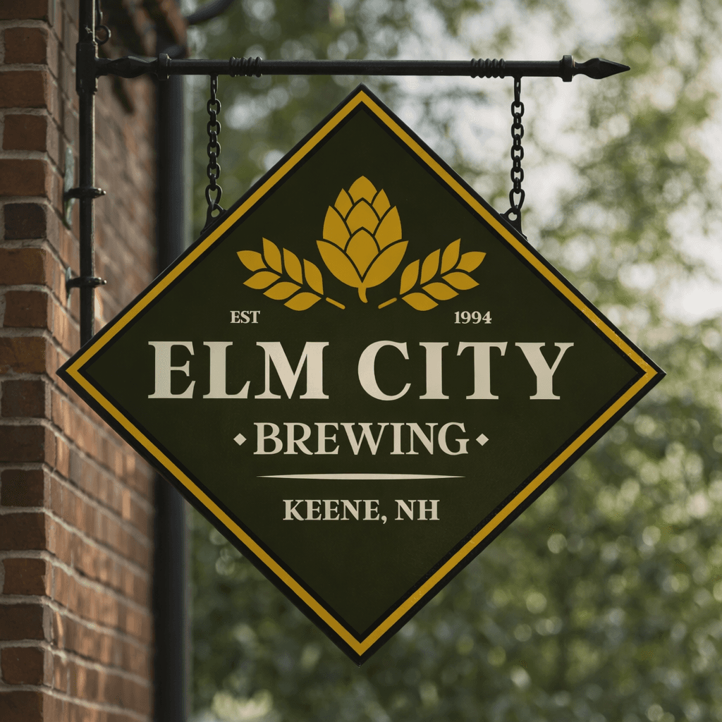
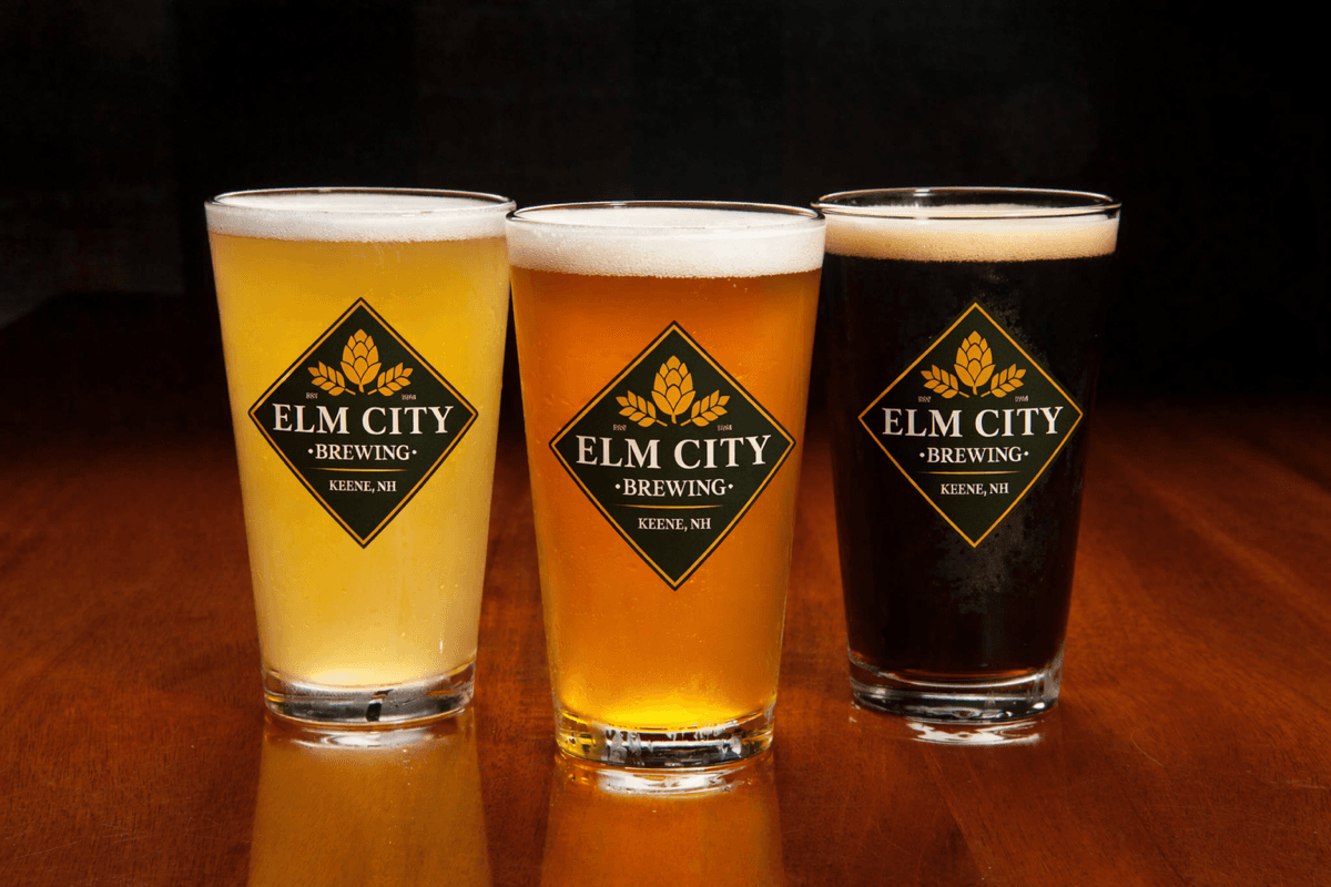
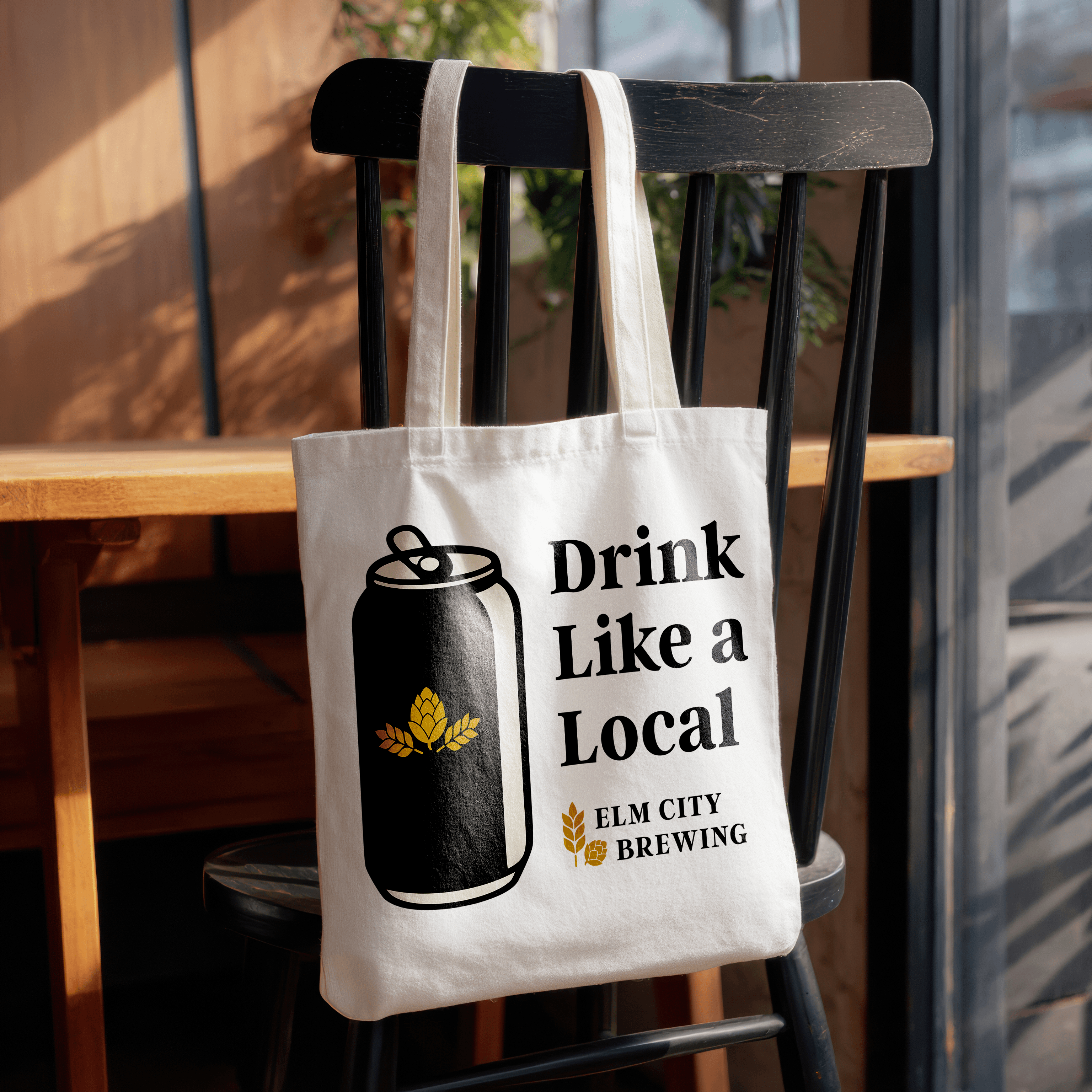
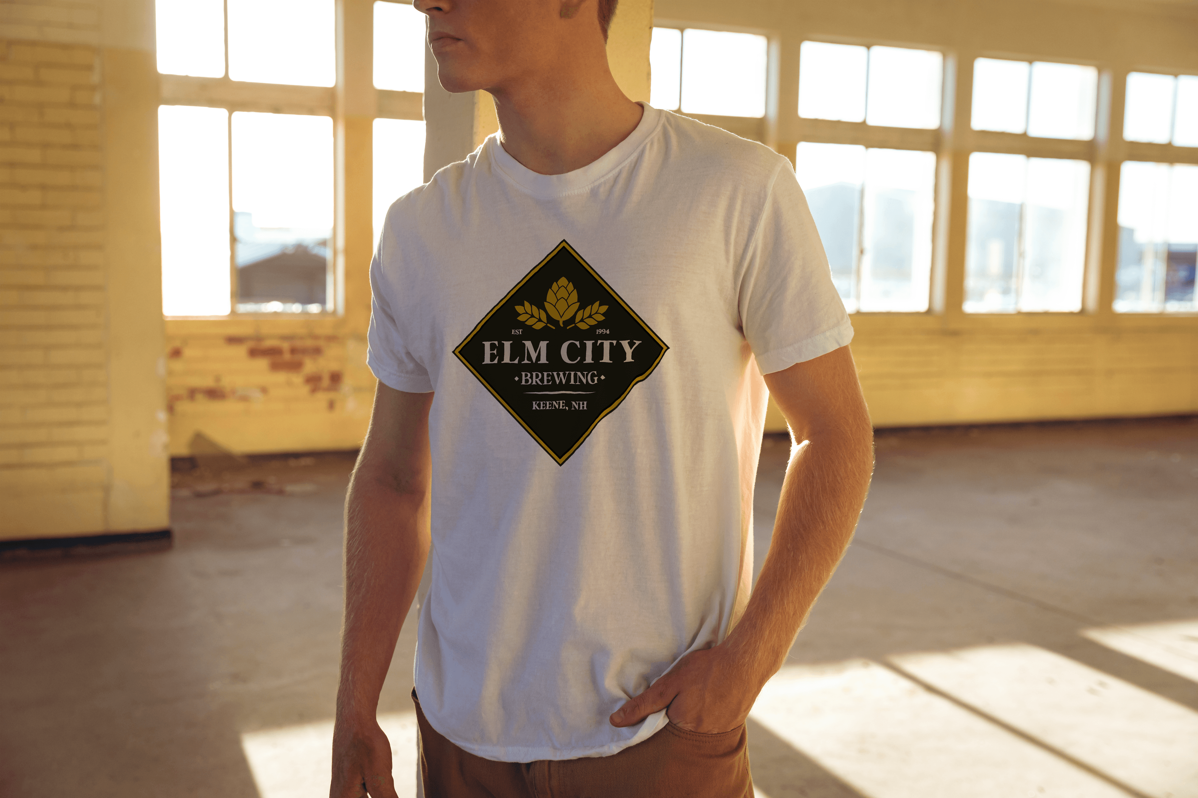
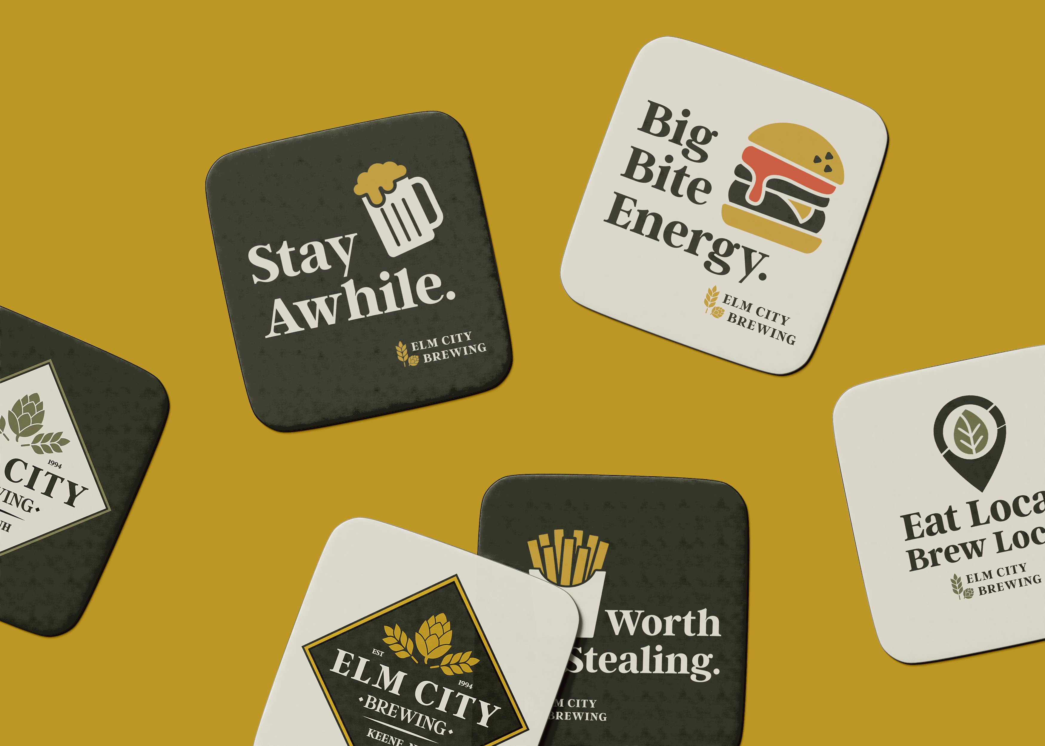
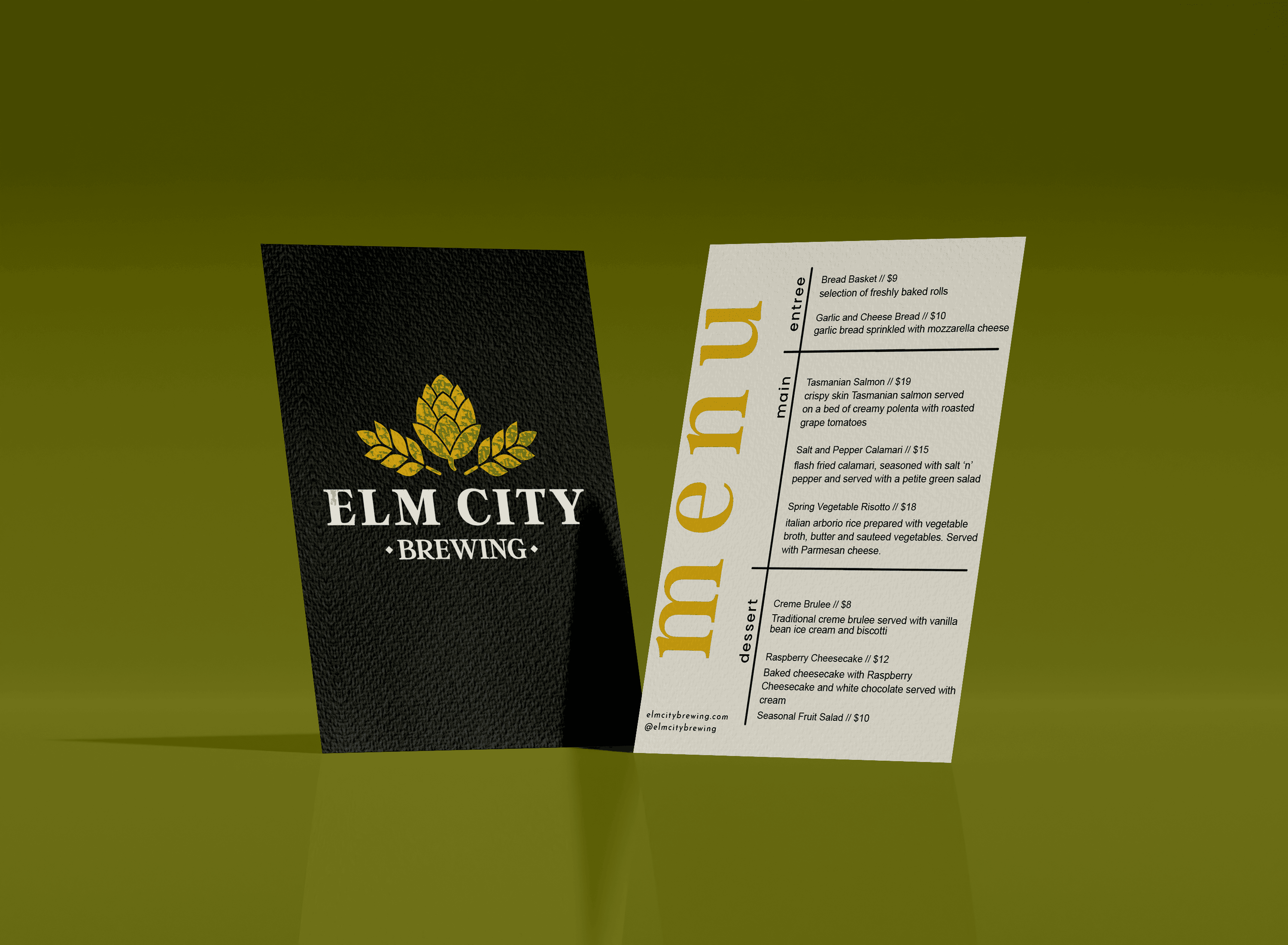
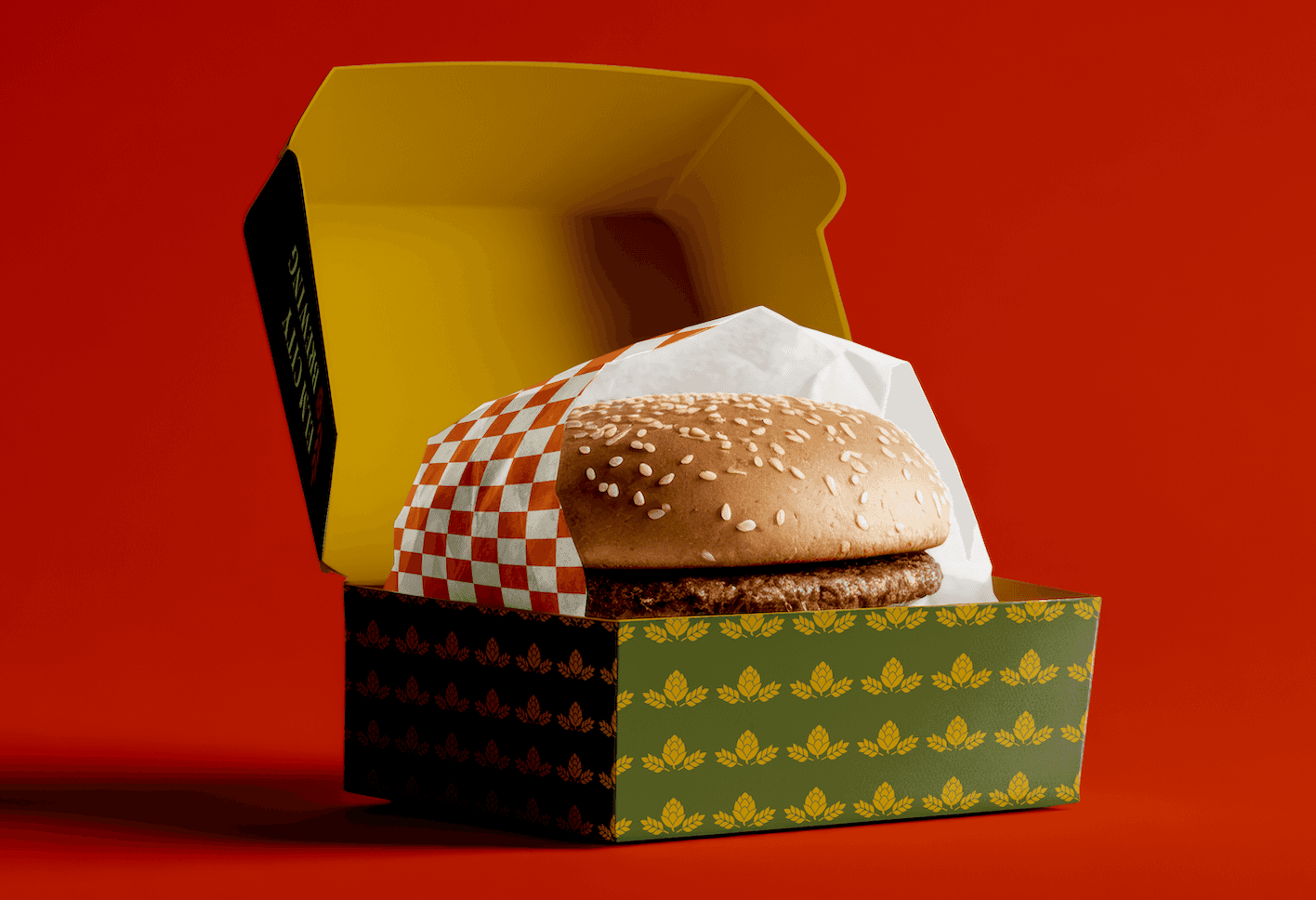
From the bar top to the street — the brand shows up everywhere it matters.
The same brewery, finally legible
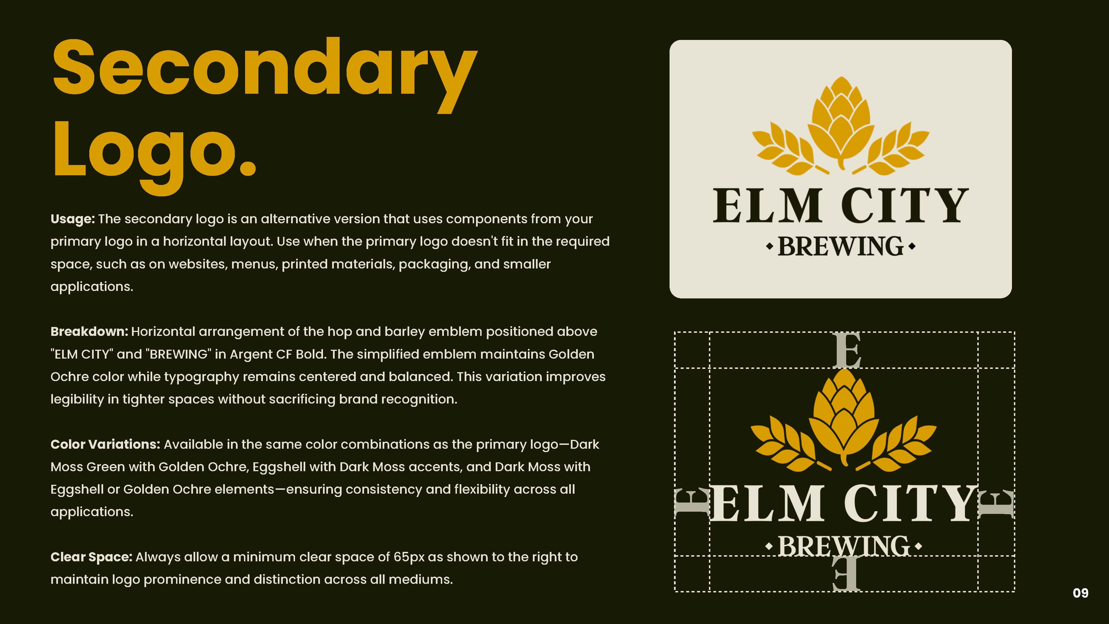
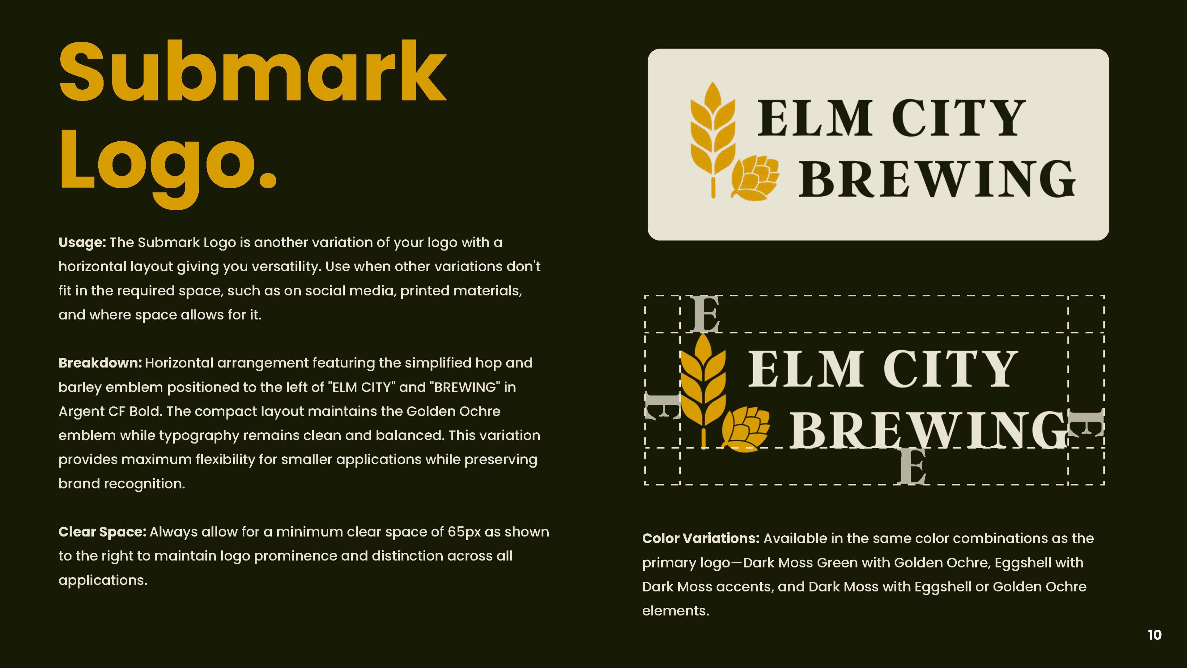
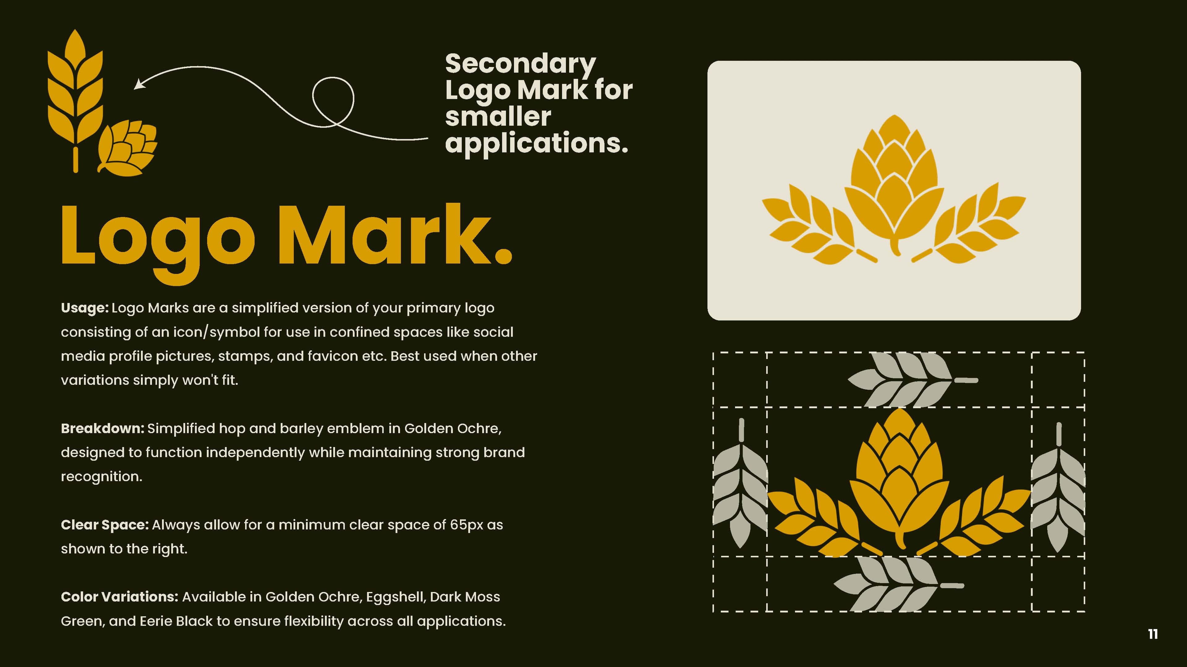
Nobody walking into the Colony Mill should feel their local was replaced, and nobody does. The date, the diamond and the hop-and-barley all survived; what changed is that they now work at every size on every surface the brewery uses. Elm City has a complete system — four marks, a stated color ratio, a typographic hierarchy, an illustration set, social and photography direction, and thirty-one pages written so the team can apply all of it without calling me.
Delivered as a Comprehensive Branding package.
Equity Kept
The date, the diamond and the hop-and-barley all carry forward. Regulars recognize it; it simply works now.
One Mark, Every Surface
From a street sign to a favicon to an embroidered hat, without a redraw or an apology.
A Team That Can Self-Serve
Thirty-one pages written for a bartender and a print vendor, not for a design department.
Room To Grow
An illustration set and a stated color ratio mean new menus, new merch and new releases stay on brand.
Questions
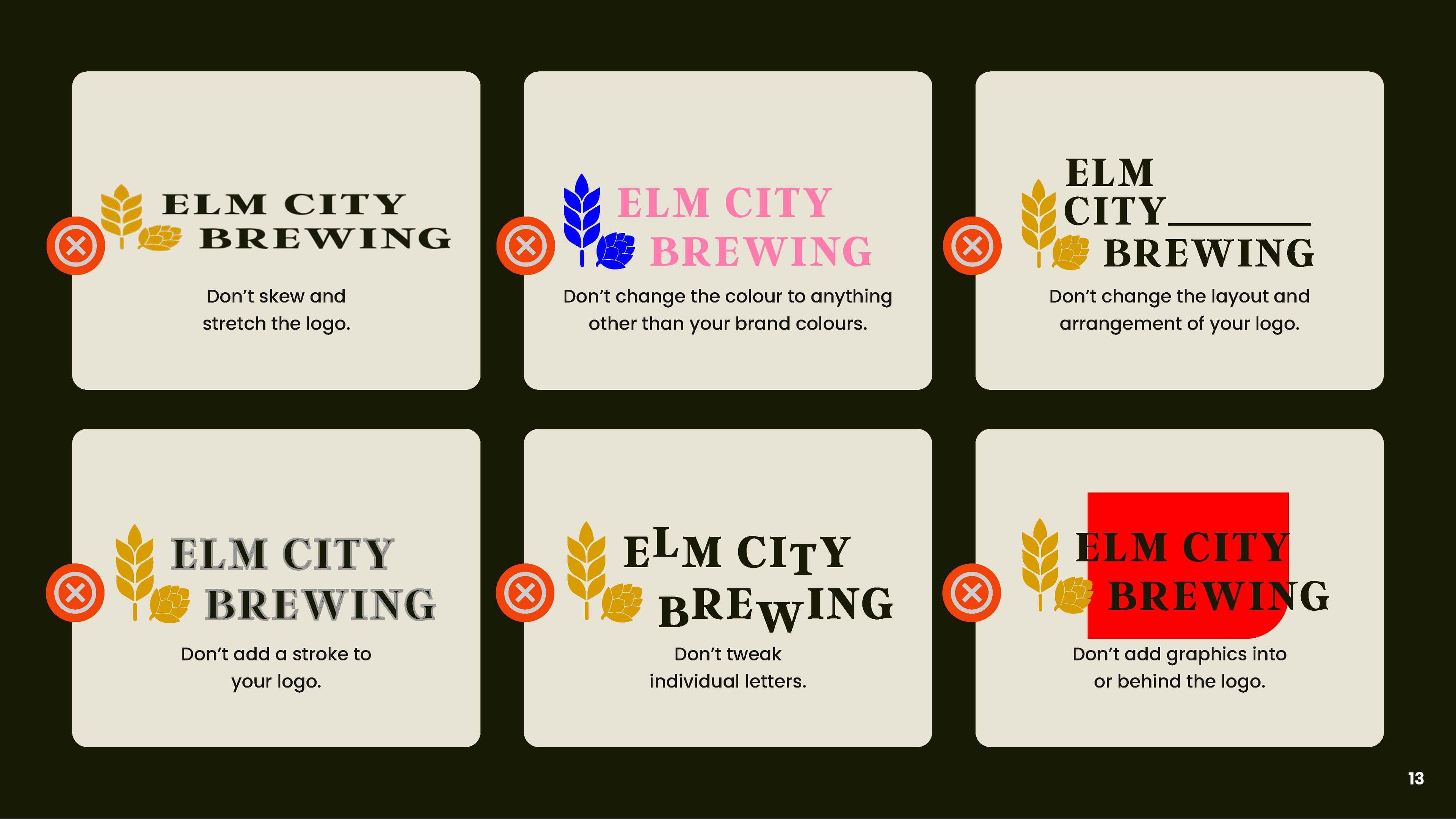
For Elm City Brewing it was a logo system of four marks with usage and clear-space rules, a five-color palette with print and screen values and a stated 60/30/10 ratio, a typographic hierarchy with correct and incorrect examples, an illustration set built from everyday brewery objects, social and photography direction, and a 31-page brand guide written for the people who use it — a bartender, a merch vendor, a sign shop. The deliverable is not a logo. It is everything a team needs to apply the brand without calling the designer.
Refine, when there is real equity to keep. Elm City had been in Keene since 1994 and people already recognized it; the problem was not the idea, it was that the execution had grown ornate and inconsistent and no longer worked at small sizes. Throwing that away would have cost thirty years of recognition to solve a craft problem. The founding date, the diamond format and the hop-and-barley emblem all carried forward. What changed was the detail, the hierarchy and the palette.
Because a logo has to survive everywhere it is used, not just in the file it was drawn in. The previous mark carried a beveled banner, a scene of glassware, two display faces and eight colors — legible on a sign, mud at an inch wide on a coaster, and unprintable in one color on a shirt. Streamlining the emblem to hop and barley gave one recognizable silhouette that holds from a street sign down to a favicon and still embroiders cleanly.
Elm City was a Comprehensive Branding package, which runs twelve weeks across four stages: research, strategy and direction; design production; brand presentation; then guidelines and delivery. A single beer label is much shorter, usually one to three weeks. Both are quoted per project.
The range of surfaces. A brewery mark has to work on a tap handle, a can, an embroidered hat, a chalkboard, a street sign, a coaster and an Instagram avatar, often in one color and often very small. That constraint rules out the detail most logos can afford, and it is why the work is closer to sign painting than to screen design.