Sequoia Sex Toys
Brand Identity & Packaging System
Project Type
Master of Fine Arts Thesis
Focus
Brand Identity, Packaging, Illustration & E-Commerce
Industry
Adult Wellness / Consumer Products
Concept
Sequoia Sex Toys
Rooted in pleasure.
This project was developed as my Master of Fine Arts thesis in Media Design, exploring how thoughtful branding can reshape the visual language of the adult wellness industry.
Adult product brands typically fall into two visual extremes: sterile, clinical aesthetics or overtly explicit imagery. This thesis explored a third direction — a brand identity that celebrates craftsmanship, humor, nature, and body positivity while maintaining a refined retail presence.
The concept brand, Sequoia Sex Toys, is imagined as a socially conscious wooden toy company rooted in sustainable materials, artisan production, and open conversations around pleasure and intimacy. The final outcome is a complete brand ecosystem designed to function across retail packaging, digital commerce, and lifestyle merchandise.
Finding the middle ground.
The thesis began with research into how branding shapes consumer perception in industries historically associated with stigma or discomfort. Key observations included:
- Many adult brands rely on clinical minimalism, which can feel cold or impersonal.
- Others lean into shock value and explicit visuals, limiting mainstream appeal.
- Few brands balance playfulness, sophistication, and warmth.
Sequoia was designed to occupy this middle ground. The brand positioning is built around three principles:
Nature
Grounding the brand in natural materials and botanical symbolism.
Craft
Highlighting the handmade quality of wooden products.
Play
Embracing humor and storytelling to normalize conversations about pleasure.
The jackalope identity.
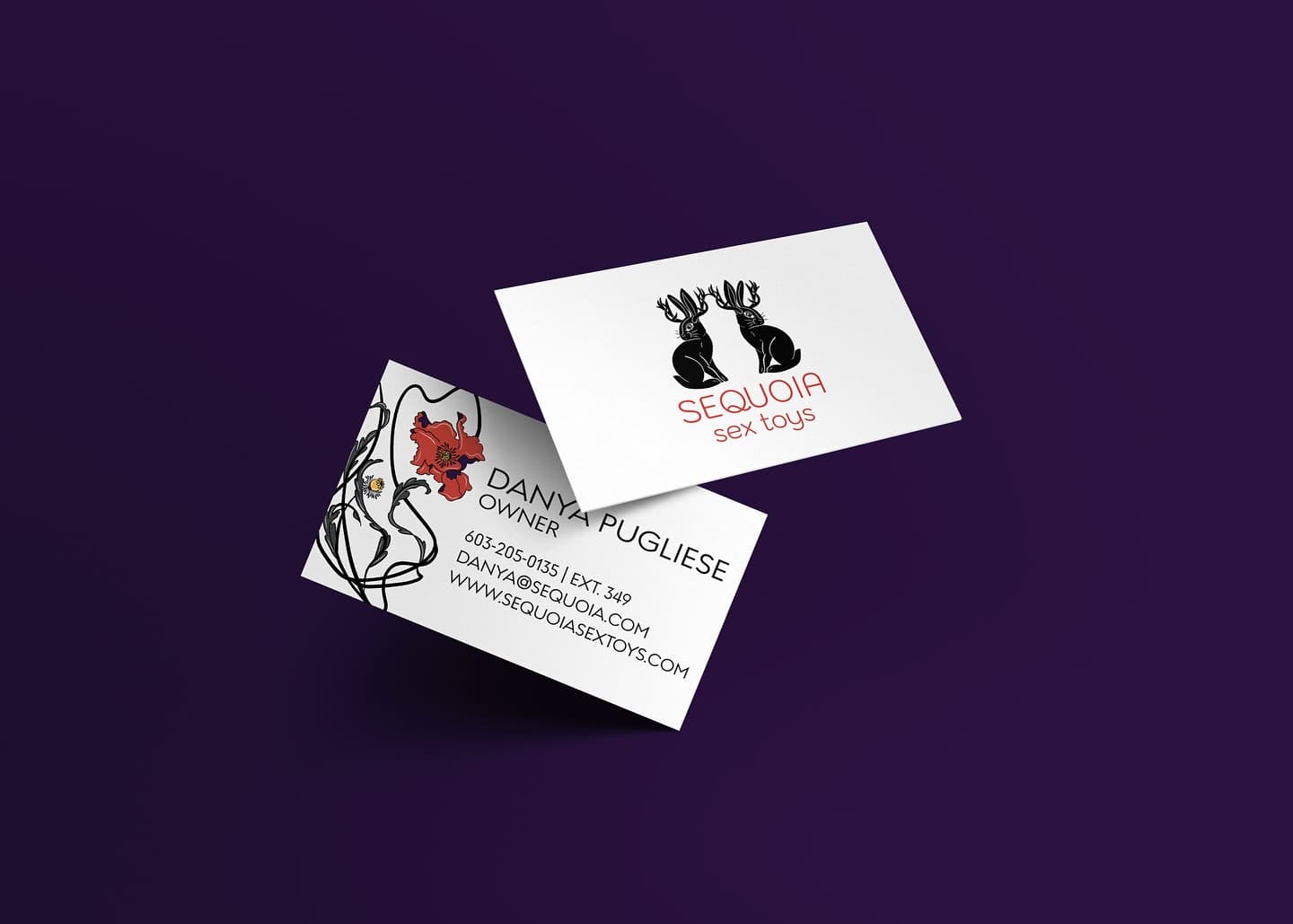
At the center of the brand identity is a mirrored jackalope crest — a mythical creature chosen to represent Sequoia's playful and slightly irreverent spirit. Two jackalopes face one another in symmetrical formation, their antlers interlocking to form a unified crest symbolizing connection, intimacy, and balance. The illustration style uses fine pen-and-ink linework, reinforcing the handcrafted nature of the brand's products while introducing a whimsical, storytelling element to the identity.
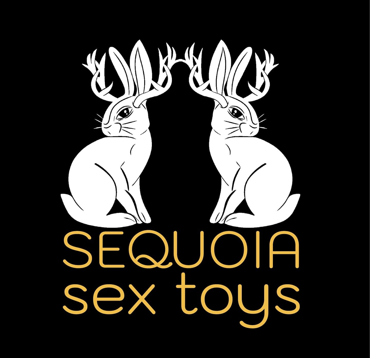
Reversed — Dark
White jackalope mark with gold wordmark on black — primary logo for packaging and dark-ground applications.
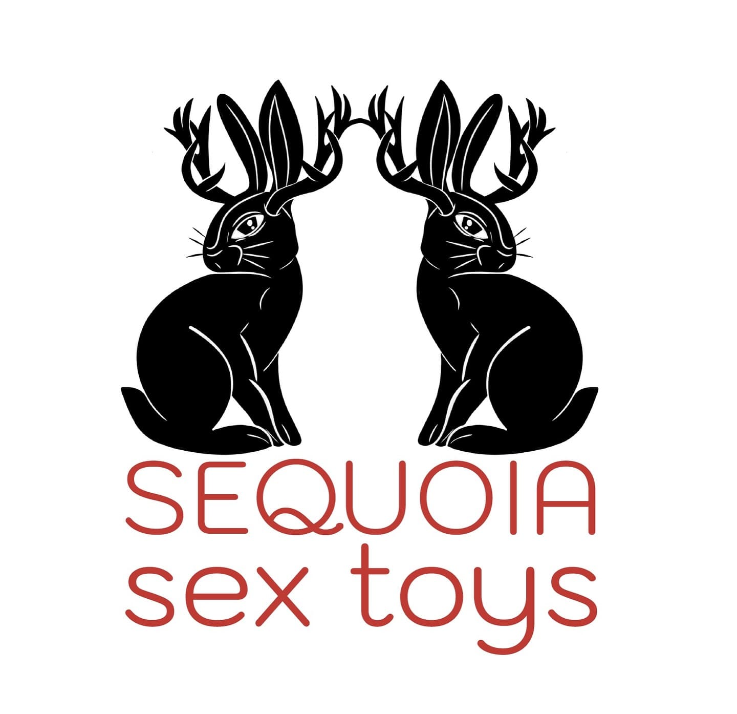
Standard — Light
Black jackalope with terracotta-red wordmark on white — for stationery and light-ground print.
Mirrored Symmetry
Interlocking antlers create a symbolic crest representing connection and intimacy
Hand-Drawn Craft
Detailed linework evokes artisanal production and authenticity
Dual Colorways
Gold-on-black and terracotta-on-white versions provide versatility across packaging and print
Mythical Character
The jackalope introduces humor, mythology, and personality into the brand system
Logo Design Process
From initial sketches and concept exploration through to the final mirrored jackalope mark and wordmark system.
Building a cohesive brand world.
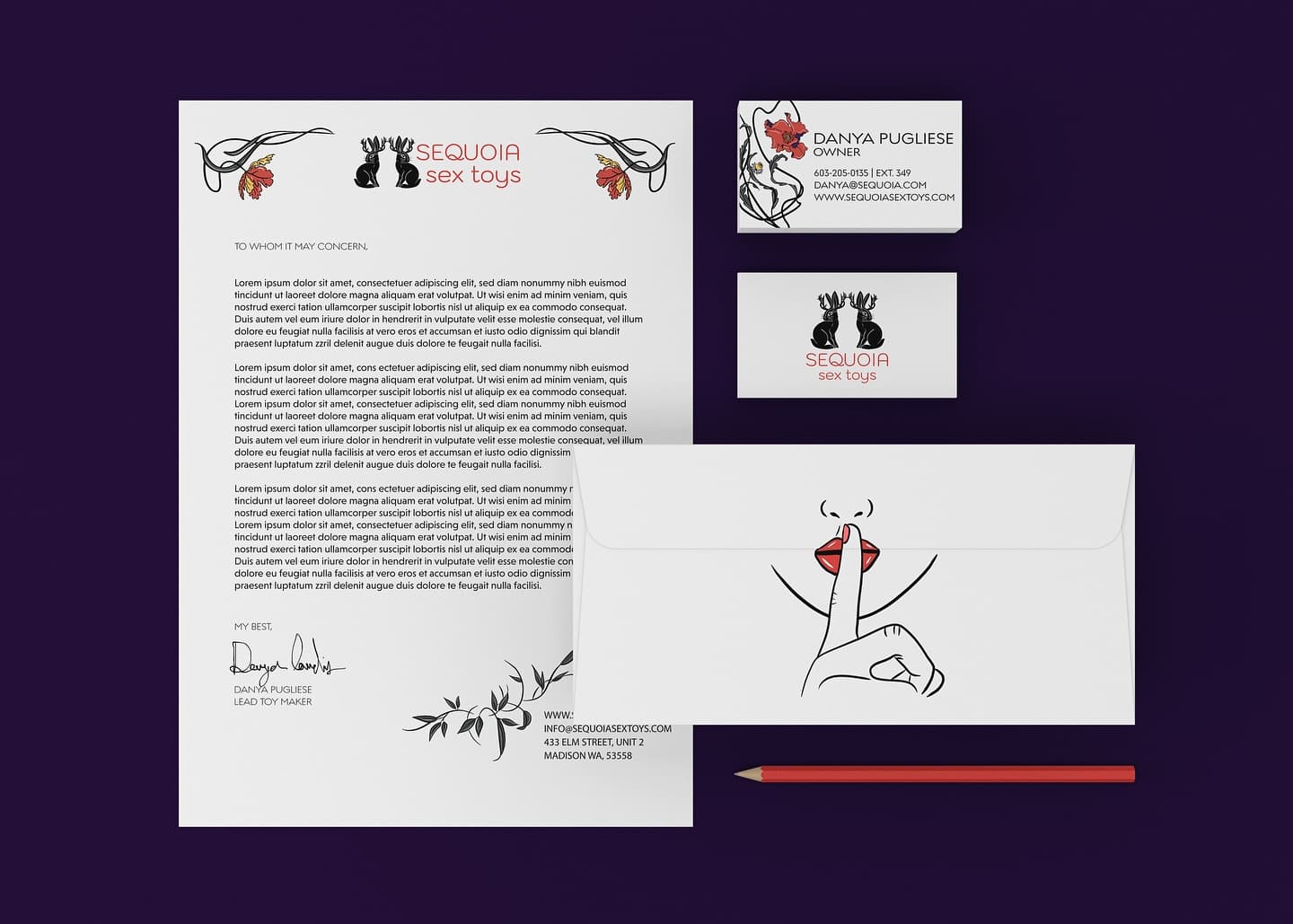
The stationery system extends the brand's illustrated personality into tactile printed materials. Botanical borders, playful fruit illustrations, and cheeky messaging establish a tone that is both sophisticated and mischievous — transforming routine communication into part of the brand experience.
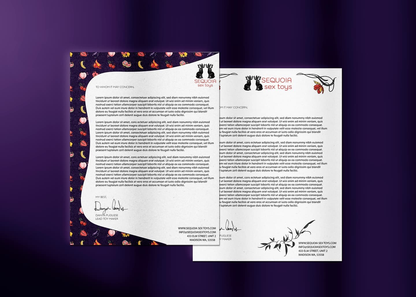
Branded Letterhead
Hand-illustrated botanical border pattern, jackalope logo lockup, and signature sign-off.
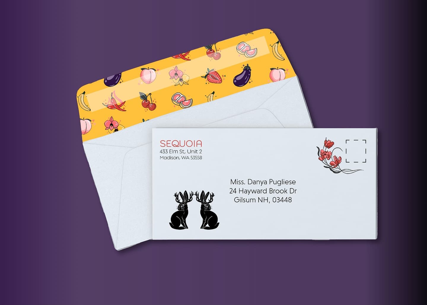
Envelope System
Branded outer with jackalope mark and poppy illustrations. Custom patterned fruit-motif liner.
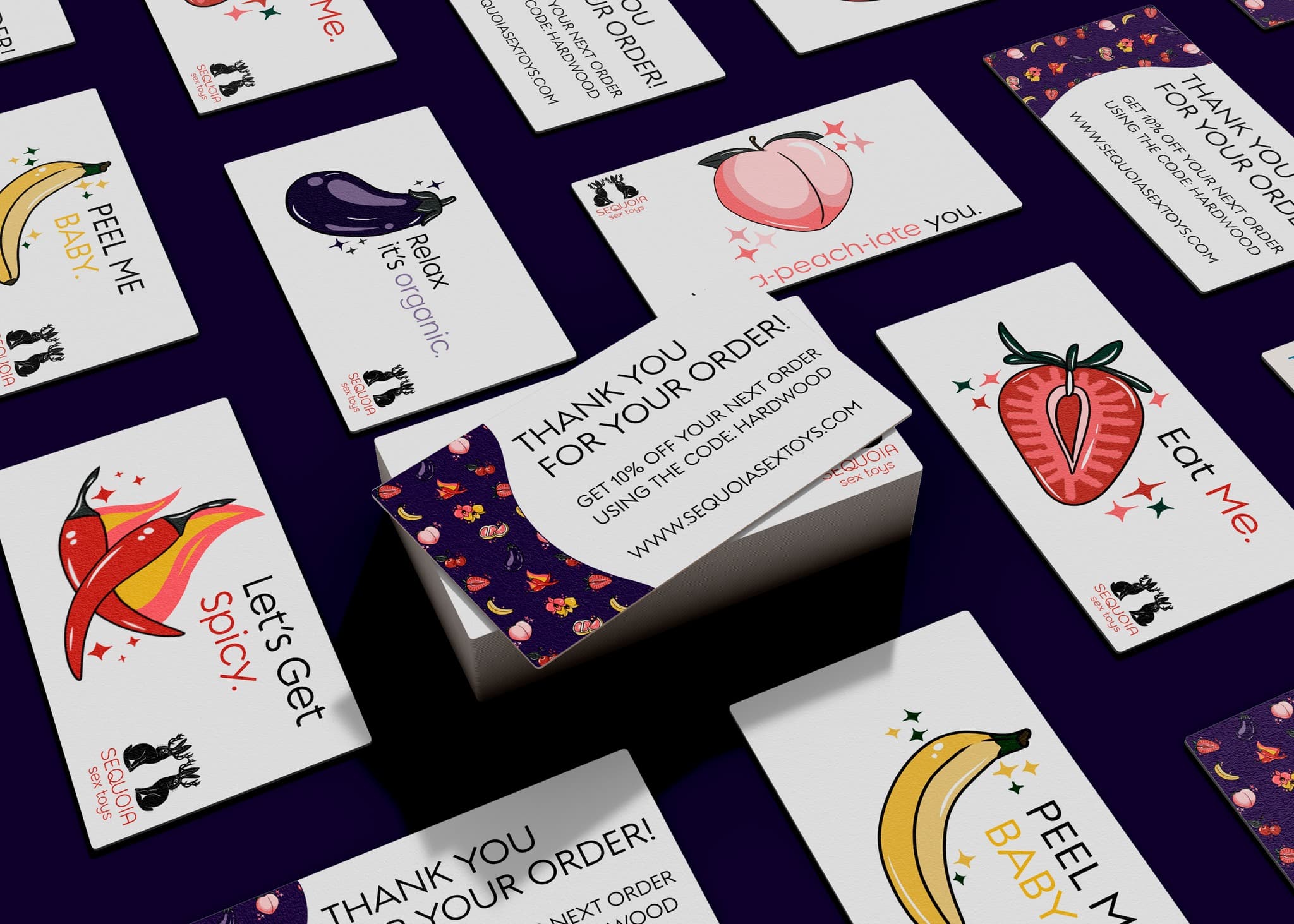
Thank-You Cards
"Peel Me Baby," "Let's Get Spicy," "I-peach-iate you" — cheeky illustrated insert cards.
Designing the unboxing experience.
A major focus of the thesis explored how packaging design can elevate a product purchase into a memorable brand moment. The packaging system treats each order as a gift experience, combining illustrated wrapping paper, custom tissue, and playful messaging. The result is packaging designed to feel premium, playful, and collectible.
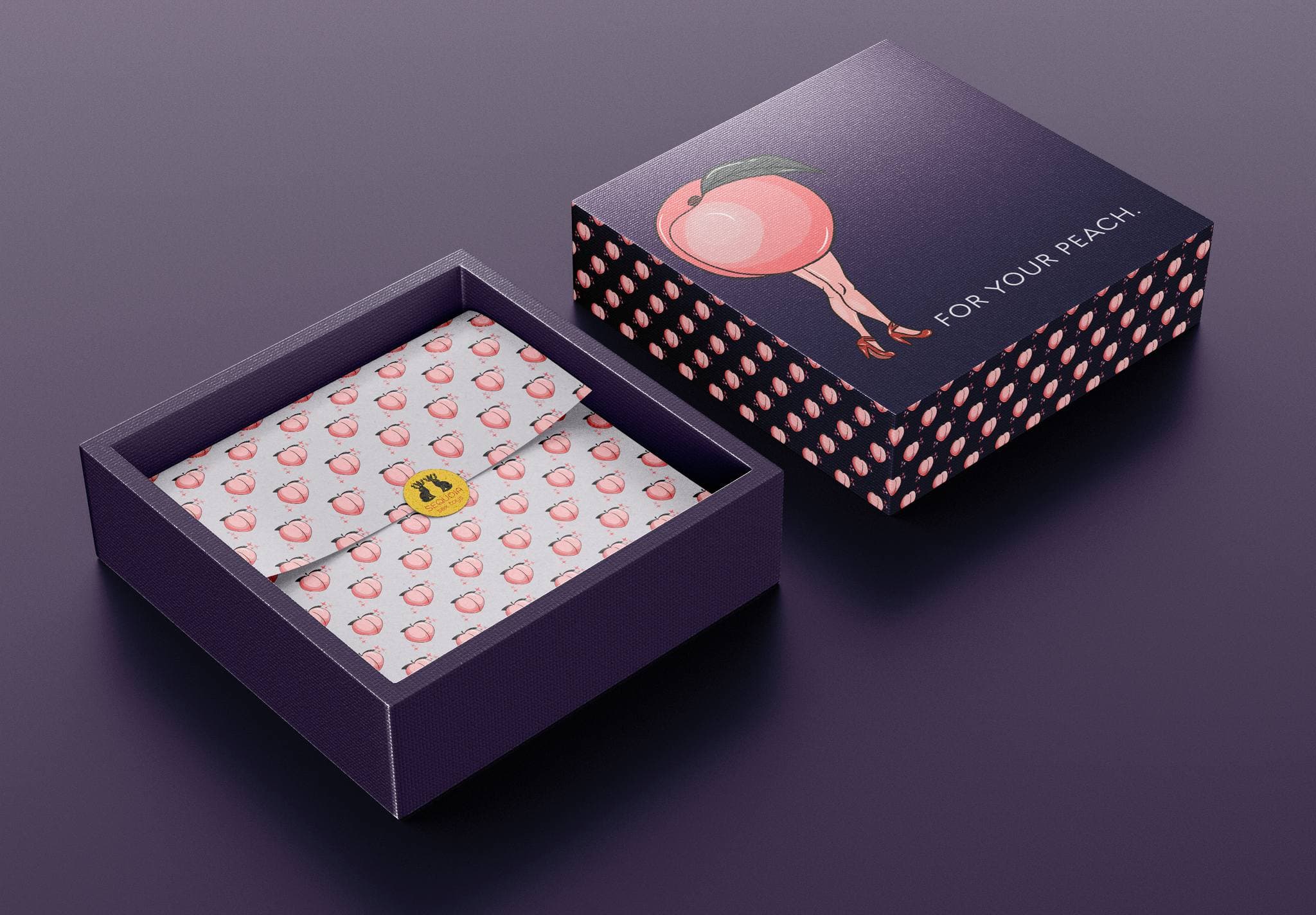
Gift Box System
"For Your Peach" gift box with illustrated pin-up character, polka-dot panels, and custom tissue paper.
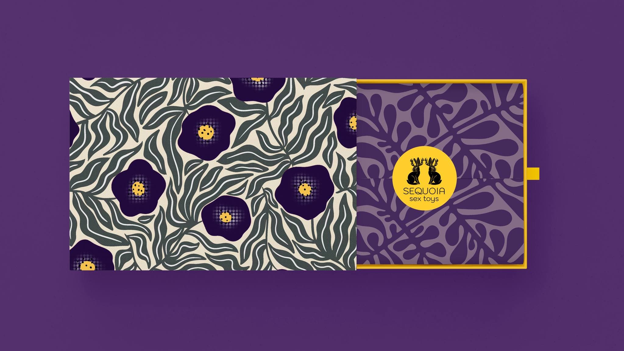
Botanical Wrap & Box
Art nouveau floral wrap with tonal inner box and gold jackalope seal.
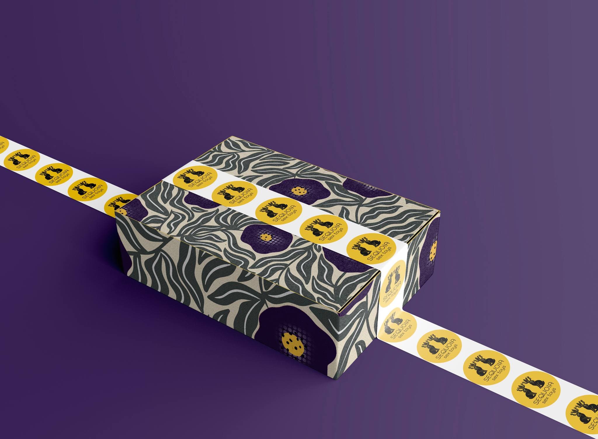
Branded Sticker Tape
Custom shipping tape with repeating jackalope logo seals for a premium unboxing.
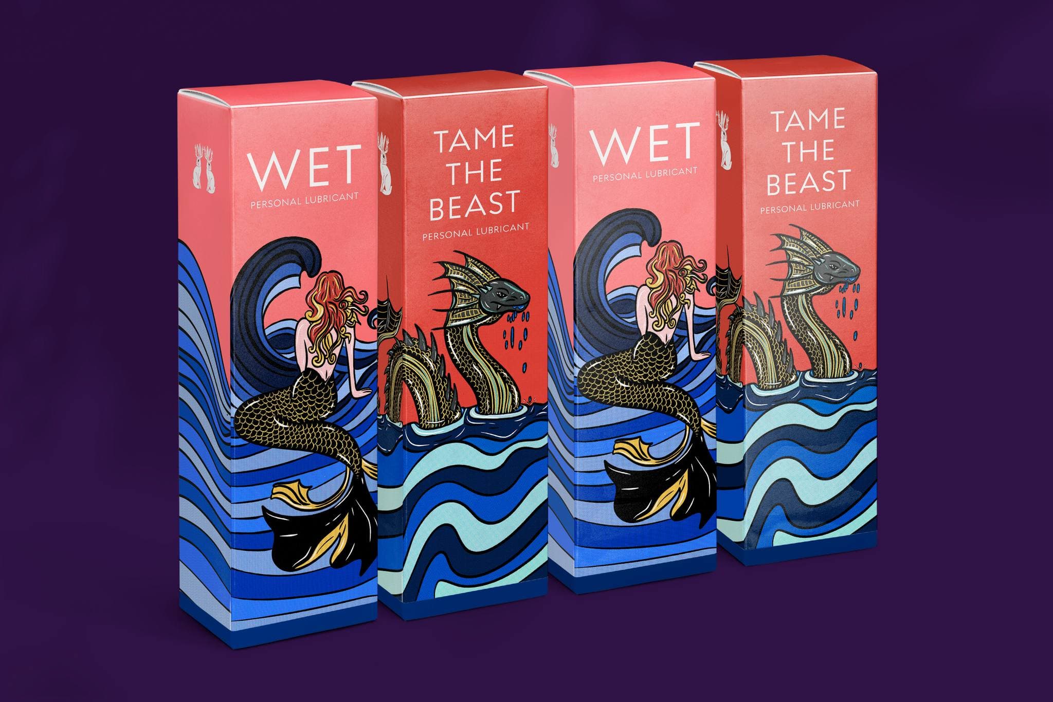
Lubricant Packaging
"Wet" and "Tame the Beast" — custom illustrated mermaid and sea dragon artwork on coral with gold accents.
Merchandise & lifestyle products.
To test the flexibility of the identity system, the thesis expanded the brand into a series of lifestyle merchandise and promotional items. Each piece reinforces the brand's playful, nature-inspired tone while maintaining visual consistency across the identity system.
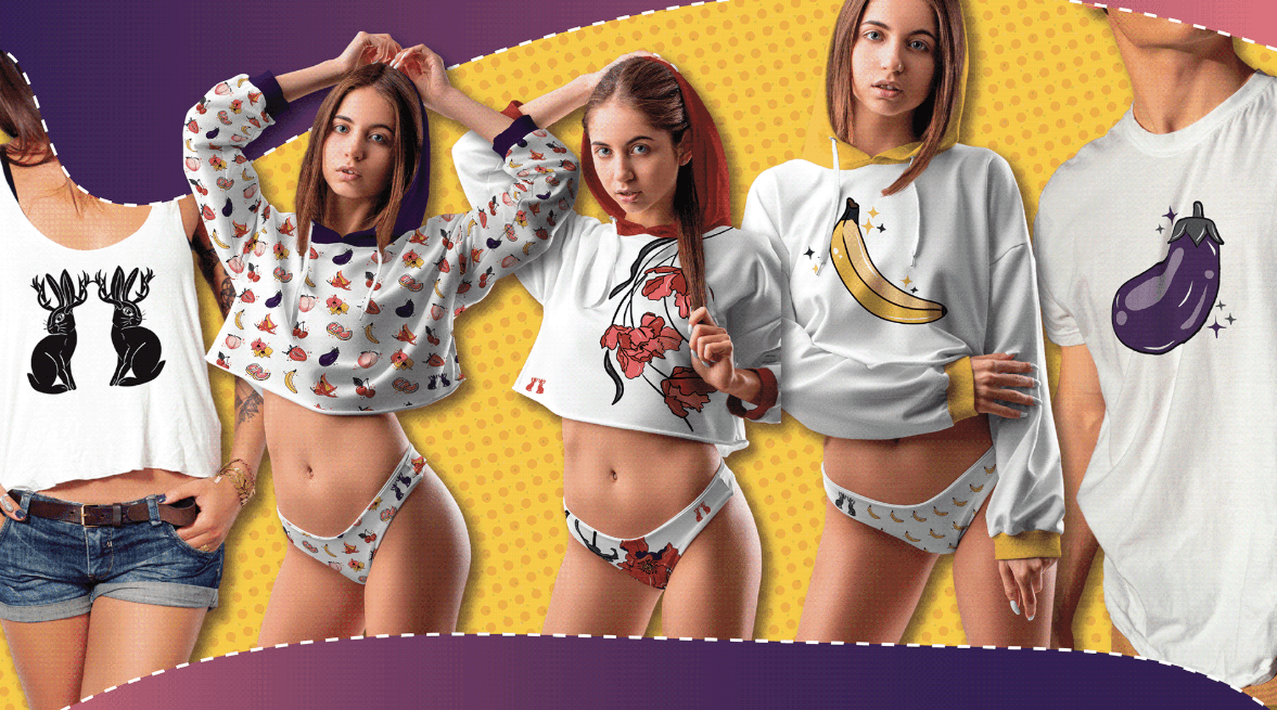
Branded Apparel Collection
Crop tops, hoodies, underwear, and tees — featuring the jackalope mark, fruit-pattern allover print, botanical illustrations, and cheeky produce graphics.
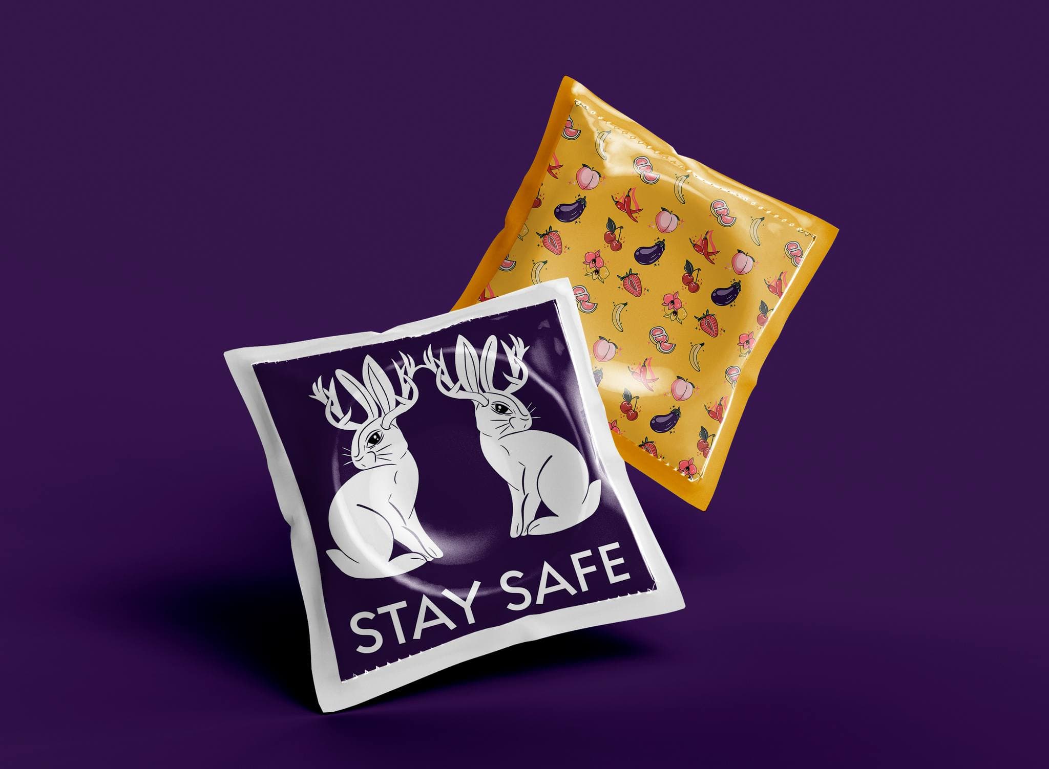
Condom Packets
"Stay Safe" jackalope design on purple, paired with a fruit-pattern variant on gold.
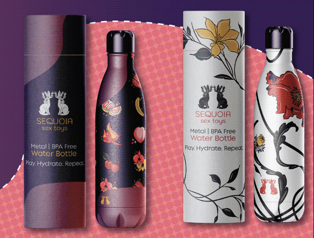
Branded Water Bottles
"Play. Hydrate. Repeat." — four BPA-free metal designs with fruit and botanical patterns.
Translating the brand into digital space.
The thesis also included the design of a fully responsive e-commerce experience. The website extends the illustrated identity into a digital environment featuring bold hero sections, product galleries, category navigation, and brand storytelling pages. The digital experience was designed to feel as distinctive and expressive as the physical packaging.
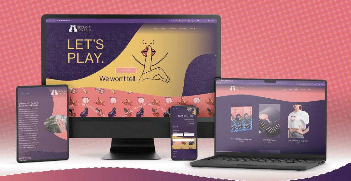
Responsive E-Commerce Website
Squarespace e-commerce build with plum-to-gold palette, illustrated hero sections, product galleries, and "Rooted in Pleasure" marquee across all breakpoints.
Custom Hero
'Let's Play' landing with shushing character and 'We won't tell' tagline
E-Commerce
Full catalog with lubricant, toy, and merchandise categories
Brand Story
'Embrace Pleasure & Embrace Nature' narrative with founder story
Responsive
Optimized across desktop, laptop, tablet, and mobile
Website Design Walkthrough
A walkthrough of the responsive Sequoia e-commerce website — hero sections, product pages, brand story, and mobile experience.
Extending the brand online.
Custom header graphics, profile imagery, and a cohesive visual language that translates the illustrated identity into scroll-stopping presence.
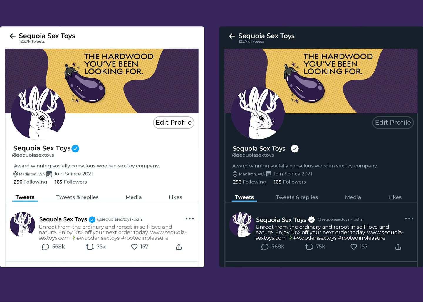
Twitter / X Profiles
"The Hardwood You've Been Looking For" header with illustrated eggplant — light and dark mode.
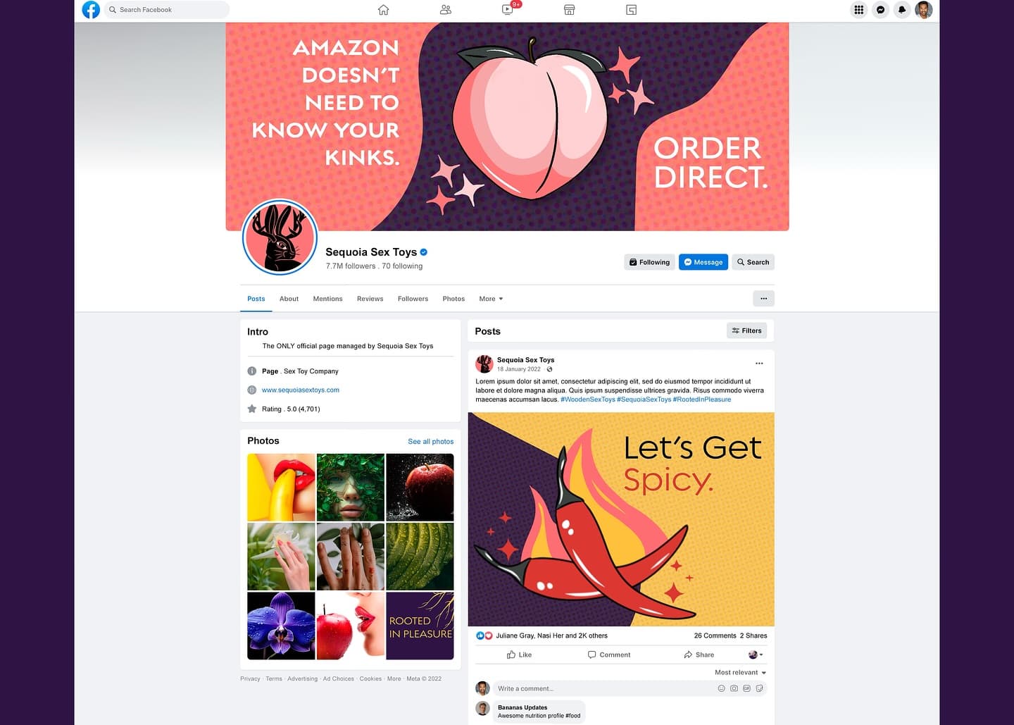
Facebook Business Page
"Amazon Doesn't Need to Know Your Kinks. Order Direct." — custom cover photo, branded posts, and curated photo gallery.
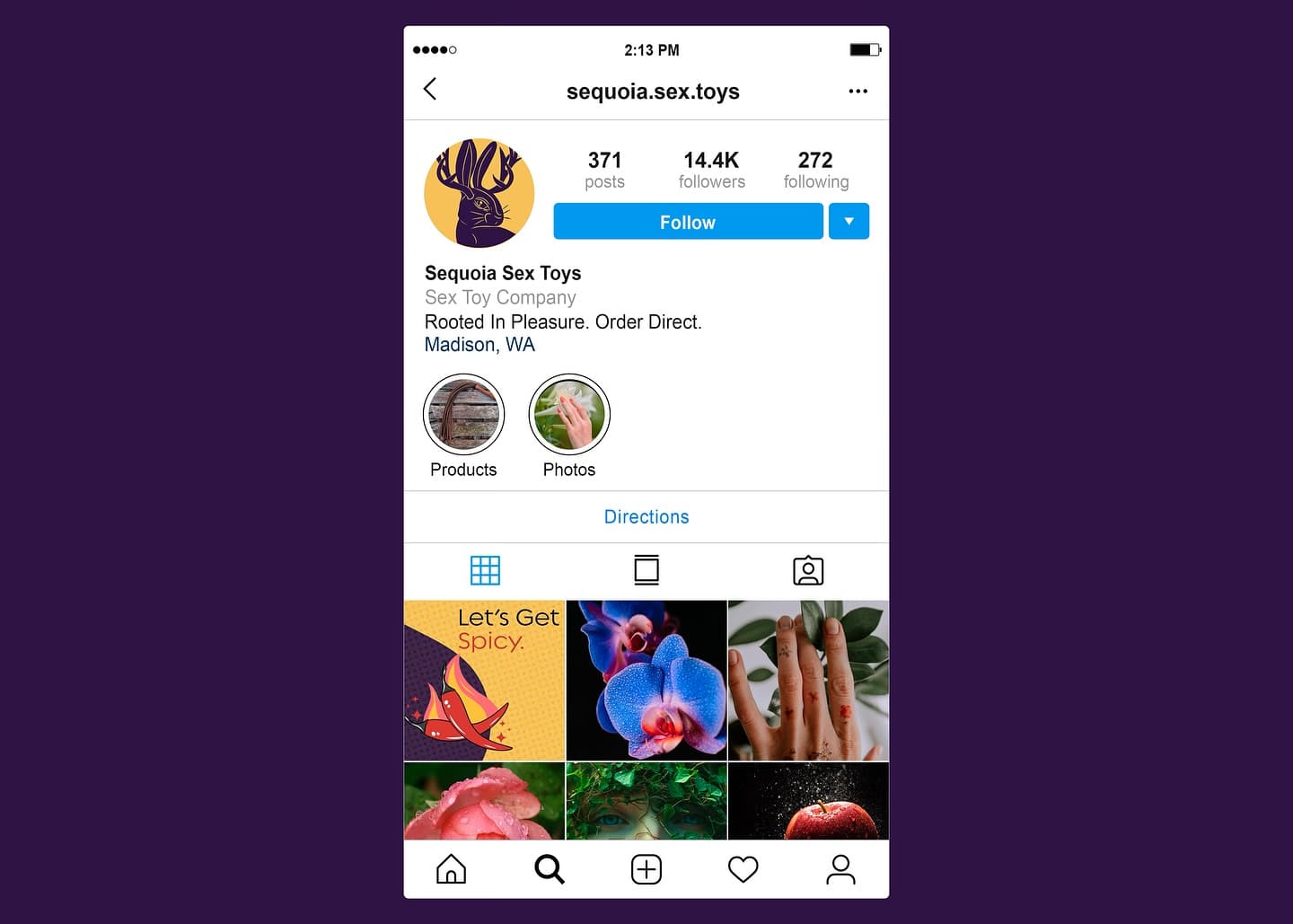
Instagram Profile
Curated grid with product photography, illustrated content, and consistent visual identity.
A complete brand ecosystem.
Brand Strategy & Positioning
Logo & Visual Identity System
Custom Illustration Suite
Stationery & Printed Materials
Packaging & Gift Box System
Lubricant Product Packaging
Merchandise & Promotional Items
Responsive E-Commerce Website
Social Media Templates & Assets