Legacy Farm Rebrand

Monadnock Berries: A Refined Destination Reimagined

Logo identity system for a legacy berry farm positioning as a curated estate experience.

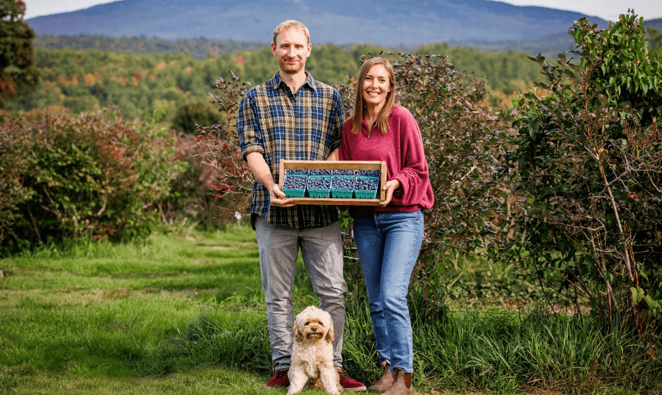
Oliver and Elise, owners of Monadnock Berries, standing in front of Mount Monadnock holding their farm sign — legacy berry farm brand identity by Black Rabbit Creative, Portsmouth NH, New Hampshire, New England
The Challenge

From Farm to Destination

Monadnock Berries is 30 years old. They're not a commodity producer — they're a destination experience. But their visual identity didn't reflect that positioning. They needed a mark that felt elevated, grounded, and distinctly theirs.

The question wasn't "make a pretty logo." It was: "Should we lean into history and heritage, or lean into minimalism and refinement, or lean into the warmth of the harvest?" Three completely different strategies. One brand. Which one feels right?

The Brief (as presented)

  • Elevate from farm to destination venue
  • Appeal to customers seeking curated experiences
  • Work across signage, packaging, merchandise, digital
  • Feel timeless, not trendy
The Process

Three Strategic Directions

Before sketching a single mark, we explored three distinct positioning strategies. Each one answered the brand question differently. Each one was defensible. Only one felt right.

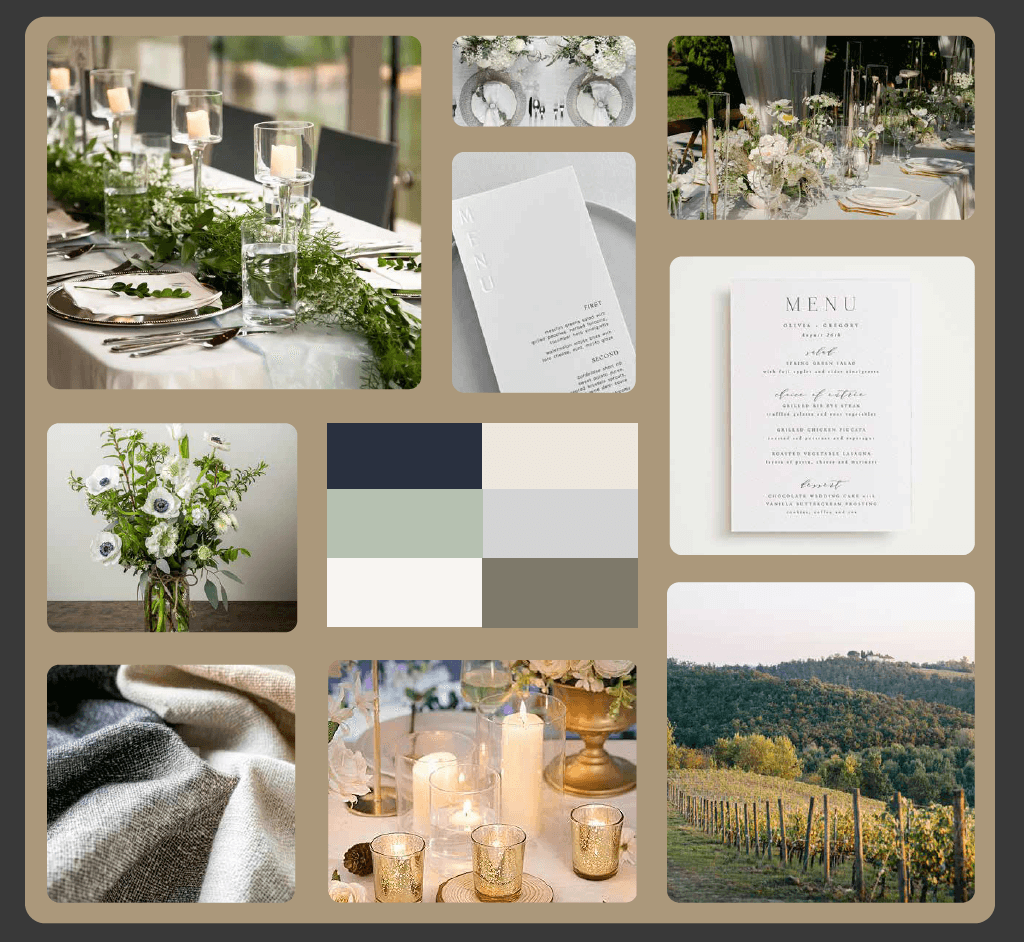
Estate Harvest — mood board direction for Monadnock Berries brand identity by Black Rabbit Creative, Portsmouth NH, New Hampshire, New England
Direction 01Chosen

Estate Harvest

Overview

A refined, destination-driven experience — elevating Monadnock from traditional farm setting to a curated estate environment.

Typography

Elegant serif typography with clean spacing creates a timeless, sophisticated feel while remaining approachable and modern.

Color Palette

Sage
Navy
Warm Cream
Warm Tan

A muted, nature-inspired palette of sage, navy, and warm neutrals reflects the landscape while adding depth and refinement.

Strategic Positioning

For clients seeking an elevated yet grounded atmosphere. The landscape is there. The refinement is intentional.
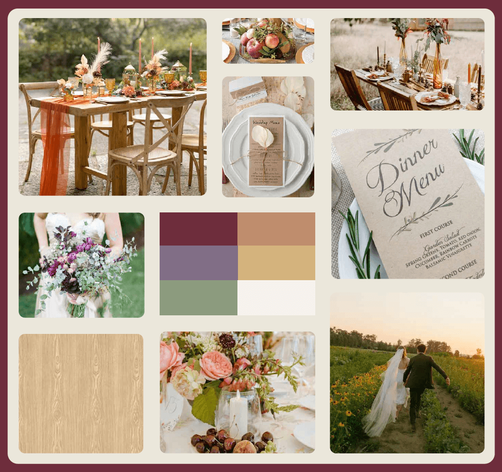
Harvest Heritage — mood board direction for Monadnock Berries brand identity by Black Rabbit Creative, Portsmouth NH, New Hampshire, New England
Direction 02

Harvest Heritage

Overview

A warm, harvest-driven wedding destination blending refined design with the authenticity of a working farm. It shifts away from formal luxury toward a more seasonal, experiential atmosphere rooted in gathering, food, and landscape.

Typography

A heritage-inspired serif creates a timeless, grounded feel, balanced by a clean sans serif for clarity.

Color Palette

Deep Berry
Olive
Muted Plum
Warm Wood

A rich, nature-inspired palette of deep berry, olive, muted plum, and warm wood tones reflect the harvest season while adding depth and warmth.

Strategic Positioning

For couples seeking an elevated yet organic celebration. This one leans into the farm. Makes it intentional. Makes it warm.

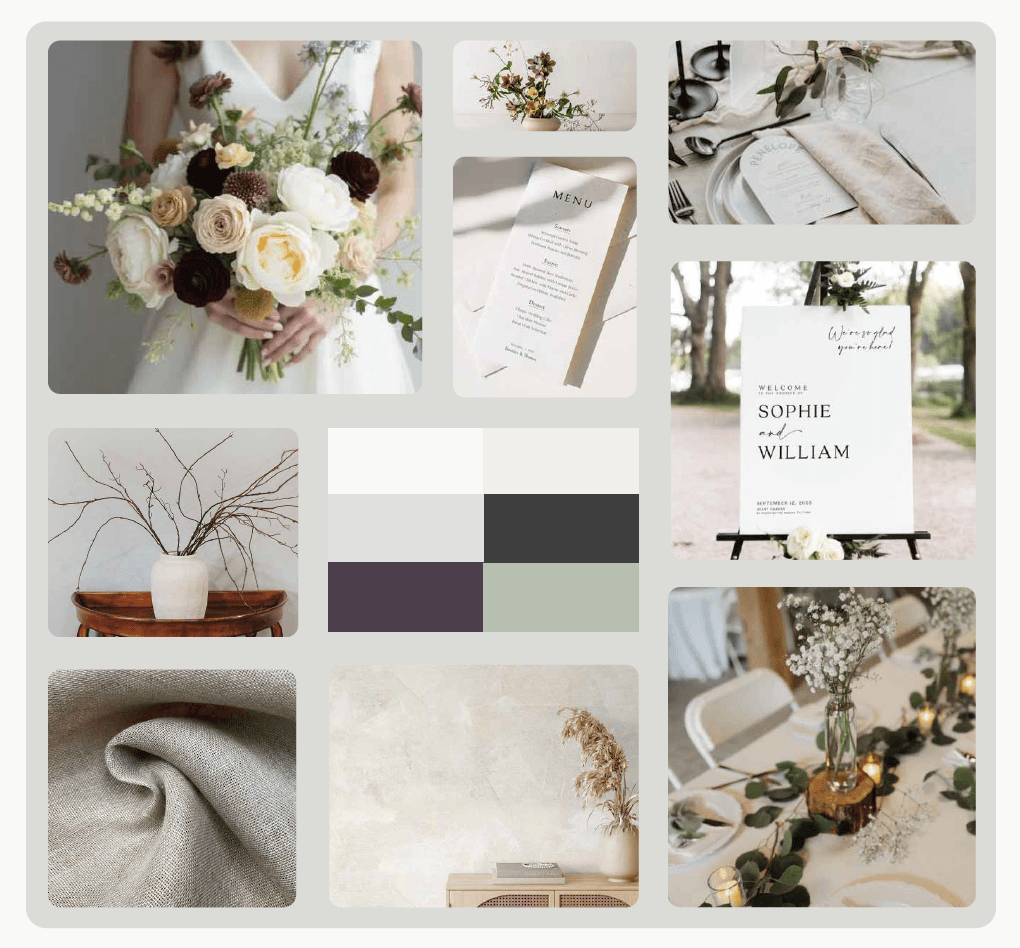
Minimalist Botanical — mood board direction for Monadnock Berries brand identity by Black Rabbit Creative, Portsmouth NH, New Hampshire, New England
Direction 03

Minimalist Botanical

Overview

A refined, modern wedding experience rooted in simplicity and space. This direction embraces restraint — letting natural materials, soft light, and subtle botanical elements speak without excess.

Typography

A modern serif with generous spacing creates a clean, editorial feel, paired with a neutral sans serif for balance.

Color Palette

Warm White
Cool Gray
Sage
Charcoal

A soft, neutral palette of warm whites, cool grays, sage, and deep charcoal creates a calm, modern foundation with subtle contrast.

Strategic Positioning

For those seeking elevated, calm, and intentionally minimal. The restraint is the point. Nothing unnecessary.

The Decision

Estate Harvest Won.

After reviewing all three directions, Oliver and Elise chose Estate Harvest.

Why? Because it positioned Monadnock Berries as a destination without abandoning the place itself. It felt elevated but never pretentious. Timeless but contemporary. Rooted in landscape but intentional about experience.

That clarity — knowing exactly what the brand is and isn't — unlocked everything that came next.

The Logo System

From Strategy to Symbol

Before

The Original Mark

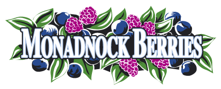
The original logo was created in the 1990s by one of the owners' children — a painting of the farm with hand-lettered text laid over it. Charming, personal, and unmistakably of its era. But not the mark of a destination.

Original 1990s Monadnock Berries logo — painted farm scene with hand-lettered text | Before the rebrand by Black Rabbit Creative, Portsmouth NH, New Hampshire, New England
Monadnock Berries primary logo mark with mountain silhouette — refined destination brand identity by Black Rabbit Creative, Portsmouth NH, New Hampshire, New England
Monadnock Berries primary logo mark without mountain — clean variation by Black Rabbit Creative, Portsmouth NH, New Hampshire, New England

Primary Mark

The Anchor

The primary mark is designed to position Monadnock Berries as a refined destination. Built around a distinctive MB monogram and paired with elegant serif typography, the logo balances structure and softness. It captures both the landscape and the elevated experience of the space.

What Makes It Work

  • The monogram is bold yet refined — distinctive enough to own, refined enough to feel intentional.
  • The typography is classic serif forms with modern spacing. Timeless without feeling dated.
  • The hierarchy is clear. Your eye moves naturally through the mark. No confusion. No guessing.

The result: a mark that feels quietly luxurious. Timeless. Intentional.

Monadnock Berries heritage mark with EST 1996 date — formal brand variation by Black Rabbit Creative, Portsmouth NH, New Hampshire, New England

Heritage Mark

The Formal Variation

The secondary mark expands the identity into a structured, heritage-driven format. By introducing the establishment date and a centered composition, this variation emphasizes history and permanence — while maintaining the elegance of the primary mark.

What Makes It Work

  • The monogram stays consistent, anchoring the system.
  • The establishment date reinforces legacy. 1996 becomes an asset, not an afterthought.
  • The centered composition feels formal and balanced. More grounded. More permanent.

When to use it: applications where the brand benefits from a traditional, established presence. Signage. Formal stationery. Moments that need weight.

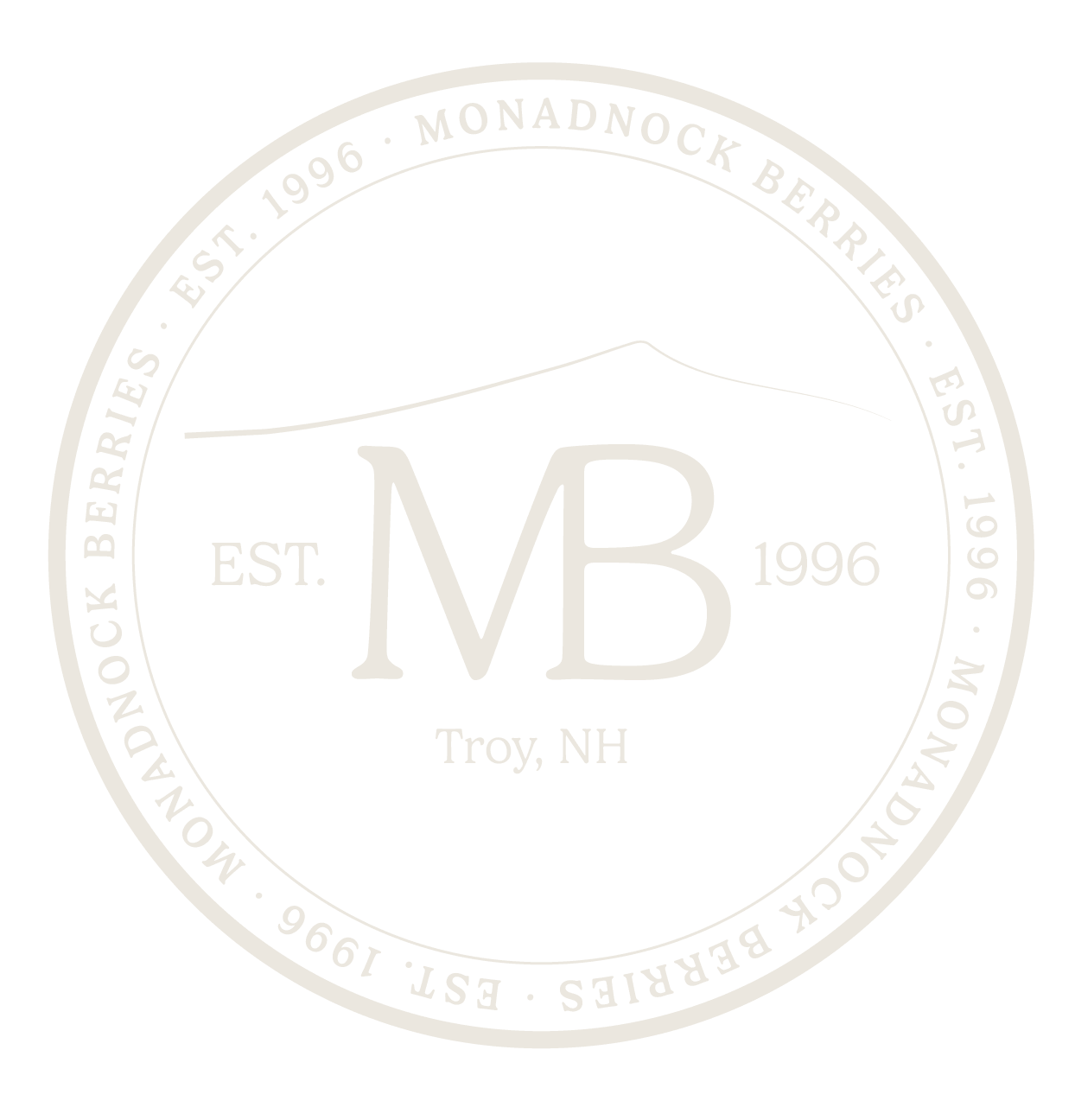
Monadnock Berries brand seal — circular signature mark with landscape detail by Black Rabbit Creative, Portsmouth NH, New Hampshire, New England

Brand Seal

The Signature

The seal is the most expressive element of the system. It brings together place, history, and experience into a single mark. The circular form creates a sense of continuity and completeness. The subtle landscape line grounds the brand in its actual environment.

What Makes It Work

  • The encircling typography reinforces location and recognition.
  • The landscape detail is subtle. It's there. It matters. It grounds the mark in place.
  • The scale is versatile. Clear at large. Clear at small. Legible on stamps, signage, embroidery.

When to use it: anywhere you want the brand to feel ceremonial. Signature-like. Rooted.

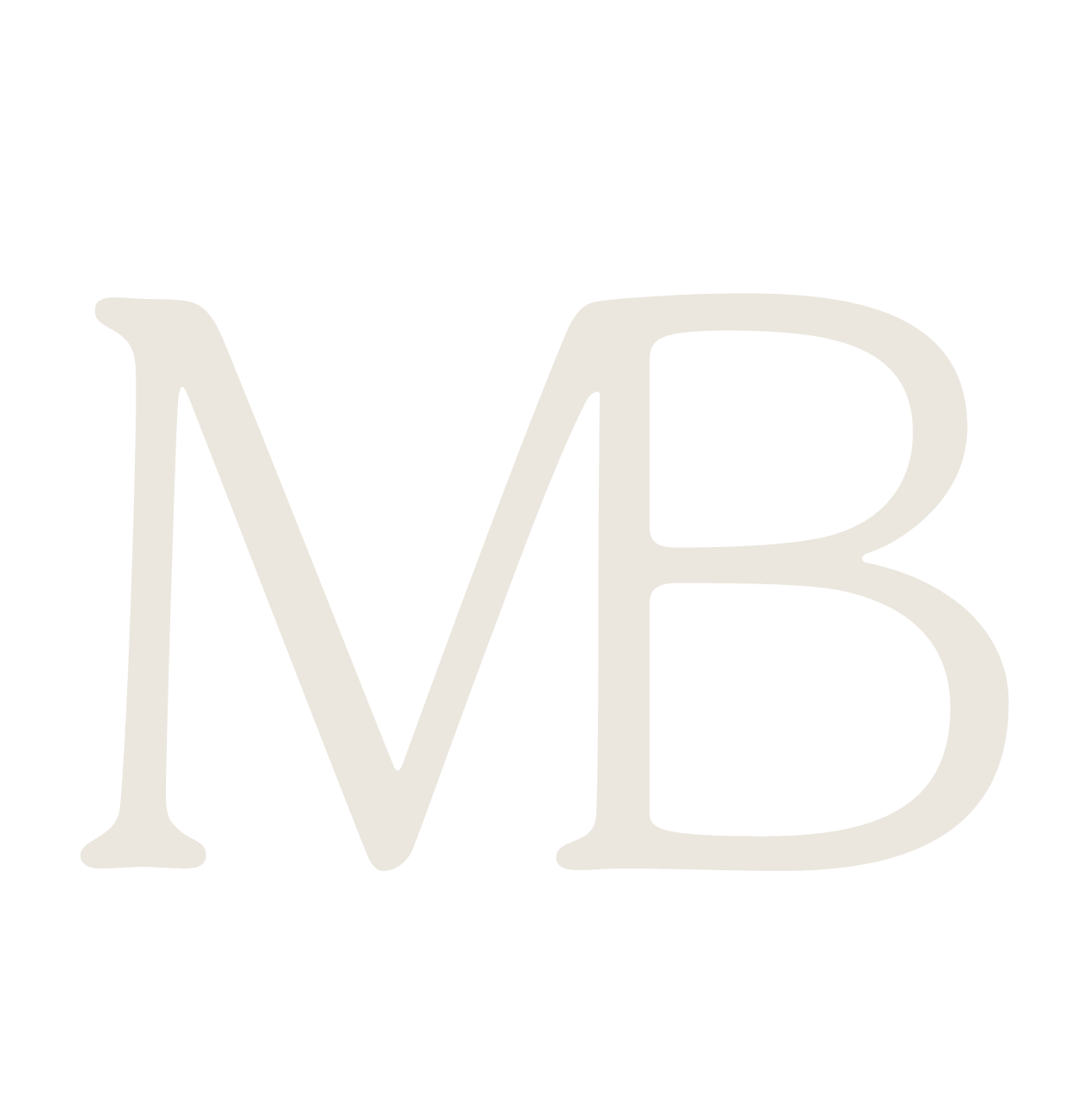
Monadnock Berries MB monogram — essential brand mark by Black Rabbit Creative, Portsmouth NH, New Hampshire, New England

Monogram Mark

The Essential Form

The monogram distills the identity to its most essential form. Using MB as a standalone element, the mark creates a recognizable symbol that works across smaller-scale applications while maintaining consistency with the broader system.

What Makes It Work

  • The letterforms are refined. Custom enough to feel distinctive. Simple enough to scale.
  • The mark is strong enough to work alone. No supporting typography needed.
  • The scale is versatile. From embroidery to digital. From tiny favors to large prints.

When to use it: when simplicity and clarity are key. When the space needs the brand but shouldn't be overwhelmed. Apparel. Favors. Digital icons.

Applications

A System in Practice

Each application was designed with intention. Not every mark works everywhere. The system allows flexibility without losing coherence.

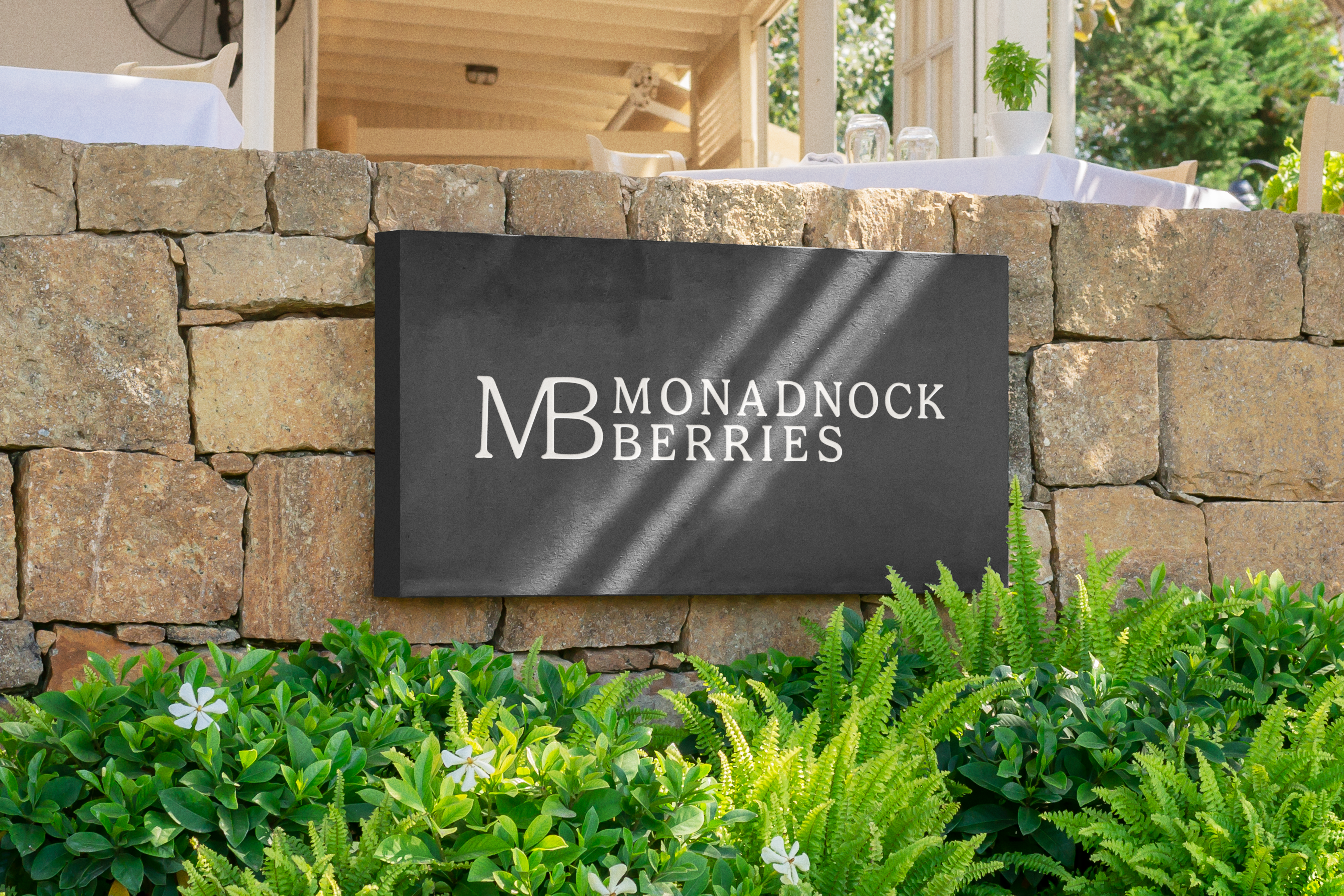
Signage — Monadnock Berries brand application by Black Rabbit Creative, Portsmouth NH, New Hampshire, New England
Signage

Primary mark. Large. Clear. Commands the space without shouting.

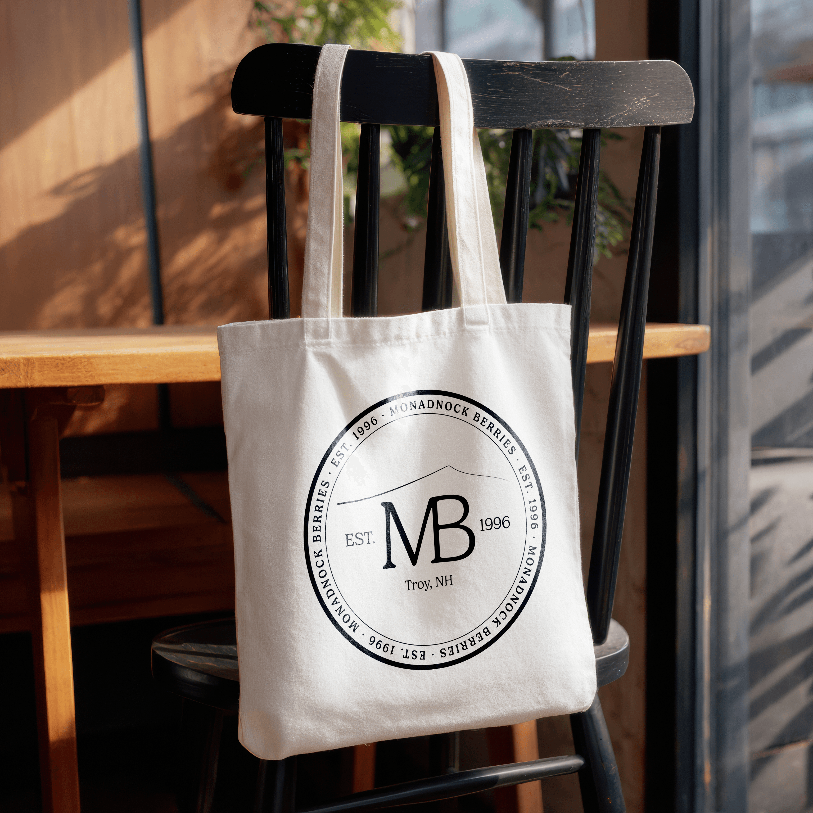
Tote Bag — Monadnock Berries brand application by Black Rabbit Creative, Portsmouth NH, New Hampshire, New England
Tote Bag

The seal becomes a signature detail. Ceremonial. Owned. Something you'd display, not hide.

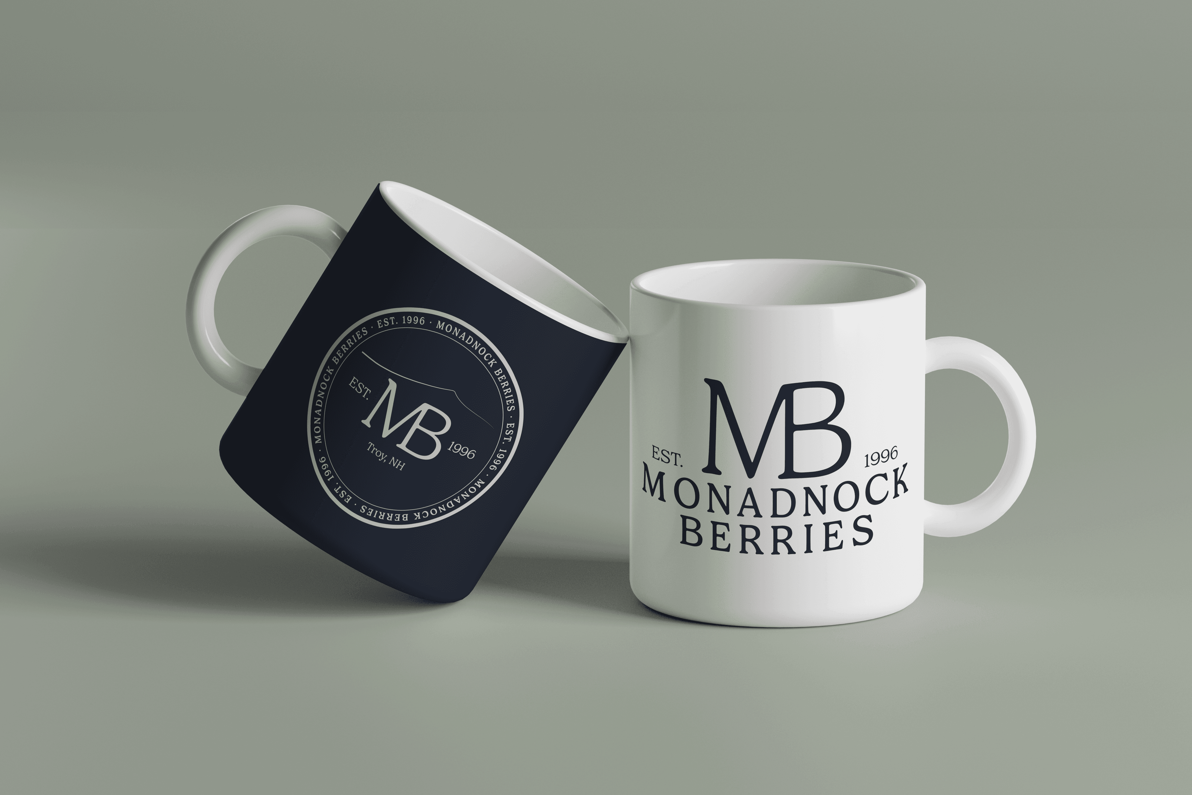
Mug — Monadnock Berries brand application by Black Rabbit Creative, Portsmouth NH, New Hampshire, New England
Mug

The primary mark works here. Simple. Clear. Refined. You pick it up and know exactly what it is.

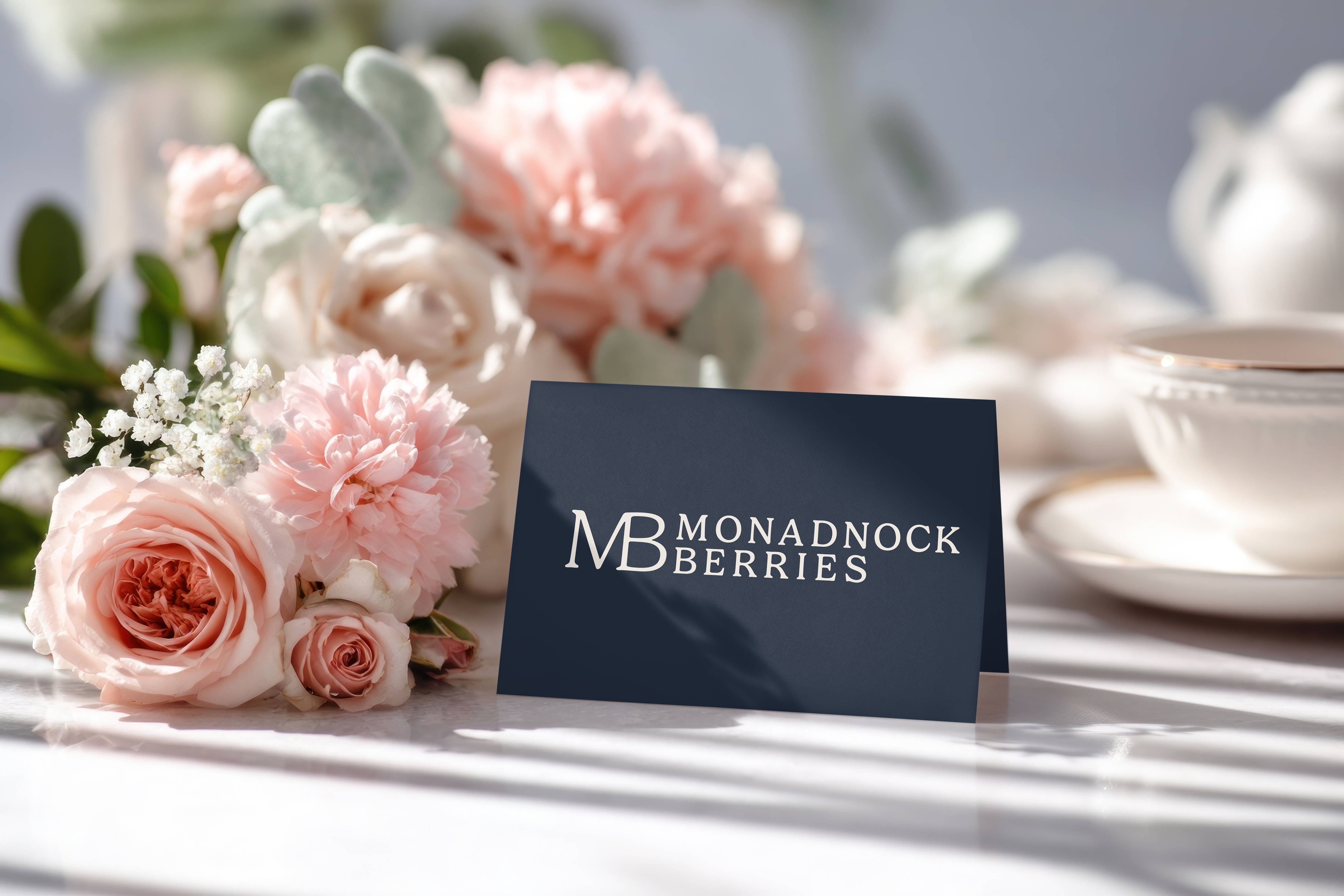
Business Card — Monadnock Berries brand application by Black Rabbit Creative, Portsmouth NH, New Hampshire, New England
Business Card

Heritage mark. Establishes formality without overdoing it. The establishment date tells the story.

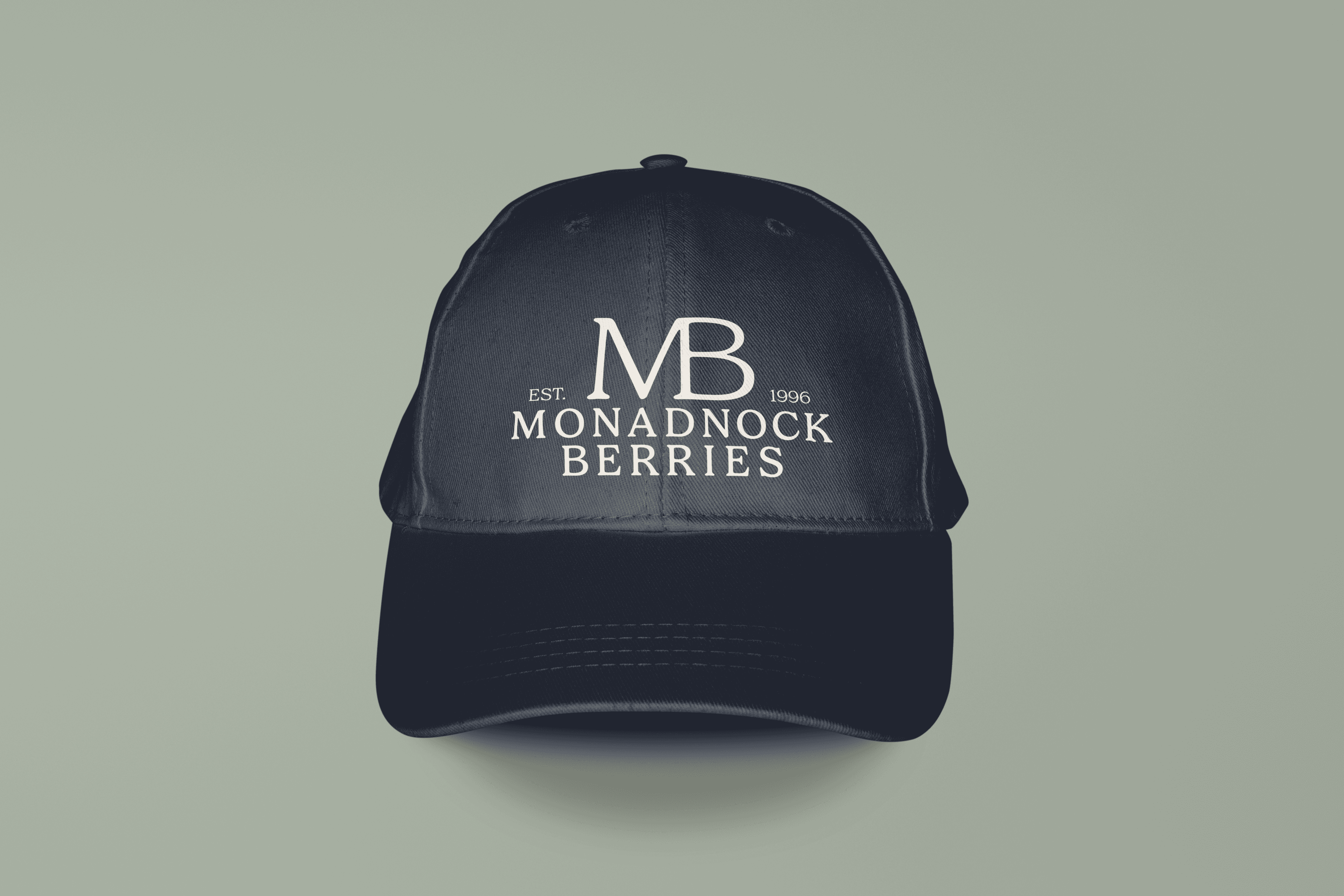
Hat / Apparel — Monadnock Berries brand application by Black Rabbit Creative, Portsmouth NH, New Hampshire, New England
Hat / Apparel

Monogram-forward. Scaled appropriately. Clean. Not crowded.

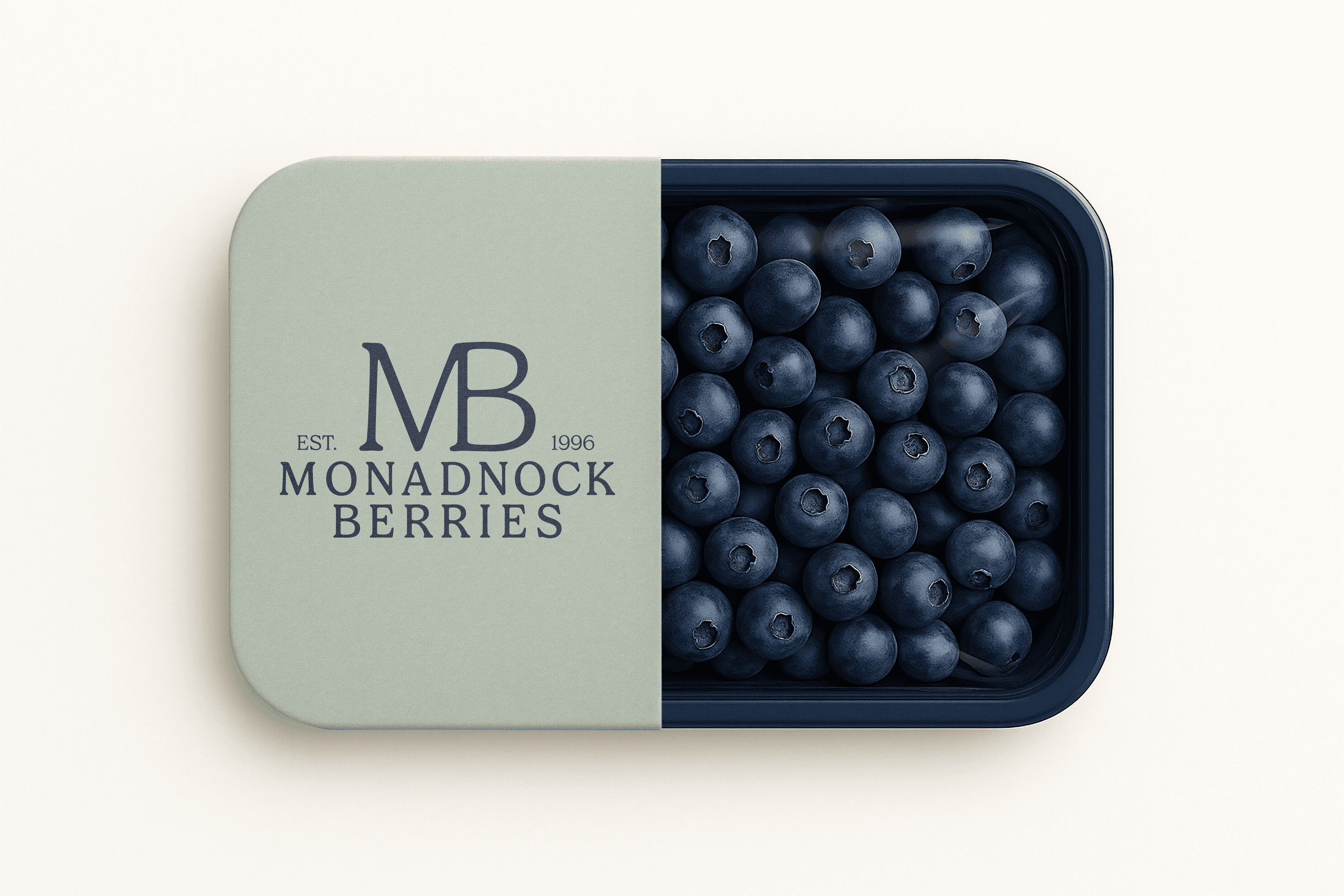
Packaging — Monadnock Berries brand application by Black Rabbit Creative, Portsmouth NH, New Hampshire, New England
Packaging

Primary mark on retail packaging — brand and product living together, no compromise.

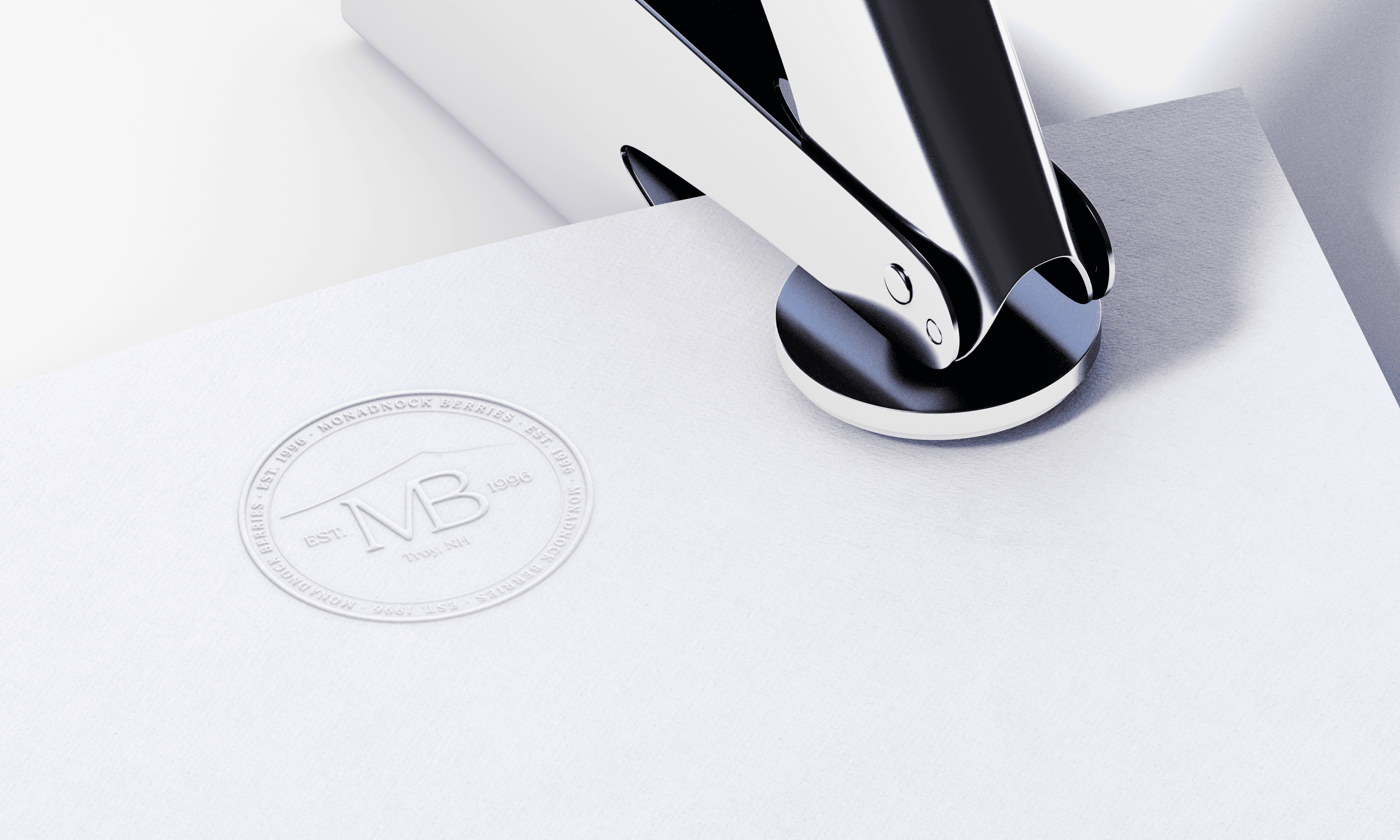
Embossed Seal — Monadnock Berries brand application by Black Rabbit Creative, Portsmouth NH, New Hampshire, New England
Embossed Seal

The seal, made physical. A quiet detail that turns paper into a keepsake.

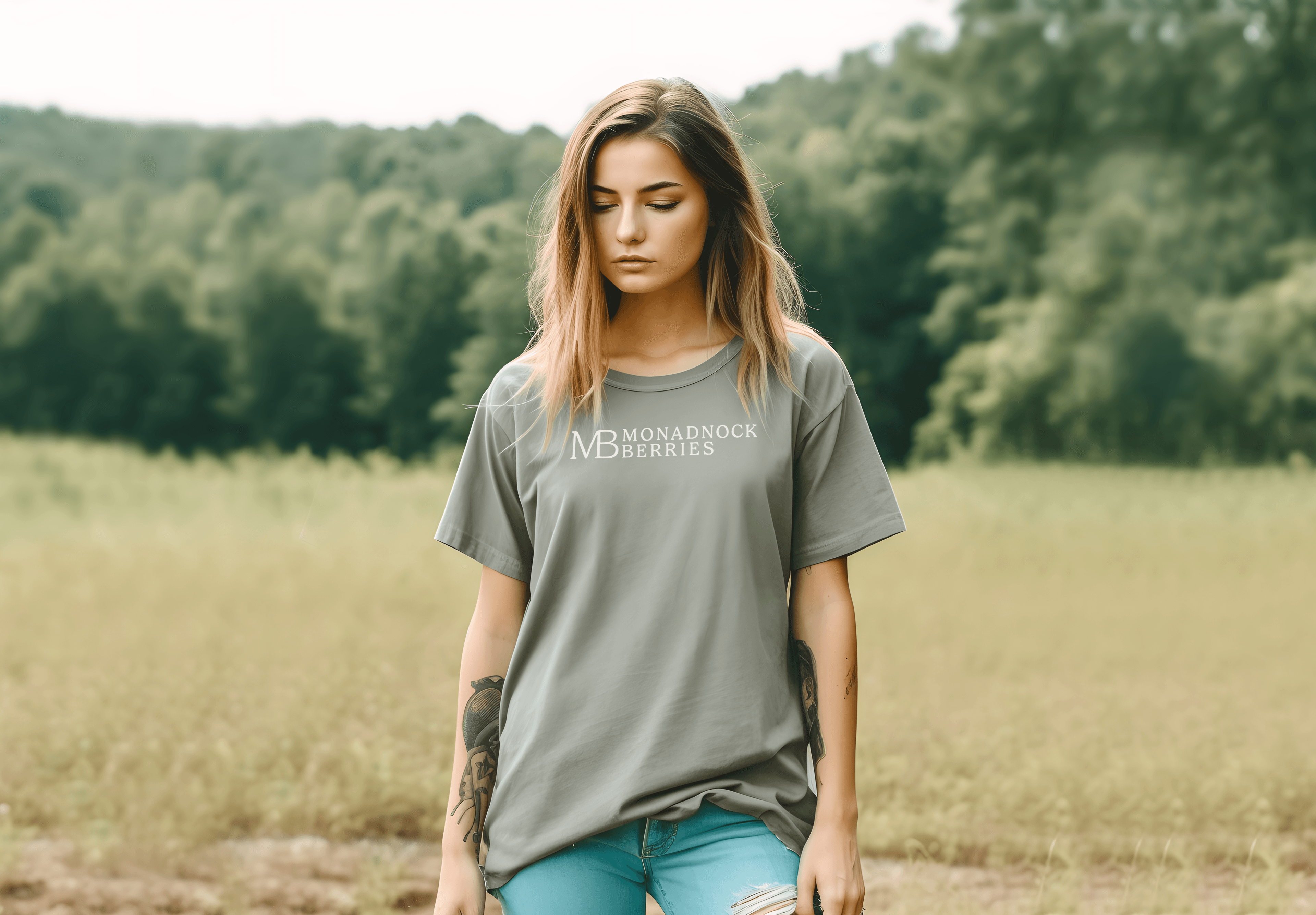
T-Shirt — Primary — Monadnock Berries brand application by Black Rabbit Creative, Portsmouth NH, New Hampshire, New England
T-Shirt — Primary

Reversed primary mark on soft cotton. Wearable, without looking like a corporate freebie.

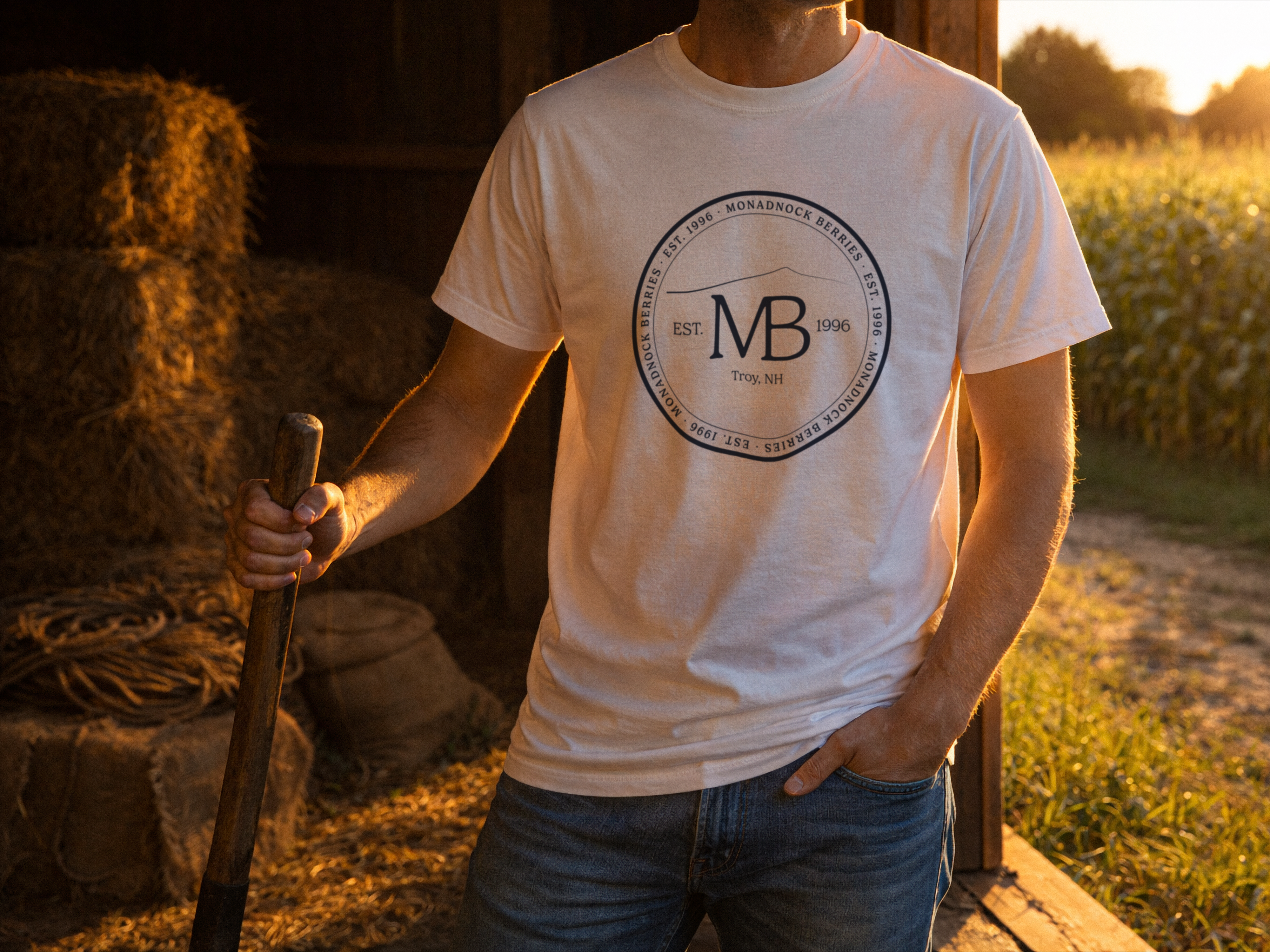
T-Shirt — Seal — Monadnock Berries brand application by Black Rabbit Creative, Portsmouth NH, New Hampshire, New England
T-Shirt — Seal

The seal centered on the chest. A collectible piece — the kind you keep.

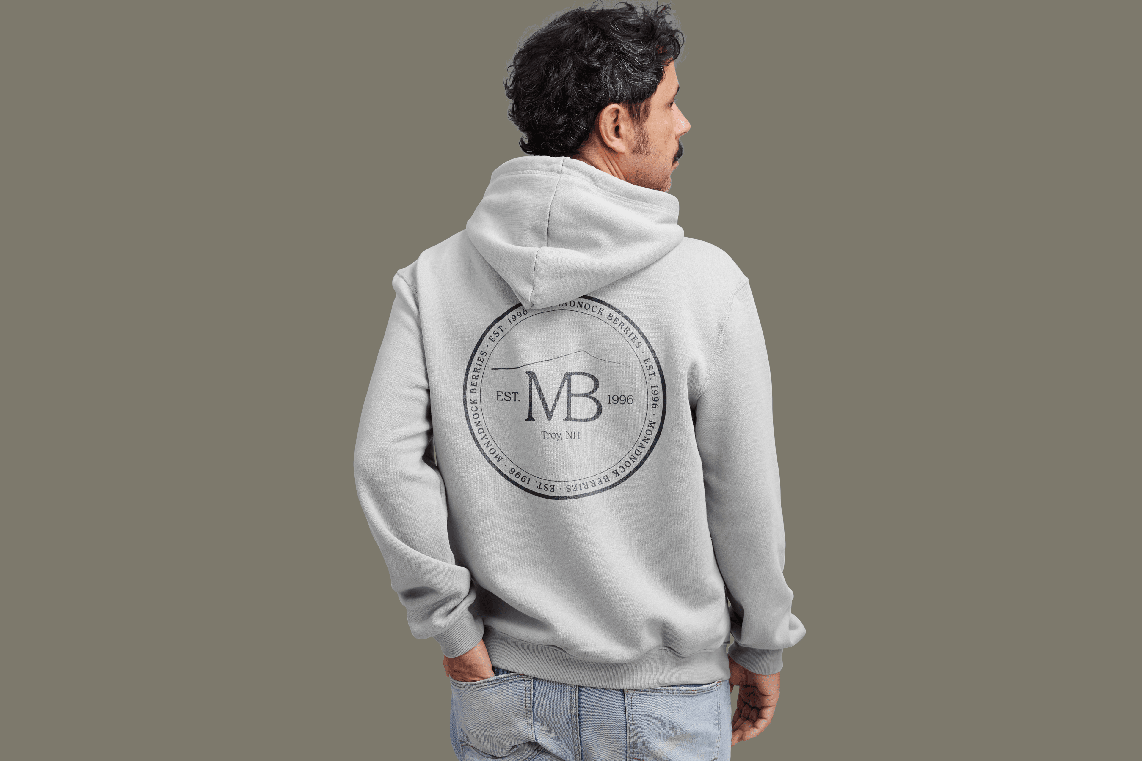
Hoodie — Monadnock Berries brand application by Black Rabbit Creative, Portsmouth NH, New Hampshire, New England
Hoodie

Full seal on the back. A quiet nod for people who know the place.

More Than a Logo

What Actually Got Delivered

Monadnock Berries didn't just get a logo. They got clarity.

01Strategic clarity

Three distinct directions forced the hard conversation: Who are we, really? The answer shaped every decision that followed.

02A mark system

Primary. Heritage. Seal. Monogram. Four marks, each intentional. Each works for different moments. Each reinforces the same brand.

03Scalability

From tiny embroidery to large signage, the system remains clear and ownable. No confusion. No dilution.

04Flexibility without chaos

The monogram works standalone. The seal works ceremonial. The primary mark works everywhere. But they're all unmistakably Monadnock Berries.

05Confidence

When Oliver and Elise put this on a hat or tote or signage, they know it feels right. Not generic. Not like someone else's brand.

What This Demonstrates

What We're Actually Good At

This project shows how we think about branding.

01

Strategy before design

We don't start with design. We start with strategy. Three directions aren't cosmetic choices — they're positioning options. You choose the direction. We execute the system.

02

Process matters

You see the thinking. You understand why each decision was made.

03

Systems beat single marks

A logo isn't one thing. It's a coherent set of marks that work together across real applications.

04

Application thinking is built in

The design didn't happen in a vacuum. Every mark was tested against how it actually gets used.

Next Steps

Your Brand Could Be Next.

If you're tired of looking like competitors. If you're ready to invest in a brand that actually stands apart. If you want strategy before design — not after.

Let's talk about your brand.

The process starts with one conversation. Understanding who you actually are. What makes you different. What you want to feel like.