Kapiloff Insurance
Legacy Brand Modernization for a New Generation
Visit kapiloff.comClient
Kapiloff Insurance
Industry
Insurance & Financial Services
Scope
Brand Identity Refresh
Focus
Trust, Clarity & Modernization
Before & After
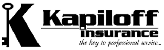

Ornate serif
Poor scalability
Dated language
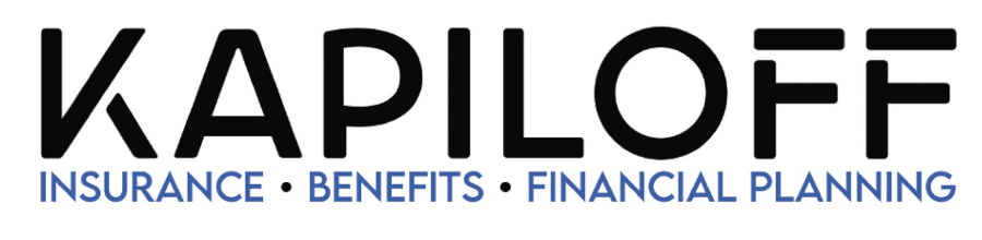

Geometric sans
Unified system
Fully scalable
Built for the next generation
Kapiloff Insurance came to the project at a pivotal moment — the business was being passed down to a new generation and needed a visual identity that felt current while preserving the credibility the company had built over time.
The goal was not to reinvent the brand, but to refine and strengthen it for the future.
The existing identity felt dated and lacked the clarity needed for modern applications. In the insurance space, even small visual shifts can impact perceived credibility — so the solution required precision.
Feel more contemporary and professional
Improve readability and recognition
Maintain trust in a sensitive industry
Create consistency across all materials
Allow flexible logo usage moving forward
Strategic simplification
The redesign focused on strategic simplification. A key move was refining the "K" into a more recognizable standalone mark, giving Kapiloff a flexible brand asset that works across multiple touchpoints.
The color system was updated with a confident blue palette — #1058CF as the dominant trust signal and #689BF8 as the supporting accent — aligned with industry expectations of stability, security, and expertise.
Clean Typography
Lemon Milk headers paired with email-safe Calibri body text for total usability
Visual Hierarchy
Stronger structure that guides the eye and builds authority
Scalability
Every element works from business card to billboard
Modern Trust Signal
Two-tone blue palette aligned with stability, security, and expertise
Brand in Action

Environmental
Outdoor LED Sign
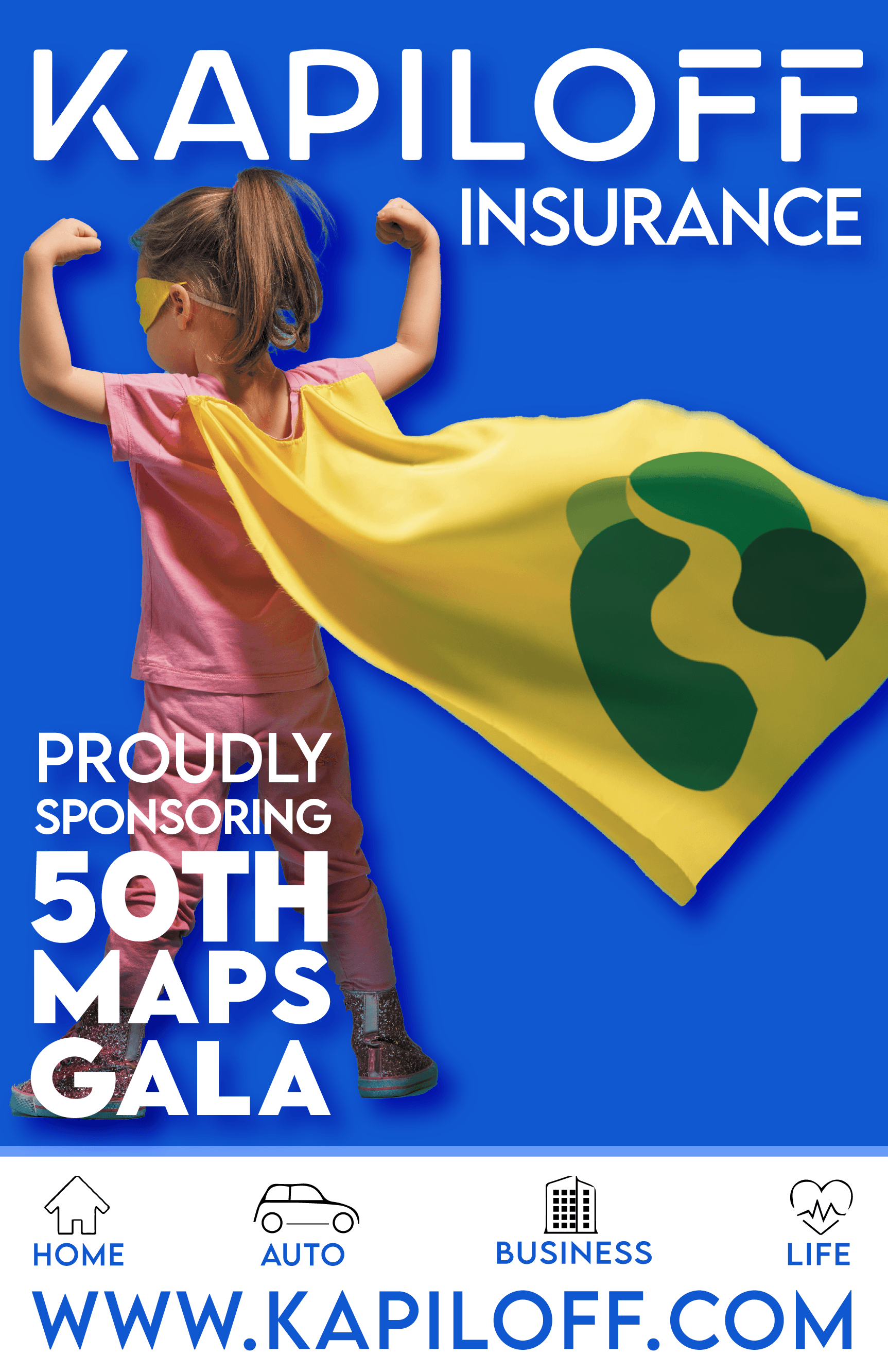
Digital / Print
Event Sponsorship Ad
Color & Typography
Color Palette
Black
#000000
Primary Blue
#1058CF
White
#FFFFFF
Light Blue
#689BF8
Typography System
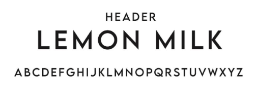
Used for all headings, titles, and the logo. Geometric, bold, highly legible.
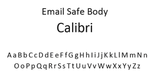
Email and body copy. System-safe — renders correctly across all email clients.
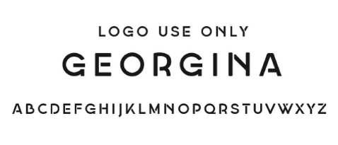
Reserved exclusively for the logo lockup — not for general marketing use.
A brand ready for its next chapter
Visual Clarity
Cleaner hierarchy and stronger legibility across all sizes
Brand Recognition
A distinctive mark that stands apart in the insurance space
Consistency
One unified system across digital, print, and internal materials
Modern Presence
Contemporary feel that earns trust without sacrificing authority
Ready to modernize your brand?