Fortified Motherhood
Strength supporting softness
Brand strategy · Visual identity · Logo suite · Hand-drawn illustration · Pattern design
Client
Fortified Motherhood
Industry
Postpartum Care
Package
Streamlined Branding
Year
2026
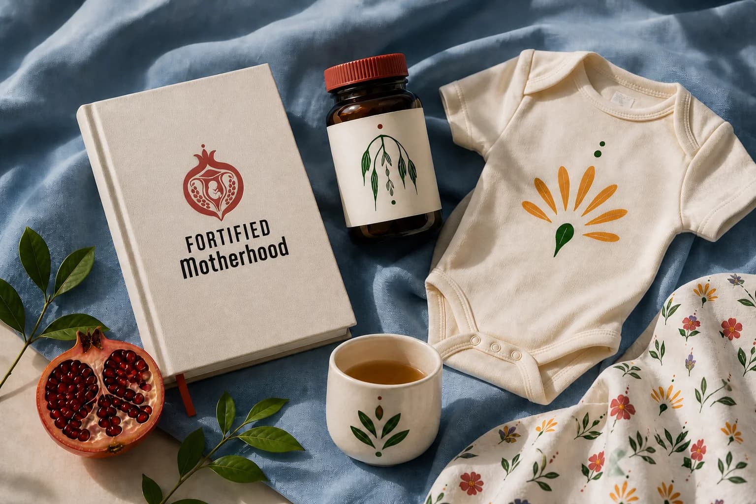
A brand to match the care
Odell Mayer-Bouchard is a mother of three, a trained bodyworker and a professional cook. She had spent years doing postpartum care quietly, through word of mouth, subcontracting and community. Her practice brings together Asian bodywork, doula care, nourishing meals and, soon, virtual coaching.
She came to me with a logo she had made with AI. The lines were thin, it was hard to read at small sizes, and it could not carry a real business. She needed a full identity she could share with confidence — one that would make her the go-to postpartum specialist in the Monadnock region and reach mothers well beyond it.
Postpartum branding has become wallpaper. Lotus flowers, mother-and-child silhouettes, watercolor florals, flowing scripts and blush palettes show up on almost every brand. A new mother searching for support cannot tell one practice from the next.
Fortified Motherhood is not soft or generic, so the brand could not be either. Odell’s work has depth and substance. It is rooted in ancient traditions and in her own experience as a mother.
Break from a category built on lotus flowers and blush pastels
Carry warmth and weight at the same time
Hold up from an Instagram avatar to a stamped tote bag
Own the Monadnock region and travel well beyond it
Give a one-woman practice the presence of an established brand
Nobody in this space was pairing intimacy with strength
I started with strategy: defining two core clients, analyzing regional and national competitors, and mapping the brand’s personality. Every practice was leaning one way or the other — soft and soothing, or clinical and credible. None of them were doing both, which is exactly what Odell’s work is. That gap became the direction, shorthanded in the studio as less baby shower, more ancient wisdom meets modern woman. Every decision after it — color, type, illustration, pattern — was made against it.
Color
A deep pomegranate carries the mark. Steel blue and slate hold the brand steady around it, forest green and clay come from the botanicals, and warm ivory gives everything room to breathe. The palette is warm without being sweet and rich without being heavy. It breaks deliberately from the pastels that dominate the category.
Warm Ivory
#F2F4F0
Steel Blue
#8DB6C8
Pomegranate
#B34747
Slate
#4B6D7B
Forest Green
#113F1A
Clay
#EF902B
Violet
#6A50C2
Ink
#0A0A0A
Typography
Aptly
Reserved for the wordmark alone — a condensed uppercase structure answered by rounded warmth.
Henriette
Weighted, old-style and full of character. It gives the brand its sense of history and strength.
Avenir
The workhorse. Clear, calm and highly readable without ever feeling sterile.
Logo Suite
A complete system rather than a single mark: primary, secondary, logo mark and submark, plus versions carrying the tagline and the service line. Each ships in color, black and reversed, for print and digital. Every mark holds up on a website header, an Instagram avatar or a stamped tote bag.
Stacked lockup. The vendor default, and the version that leads on the website and printed collateral.
Horizontal lockup for wide, short spaces — a site header, an email signature, the top of a form.
The pomegranate standing alone, for favicons, seals and embroidery where the wordmark would not survive.
Compact badge for profile images, packaging seals and merchandise.
An apothecary, drawn by hand
This is where the brand becomes its own. I drew each illustration by hand instead of buying stock florals. The imperfect, human line is a quiet signal of what Odell offers: care from real hands, not a clinical process. Every subject was chosen for what it means in postpartum recovery — the eight read as an herbal apothecary for the brand, and each one tells part of the story.
The Streamlined package covers a smaller set. Odell commissioned the full eight as an addition, so the brand has a complete symbol vocabulary rather than a starting point.

Nourishment
Nettle
A traditional mineral-rich tonic, long used to rebuild strength and replenish the body after birth.
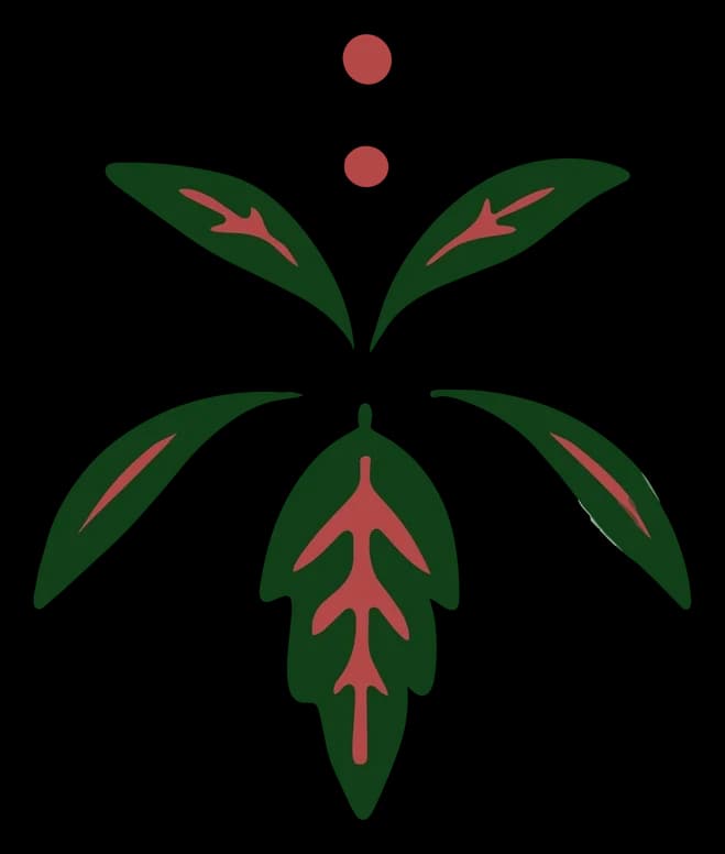
Strength
Raspberry Leaf
Used for generations to tone and support the womb through pregnancy and recovery.
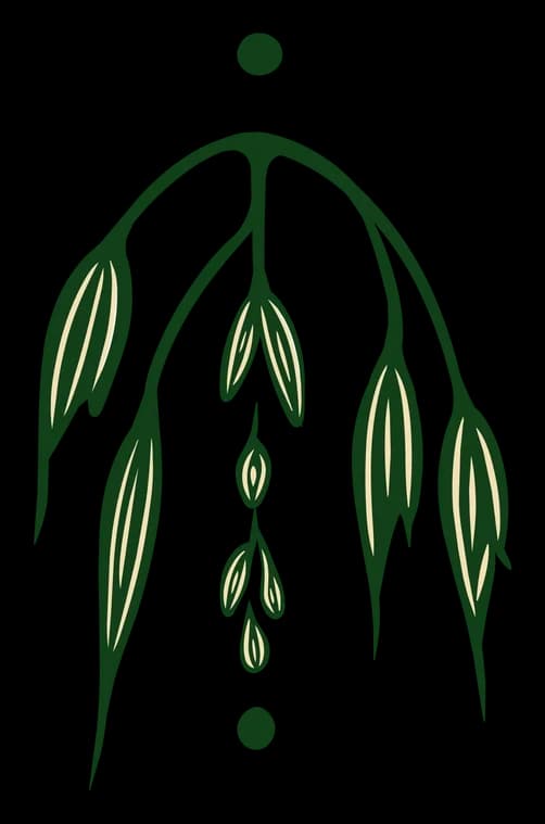
Rest
Milky Oats
Calms and restores a depleted nervous system. Oats have long been a staple for nursing mothers.

Healing
Calendula
A healing flower traditionally used in postpartum sitz baths and salves to soothe and mend tissue.
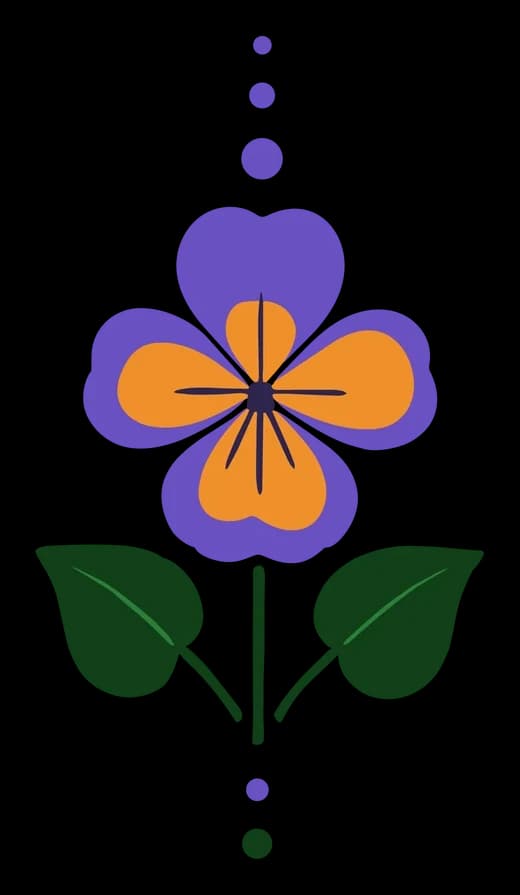
Soothe
Violet
Gentle and cooling. It stands for tenderness and quiet comfort in the early weeks.
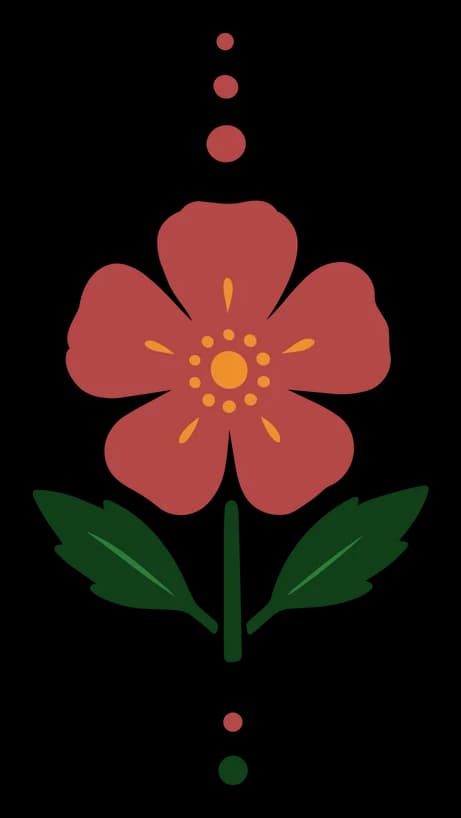
Heart
Wild Rose
Love, emotional healing and the fierce devotion of new motherhood.
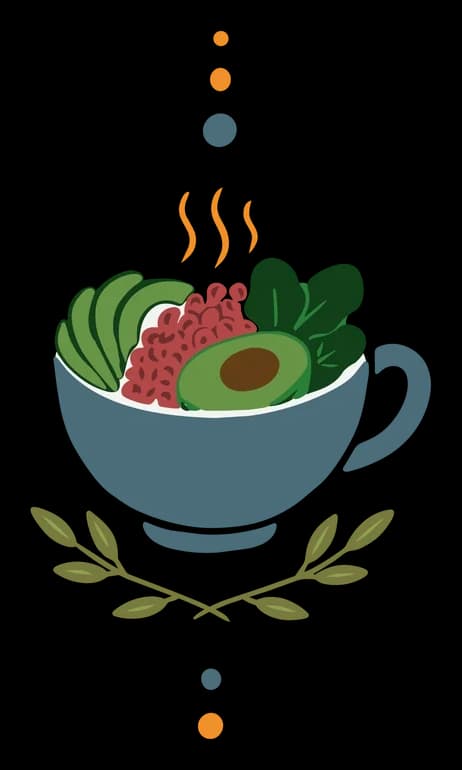
Sustenance
Warm Meals
The center of Odell's practice. Across healing traditions, and especially the Asian practices behind her bodywork, warm food is the foundation of recovery.
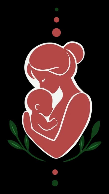
Bond
Mother & Baby
The brand's purpose in one image: a mother who is held, so she can hold everything else.
Pattern
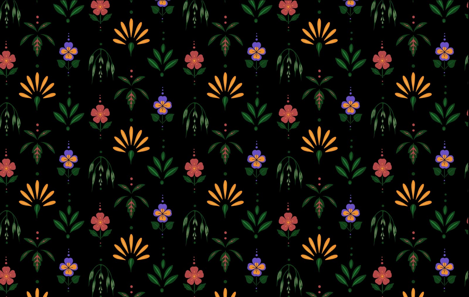
The botanicals are woven into a repeating pattern that brings texture and richness to packaging, print, merchandise and digital backgrounds. It is used as accent, not decoration — a way for the brand to fill a surface without ever repeating the logo.
Brand Guide
Written for the people who will actually use it — a printer, a merch vendor, Odell herself at eleven at night. Logo rules, the full palette with production values, the botanical tokens and what each one means.
Brand in Action
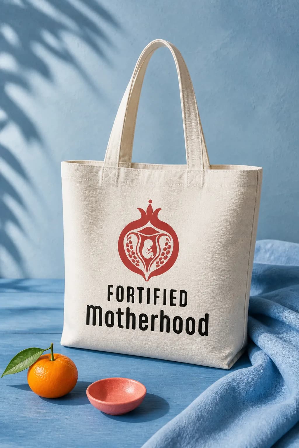
Merchandise
Canvas Tote
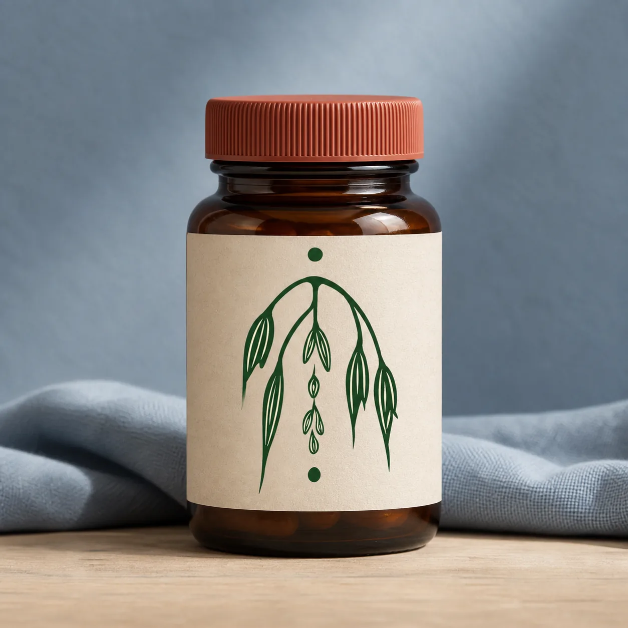
Packaging
Supplement Label
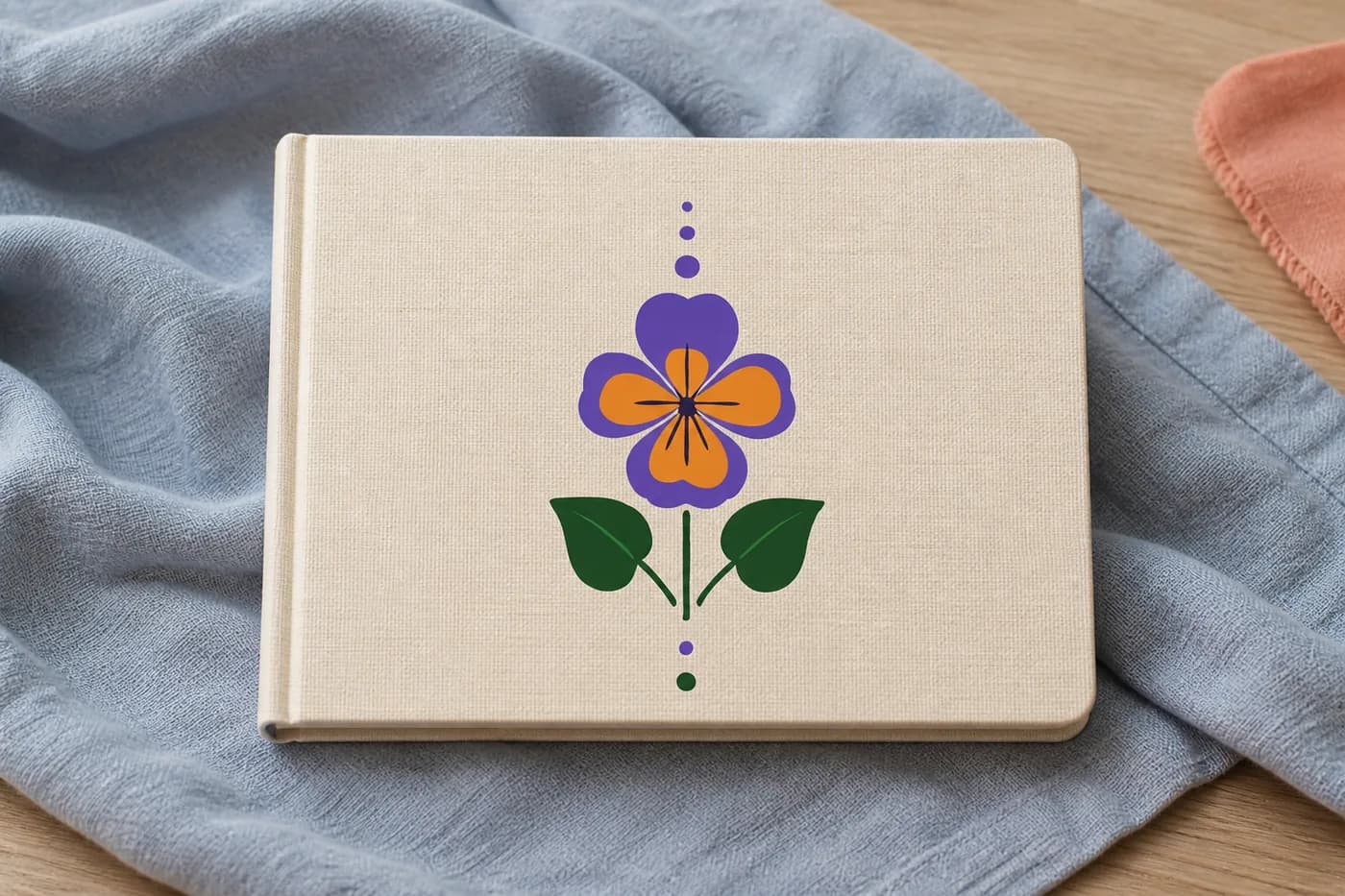
Postpartum Journal
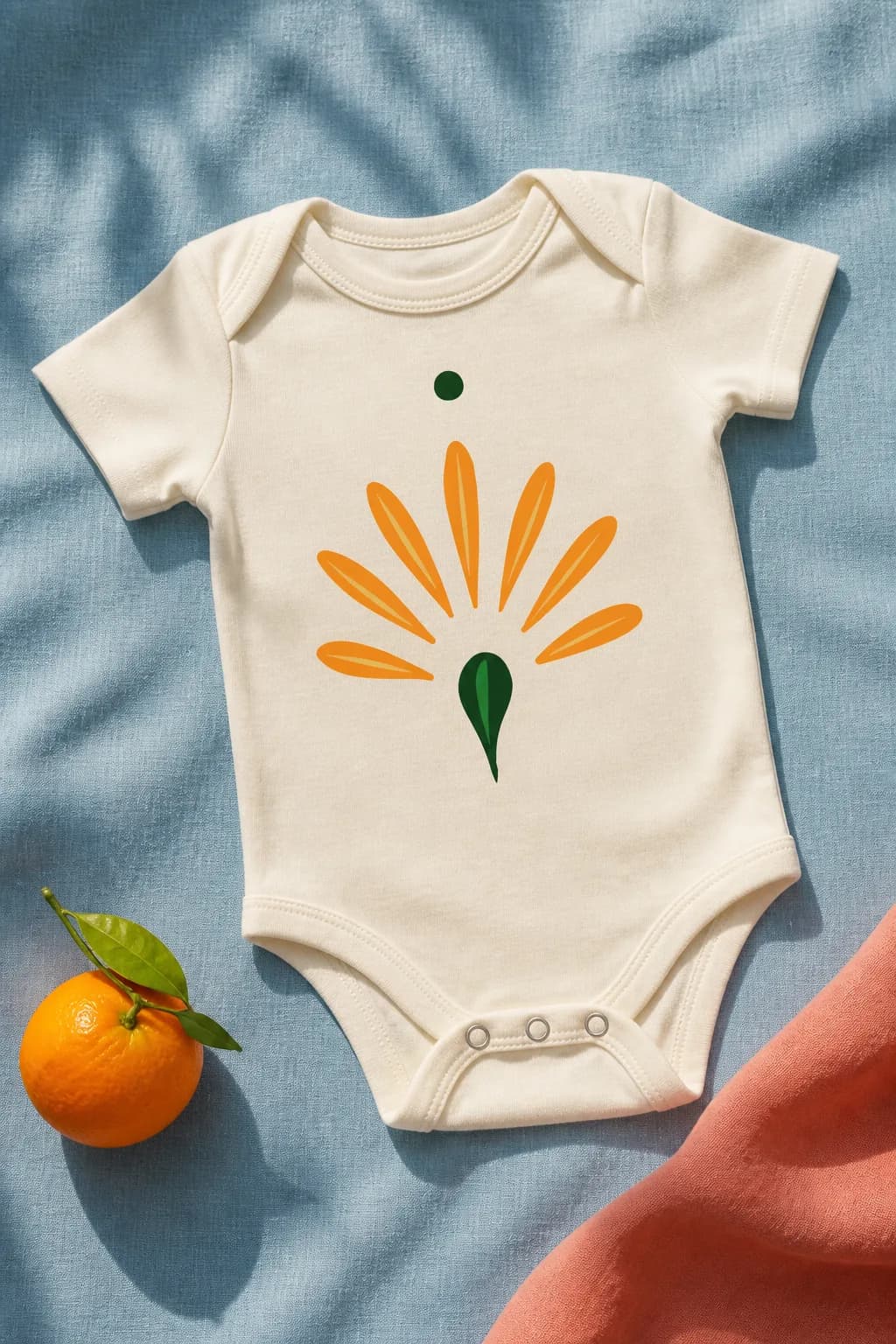
Apparel
Infant Bodysuit
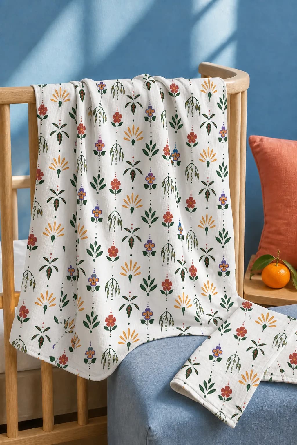
Textiles
Patterned Swaddle
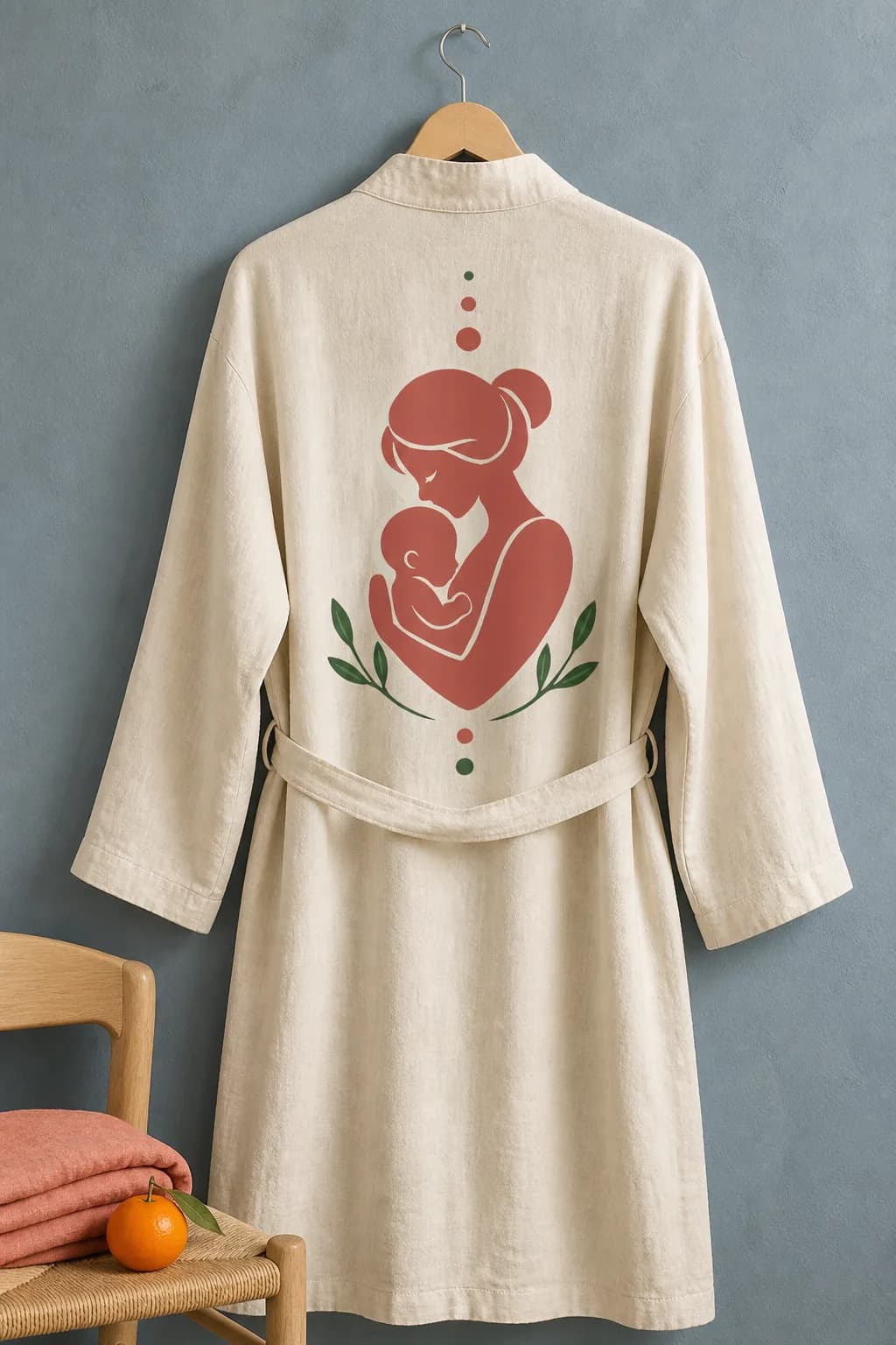
Apparel
Recovery Robe
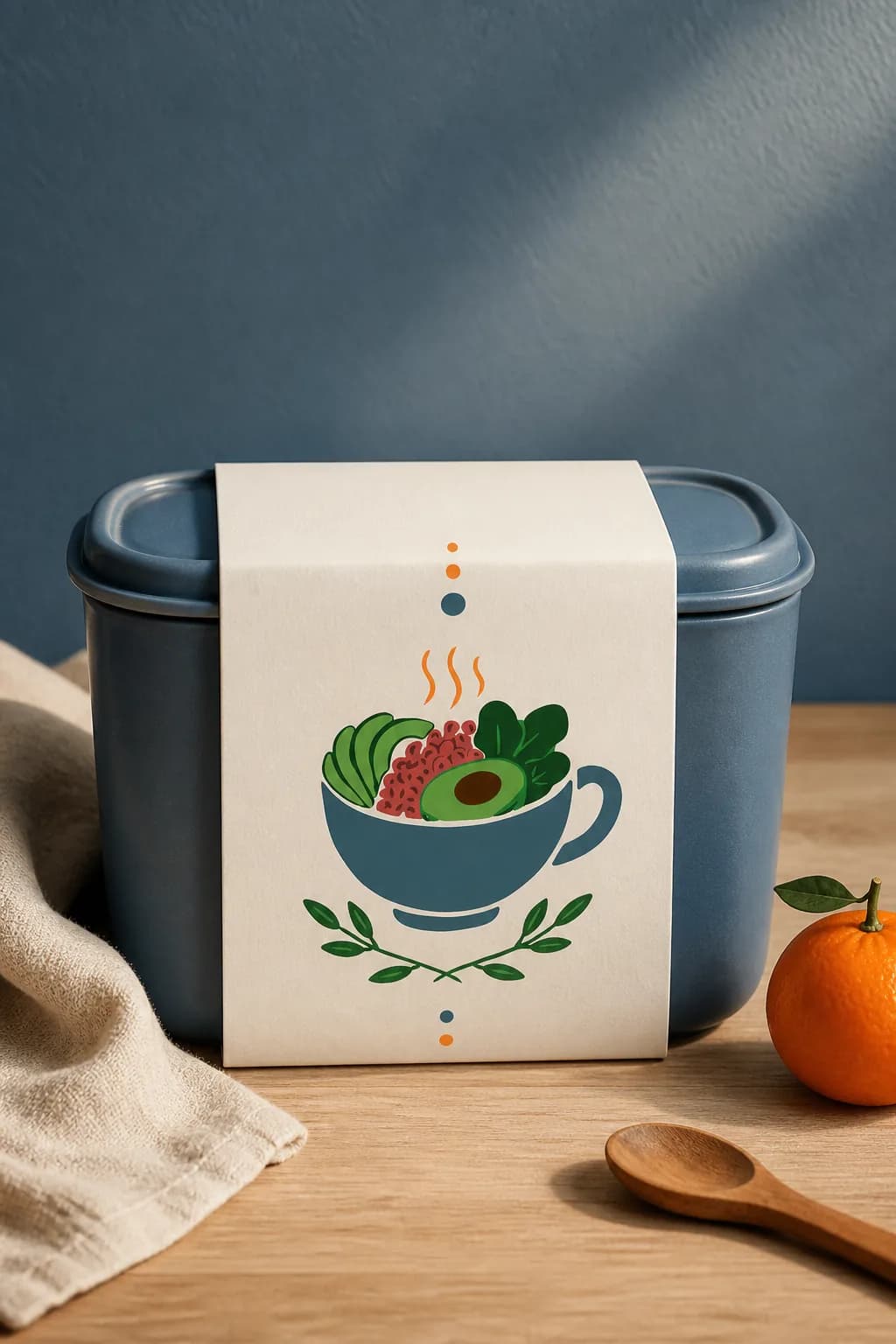
Packaging
Meal Delivery Box
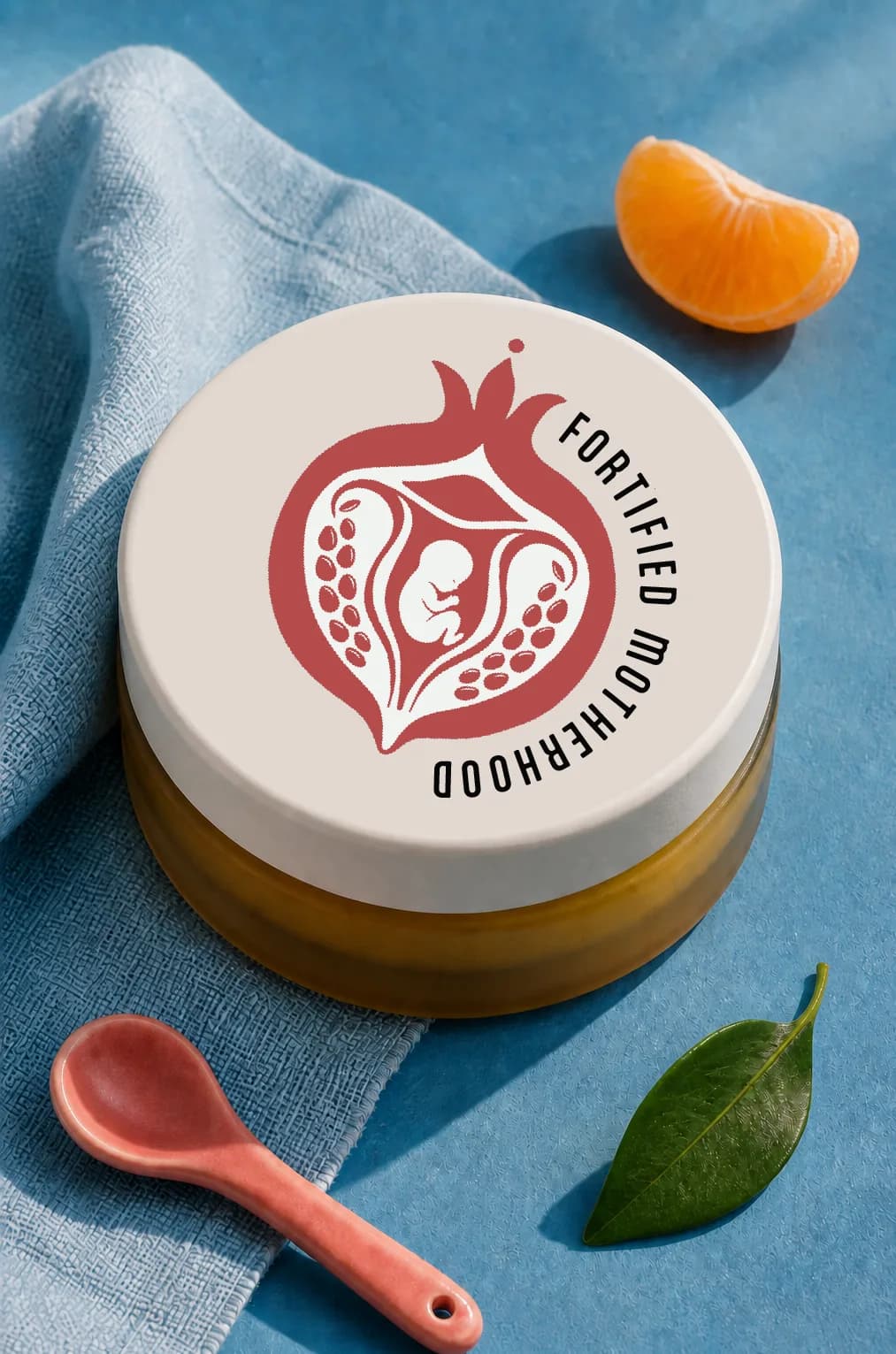
Packaging
Balm Tin
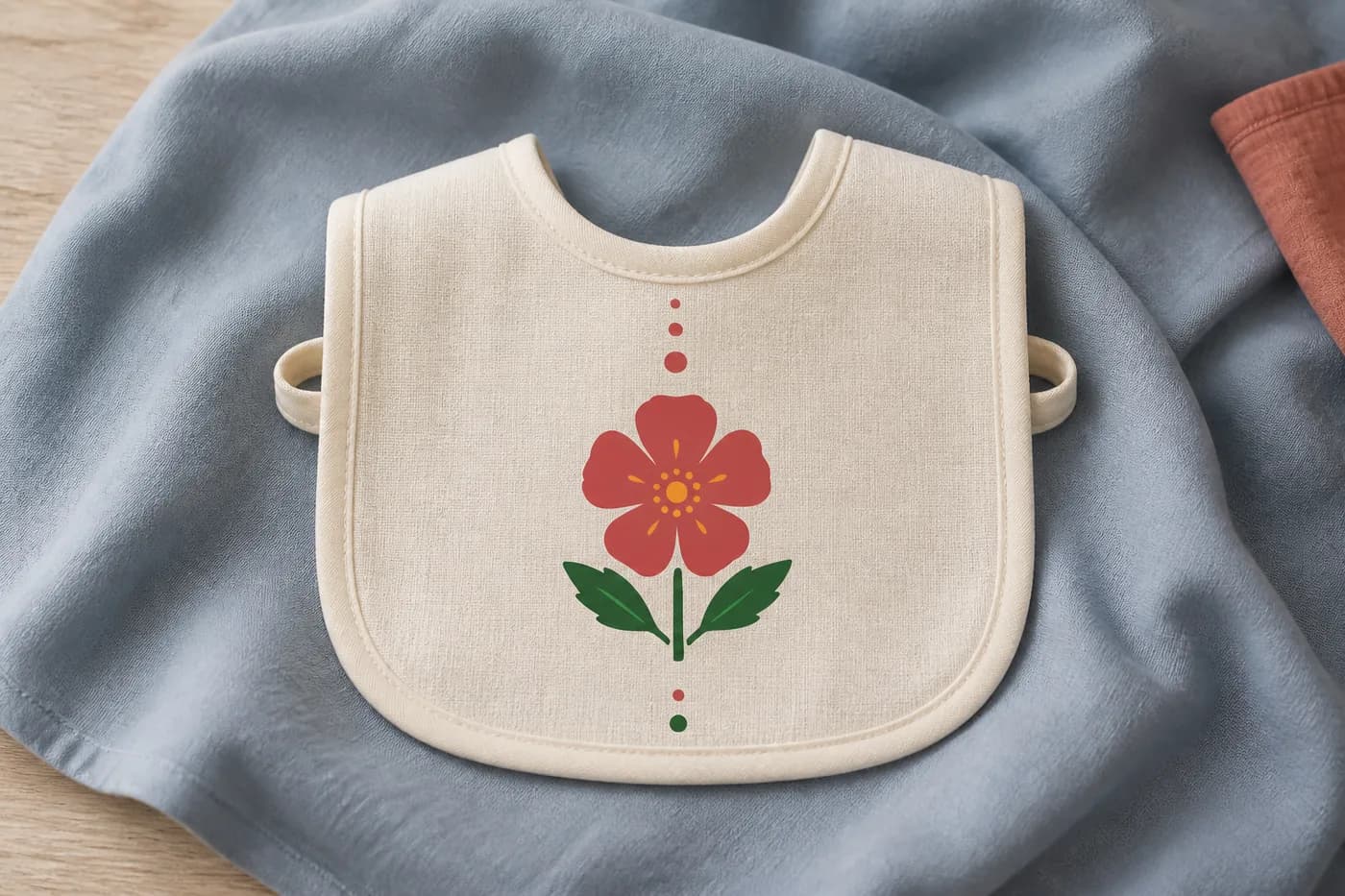
Textiles
Infant Bib
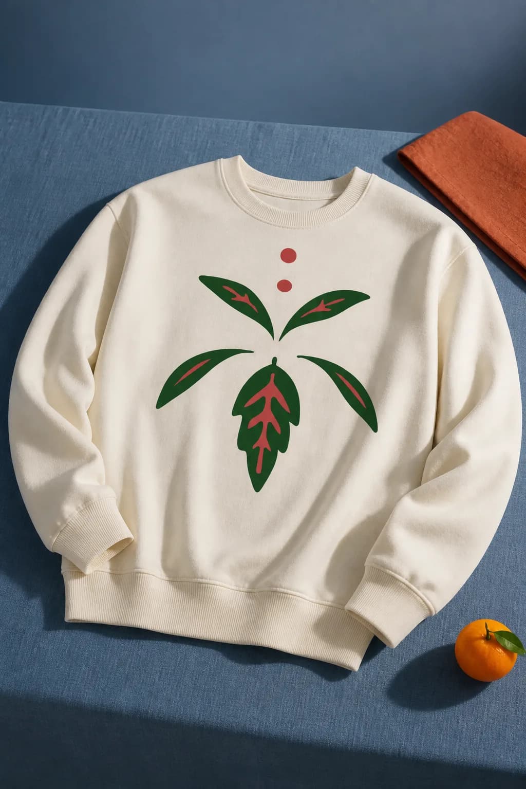
Apparel
Crewneck
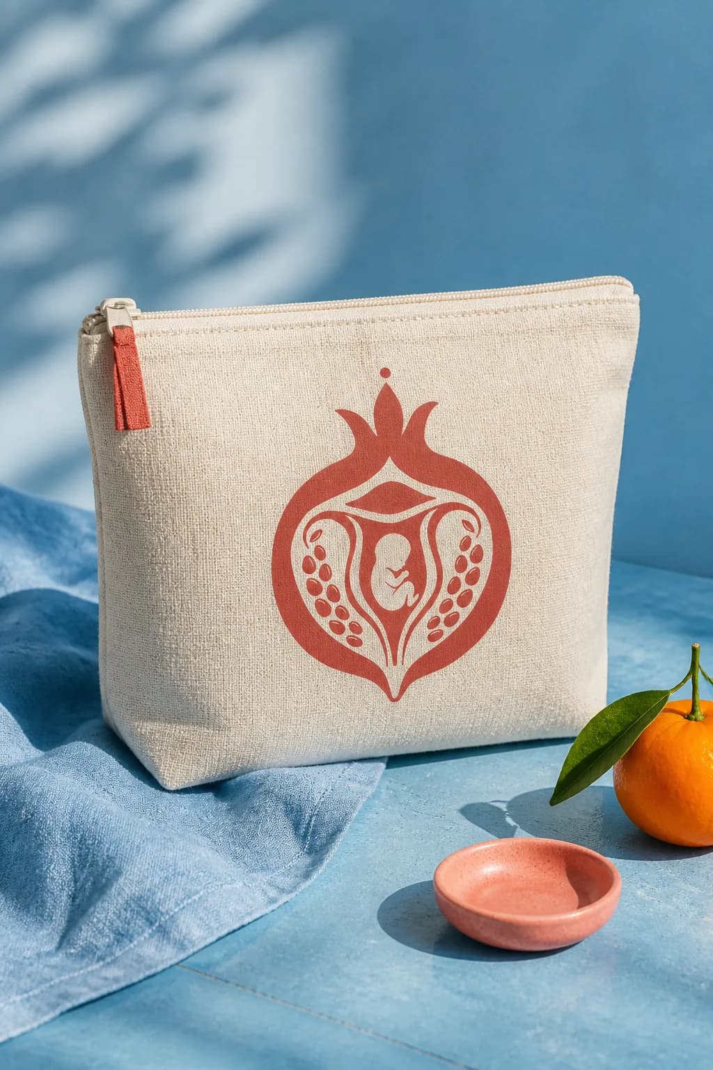
Merchandise
Canvas Pouch
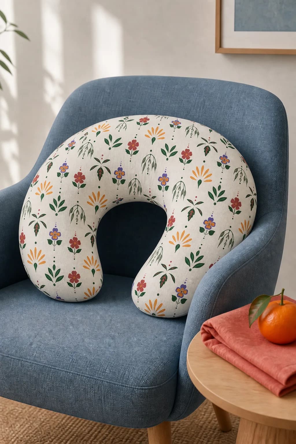
Textiles
Nursing Pillow
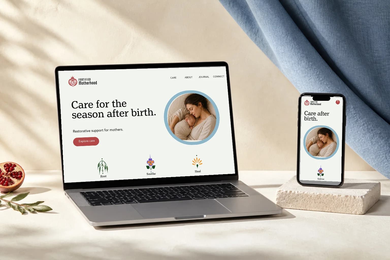
Digital — Website Direction
It feels like her, not like the category
Fortified Motherhood now has a brand that matches the depth of Odell’s work. Every element carries meaning: the pomegranate mark, the old-style type, and herbs drawn by hand that postpartum women have relied on for centuries. The system is complete — a full logo suite, brand typography and color, eight hand-drawn illustrations, a signature pattern and a brand guide — and it is ready for her website, her virtual coaching and the community-funded care she plans to offer one day.
Delivered as a Streamlined Branding package, with the expanded illustration set commissioned on top of it.
Category Break
No lotus, no script, no blush. The brand is recognizably not the practice next to it.
Meaning Throughout
Eight botanicals chosen for what they do in recovery, not for how they decorate.
Built to Scale
A system ready for a website, virtual coaching, packaging and merchandise before those exist.
Confidence to Share
An identity Odell can put in front of a client without explaining or apologizing for it.
Questions
For Fortified Motherhood it was a logo system of four marks with tagline and service-line variations, a color palette with production values for print and screen, a typographic pairing, eight hand-drawn botanical illustrations, a repeating pattern built from them, and a brand guide written for vendors. Every mark ships in color, black and reversed, for print and digital, so the practice can hand files to a printer or a merchandise supplier without coming back to the studio.
By finding the gap first. Competitor analysis across regional and national postpartum practices showed the category splitting two ways — soft and soothing, or clinical and credible — with almost nobody doing both. That gap set the direction, and it ruled out the category defaults: no lotus flower, no watercolor florals, no flowing script, no blush palette. Every decision after it was tested against whether it would be mistaken for the practice next door.
An imperfect, human line signals what a care practice actually offers: care from real hands rather than a clinical process. Stock florals are available to every competitor simultaneously, so they cannot differentiate anything. Drawn artwork is owned outright, and here each subject was chosen for what it does in postpartum recovery — nettle for nourishment, milky oats for rest, calendula for healing — so the set works as a symbol system rather than decoration.
It was delivered as a Streamlined Branding package, which runs six weeks across three two-week stages: mini strategy and mood boards, design and logo suite, then guidelines and wrap-up. The expanded set of eight illustrations was commissioned on top of the package. Both branding packages are quoted per project rather than priced from a list.
Yes. Black Rabbit Creative is based in Portsmouth, New Hampshire and works with clients across New England and remotely beyond it. Fortified Motherhood serves the Monadnock region, and most of the work happened in files and video calls.
Tired of looking like everyone else in your category?