Case Studies
Self-initiated practice briefs designed to push creative boundaries, explore new styles, and develop full brand systems from concept to completion — without client constraints.
Lobster Lab
Brand Identity & Packaging — Concept Restaurant
Project
Lobster Lab
Type
Concept / Practice Brief
Scope
Brand Identity, Packaging, Menu, Merch, Signage
Year
2024
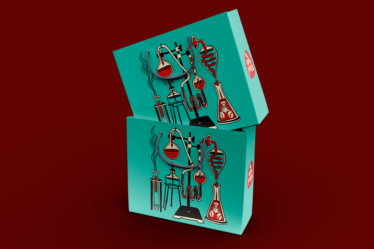
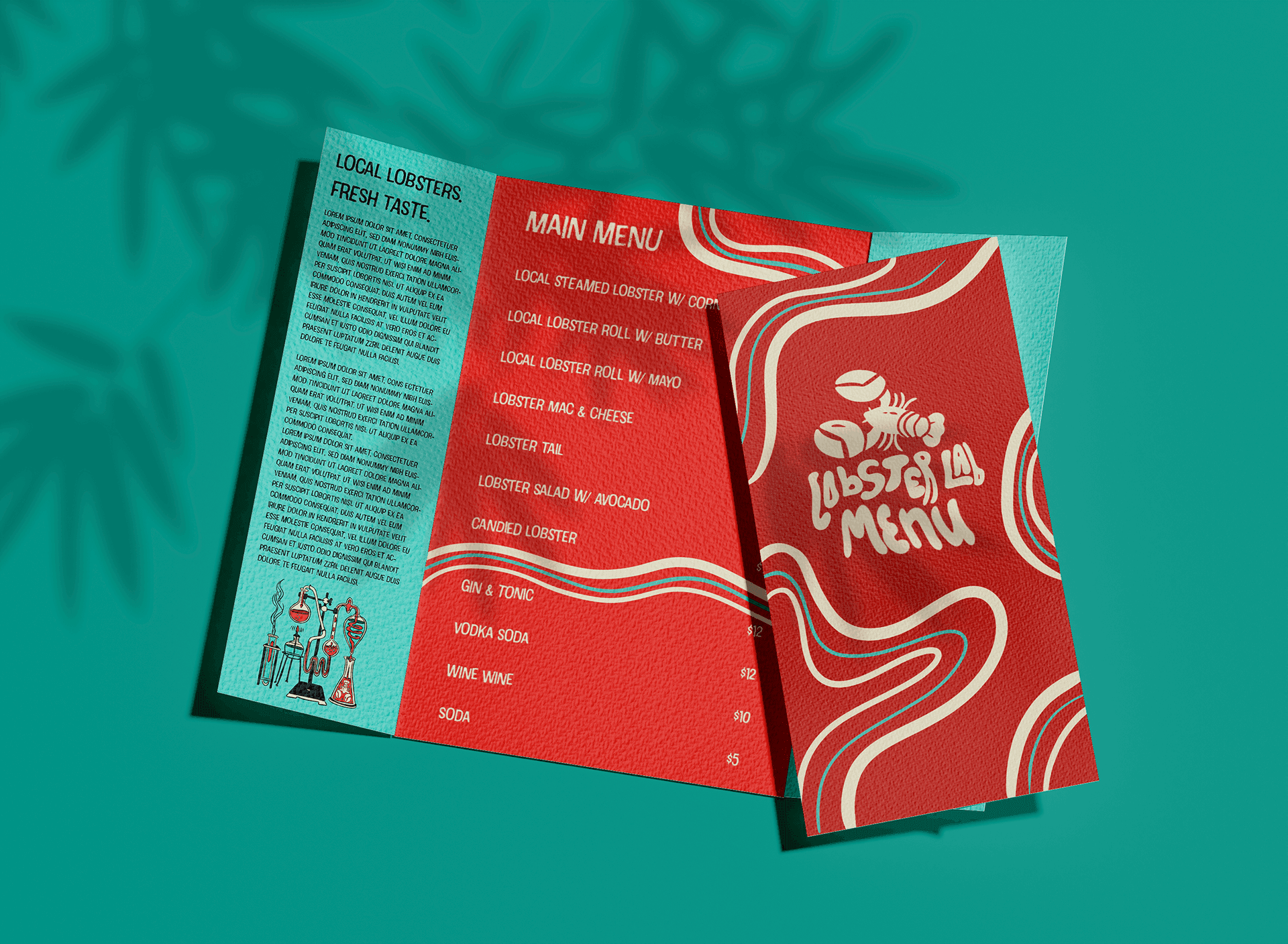
Where science meets seafood.
Lobster Lab is a concept brand for a quirky, local lobster shack that leans into a playful "science experiment" theme — as if the perfect lobster roll was the result of mad-scientist-level dedication.
Created as a self-initiated practice brief, this project explores full brand identity development from illustration and typography to packaging, merchandise, and environmental signage — all unified by a bold teal-and-red palette and hand-drawn character.
The goal was to create a brand system that feels fun, memorable, and distinctly different from the typical rustic seafood aesthetic — proving that even casual dining can have serious design craft.
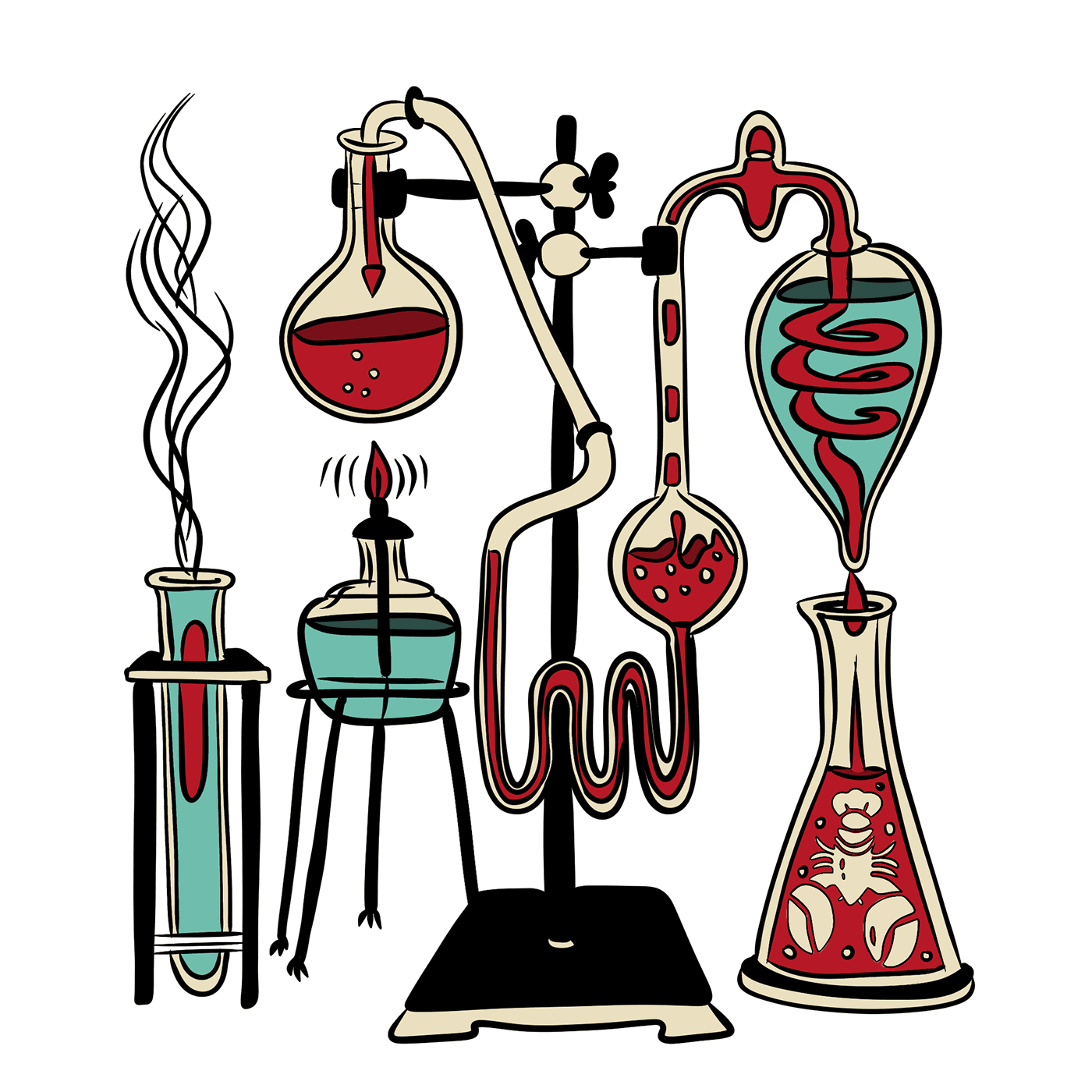
Custom Illustration
Hand-drawn laboratory equipment featuring lobster motifs — beakers, burners, and a signature Erlenmeyer flask with a lobster etched inside.
Breaking the nautical cliche.
Most seafood restaurants default to anchors, rope fonts, and weathered wood. Lobster Lab takes a completely different direction — leaning into retro science, bold illustration, and a color palette that pops on shelves and in social feeds.
Retro Science
A playful 'lobster laboratory' concept blending vintage scientific illustration with bold seafood branding.
Dual Palette
Teal and deep red work as complementary anchors — ocean meets the boil pot.
Hand-Drawn Character
Custom illustration gives the brand a handcrafted, one-of-a-kind personality that mass-market competitors can't replicate.
Tactile Presence
Packaging designed to feel as good as the food — bold patterns, saturated color, shelf-stopping presence.
Beyond the plate.
A brand isn't just a logo — it's every moment someone interacts with you. The Lobster Lab system extends across takeout packaging, branded merchandise, and storefront signage, creating a consistent experience from first impression to last bite.
- Custom lobster logo & retro hand-lettered wordmark
- Flowing wave pattern system with teal accent
- Bifold menu design with bold typographic hierarchy
- Takeout box packaging — two colorway variants
- Branded merchandise — hoodie mockup
- Storefront window signage & environmental graphics
- Custom lab equipment illustration
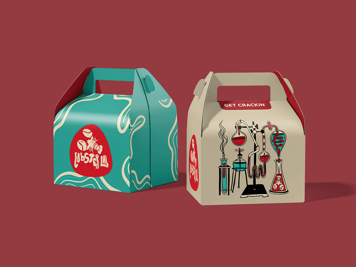
Takeout Packaging
Two colorway variants — teal wave pattern and cream with lab illustration — designed for instant brand recognition at pickup and delivery.
Living the brand.
The brand extends to physical spaces and wearable merch — the storefront window wraps the flowing wave pattern around the logo, while the branded hoodie turns customers into walking advertisements.
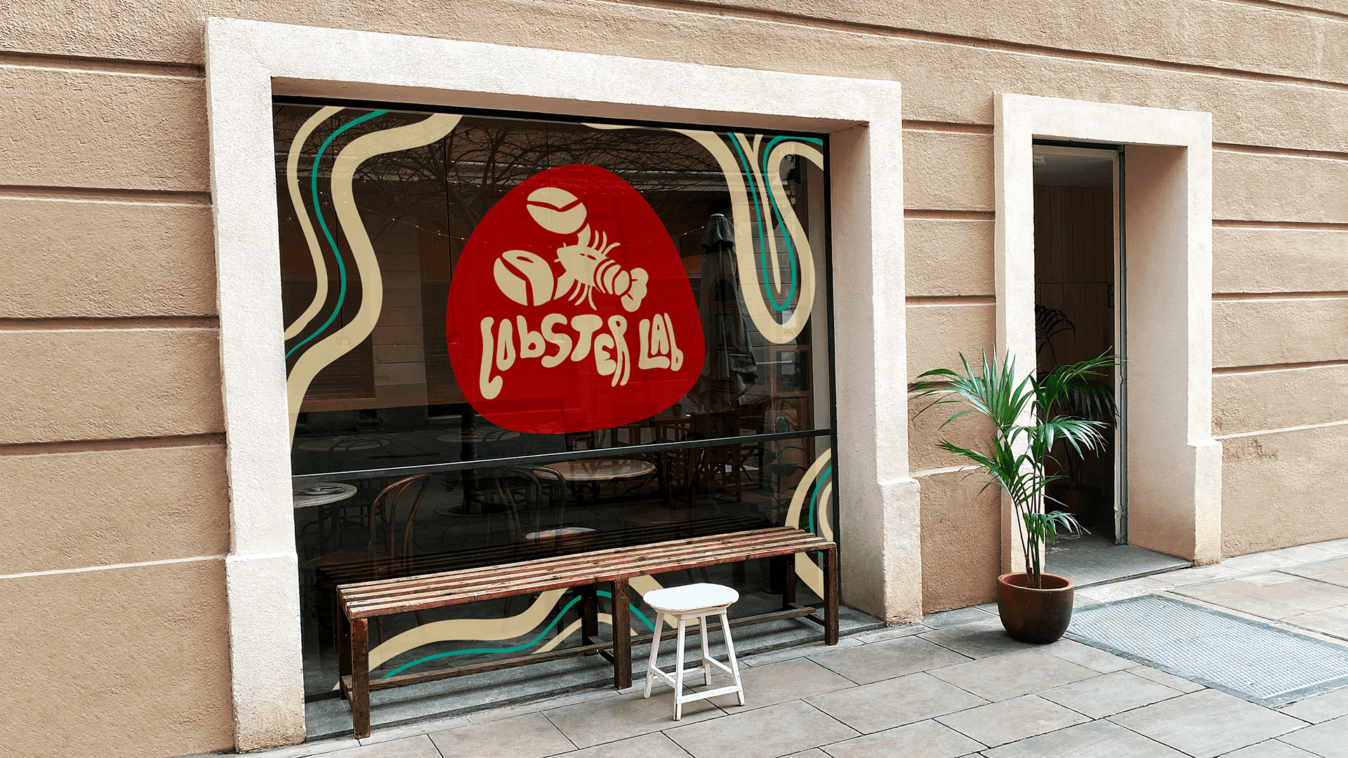
Storefront Signage
Window graphics featuring the flowing wave pattern and logo — creating a bold street presence that draws customers in.
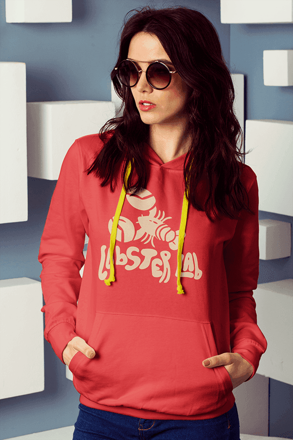
Branded Merchandise
Coral hoodie with cream logo — a wearable brand touchpoint that extends the Lobster Lab identity beyond the restaurant.
Bold, fun, unforgettable.
The finished brand system proves that restaurant branding doesn't have to play it safe. Every element — from the hand-drawn lab equipment to the wave-pattern takeout boxes to the storefront signage — works together to build a brand that's impossible to ignore.
As a practice brief, Lobster Lab demonstrates full-scope brand thinking: strategy, illustration, typography, packaging, merchandise, environmental graphics, and collateral design all working as one cohesive system.
Calentón Mexican Hot Sauce
Brand Identity & Packaging — Concept Product
Project
Calentón Mexican Hot Sauce
Type
Concept / Practice Brief
Scope
Brand Identity, Packaging, Mascot, Merch, Advertising
Year
2025
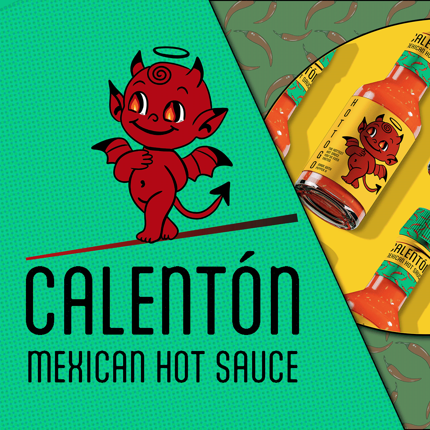
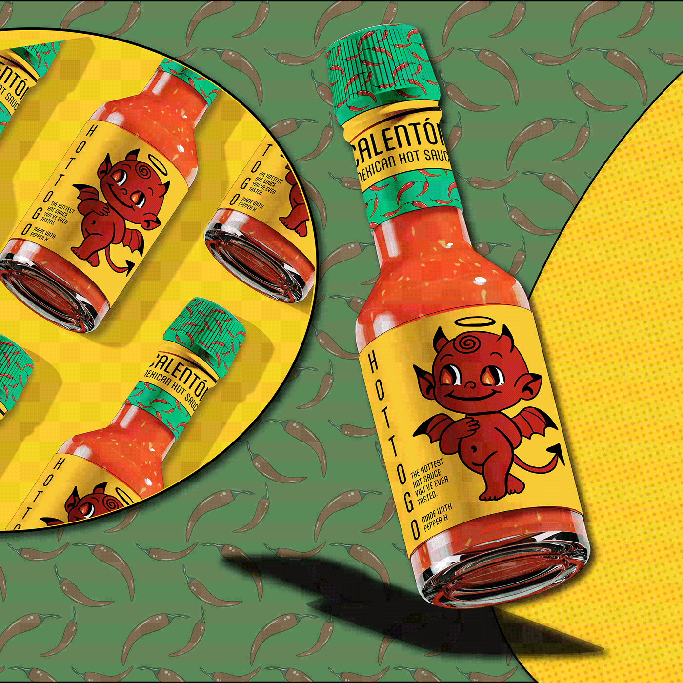
Hot Sauce with a twist.
Calentón is a concept brand for a Mexican hot sauce that leans into a playful, mischievous theme — as if the perfect blend of spices was the result of a devilish experiment.
Created as a self-initiated practice brief, this project explores full brand identity development from illustration and typography to packaging, merchandise, and advertising — all unified by a bold red, yellow, and green palette and a custom chili pepper pattern.
The goal was to create a brand system that feels fun, memorable, and distinctly different from the typical hot sauce aesthetic — proving that even condiments can have serious design craft.
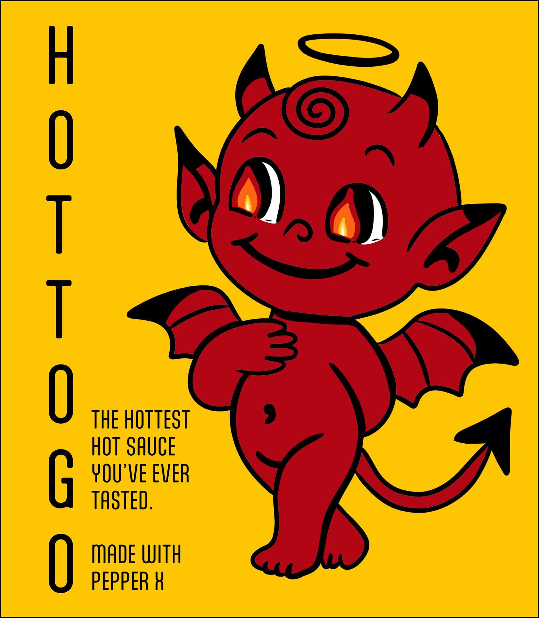
Packaging Design
Bold yellow HOT TO GO package design featuring the devil mascot, hand-lettered logotype, and key product details — designed for maximum shelf impact.
Breaking the hot sauce cliche.
Most hot sauce brands rely on aggressive flames, skulls, and extreme heat imagery. Calentón takes a completely different direction — leaning into playful character design, a mischievous devil mascot, and a vibrant Mexican-inspired color palette that pops on shelves and in social feeds.
Devilish Charm
A mischievous baby devil mascot with a halo — cute enough to love, hot enough to fear. The perfect embodiment of 'dangerously delicious.'
Bold Tri-Color
Red, yellow, and green create an unmistakable Mexican-inspired palette that screams heat and flavor from the shelf.
Pattern Power
A custom chili pepper repeat pattern adds texture, depth, and instant brand recognition across every touchpoint.
Retro Attitude
Vintage TV mockups and halftone textures give the brand a playful, nostalgic edge that stands out in a crowded market.
Beyond the bottle.
A brand isn't just a logo — it's every moment someone interacts with you. The Calentón system extends across bottle packaging, branded merchandise, and advertising, creating a consistent experience from first impression to last bite.
- Custom devil mascot character with multiple poses
- Hand-lettered Calentón logotype & wordmark
- Hot sauce bottle label design — full wrap
- Repeating chili pepper pattern system
- Retro TV advertising mockups
- Branded merchandise — hoodie & tote bag
- Full brand identity system & guidelines
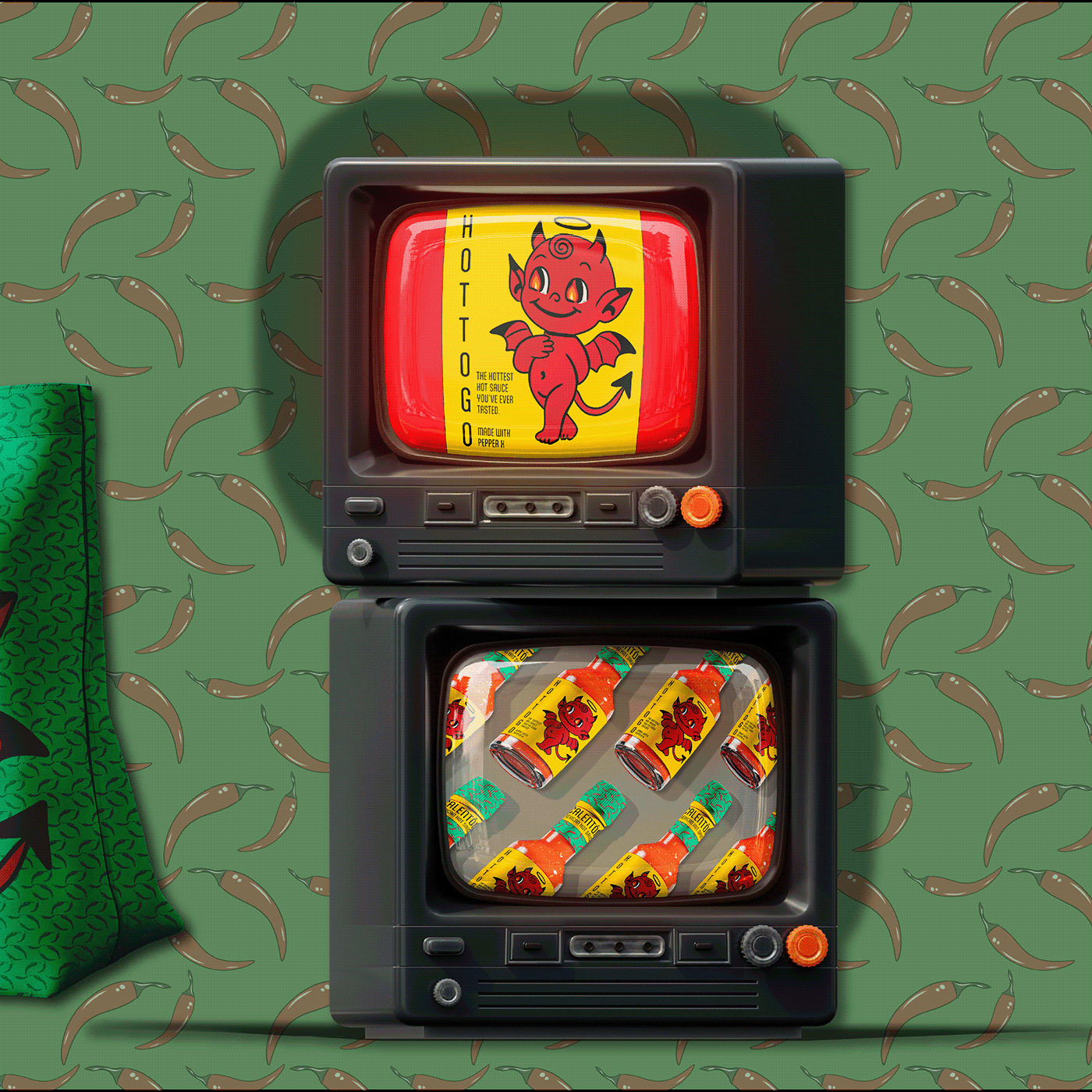
Retro TV Advertising
Stacked vintage TV mockups with the devil mascot and product lineup — a playful, retro advertising concept against the custom chili pepper pattern.
Spreading the heat.
The brand extends beyond the bottle into wearable merch — a branded hoodie and tote bag turn fans into walking brand ambassadors, keeping the Calentón identity alive far beyond the kitchen.
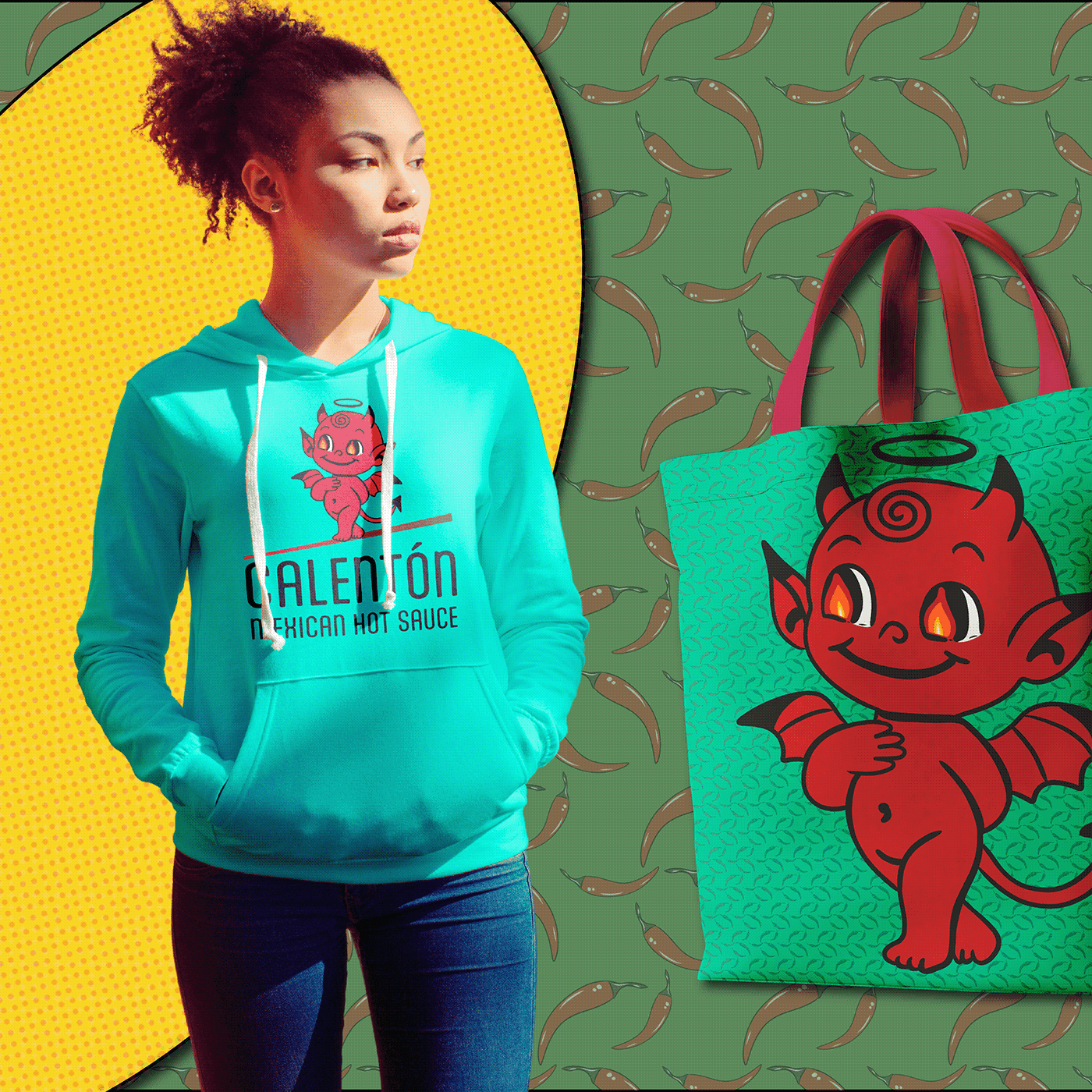
Hoodie & Tote Bag
Teal hoodie and branded tote bag featuring the devil mascot — wearable brand touchpoints that extend the Calentón identity beyond the shelf.
Devilishly delicious.
The finished brand system proves that hot sauce branding doesn't have to play it safe. Every element — from the hand-drawn devil mascot to the chili pepper pattern to the retro TV advertising — works together to build a brand that's impossible to ignore.
As a practice brief, Calentón demonstrates full-scope brand thinking: strategy, character design, typography, packaging, merchandise, advertising, and pattern design all working as one cohesive, fiery system.
Sharpening the craft.
Practice briefs are self-initiated projects designed to push creative boundaries without client constraints. They're an opportunity to explore new illustration styles, experiment with bold color palettes, and develop full brand systems from concept to completion.
These projects demonstrate the same strategic thinking and design craft applied to client work — the only difference is the freedom to take bigger creative risks.